
I first blogged about this soi-disant “Graph of Doom” (“the Graph”) back 2013. Recent global developments have put everyone in mind of how dependent we are on predictions and forecasts and just how important it is to challenge them with actual data. Then we should learn something about what we are talking about in the process.

I first came across the Graph in a piece by David Brindle in The Guardian on 15 May 2012. As far as I can see this comes from a slide pack delivered at Barnet London Borough dated 29 November 2011.
The Graph was shared widely on social media in the context of alarm as to an impending crisis, not just in Barnet but, by implication, local government funding and spending and social care across the UK. To be fair to Brindle, and most of the other mainstream commentators, they did make it clear that this was a projection. As he said, “The graph should not be taken too literally: by making no provision for Barnet’s anticipated rise in income through regeneration schemes, for instance, it overstates the bleakness of the outlook.”.
I blogged about this in 2013 I made the following points about the Graph and the charted predictions, forecasts and projections in particular.
- Use ink on data rather than speculation.
- Ditto for chart space.
- Chart predictions using a distinctive colour or symbol so as to be less prominent than measured data.
- Use historical data to set predictions in context.
- Update chart as soon as predictions become data.
- Ensure everybody who got the original chart gets the updated chart.
- Leave the prediction on the updated chart.
Nine years on, as far as I can see from my web search, points 5 to 7 have not been addressed, certainly not in the public domain. I am disappointed that none of the commentators has taken the opportunity to return to it. As I set out below, there’s a great story here. I decided it was down to me.
I went to look at Barnet’s website to search for published accounts. I wanted to see if I could find out how this actually evolved. I did not find this easy. The relevant accounts are not easy to find on the website. I am not an accountant. Perhaps a large proportion of Barnet’s residents are. Firstly, I could not find any figures before 2012/13 so I am still unsure as to whether the 2010/11 picture is forecast, preliminary or actual. There also seemed to be a number of different analysis models within which accounts were given. After a bit of judicious guesswork matching numbers, I decided that the projected budget was referring to the General Fund Revenue Budget (“the GFRB”) which is the account that revenue expenditure and income is charged for the council’s services (excluding the Housing Revenue Account). It says. The service budgets must then refer to the expenditures charged against the account. I found finalised accounts for 2012/13 to 2018/19. There were provisional accounts for 2019/20 but, as far as I could see, those did not include the GFRB so didn’t really assist.
I’m happy to be corrected on this by anybody who has a better view on the relevant numbers.
I didn’t have the original data to plot afresh, or the forecasting model. I have had to over-plot a bitmap. Not a perfect situation. I could not address all the data visualisation criticisms I made in my earlier post. That said, here is the Graph with the actual budgets and expenditures.
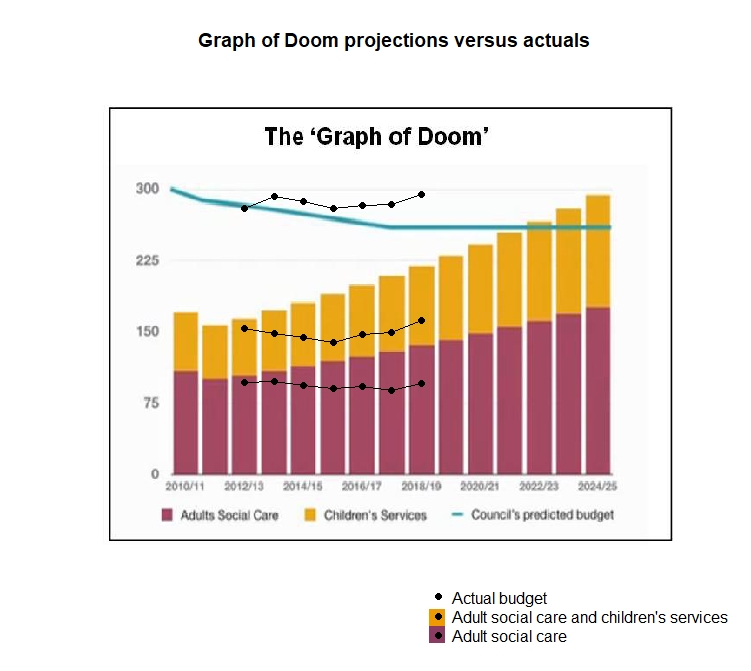
I am guessing that the original Graph adjusted future revenues and expenditures to 2011 prices. I have, therefore, replotted adjusting for CPIH, the government’s preferred inflation measure. This is a measure of consumer price inflation but I found nothing better for indexing local government expenditure. I am not an economist. Here is the adjusted chart.

There’s actually a great story here for somebody. This is not boring! It certainly looks as though forecasts of total funding held up well, a little below predicted. However, expenditure on social care appears to have diminished well below the parlous levels projected in the Graph of Doom. It has gone down rather than up. That must be because:
- Barnet have done a wonderful job in performing these services more efficiently.
- The effectiveness and performance of the services has deteriorated.
- The demographic forecasts were inaccurate..
I am betting against (3) because demographic forecasts over so short a period don’t have many ways of going wrong. I am surprised that, if (1) is the case, then Conservative members of Barnet London Borough aren’t shouting very loudly about it. Conversely, if (2), I’m surprised that Labour members are silent. What I’m looking for is somebody to put the Graph of Doom back on the stage and use it to celebrate success or attack an opponent. I would expect the national party principals to find capital in the data. Data. Perhaps it is more “nuanced” but that still sounds like an interesting story. Of course, I would also like to see some data about the effectiveness of the social services. That’s a huge part of this narrative too. Perhaps I shall look for that myself.
I would have thought that there was a good story here for a data journalist. Our mainstream media still have, thankfully, plenty of left and of right sympathies.
We need improvement stories to inspire, motivate and educate to broader and more diverse improvement efforts. We need warnings of scandal and failed public provision to inspire, motivate and educate to broader and more diverse improvement efforts. We need to show not tell.
I do just note that Barnet’s accounts also have forecasts for each succeeding year. These are so good I haven’t felt it worth blogging about them. Perhaps it all carries the spoor of rule 4 of Nelson’s funnel. But that is another story. Worth a journalist’s time I think.
I’ll be back.
