UK railway suicides – 2020 update

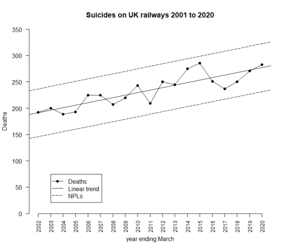
The latest UK rail safety statistics were published on 17 December 2020, again absent much of the press fanfare we had seen in the past. Regular readers of this blog will know that I have followed the suicide data series, and the press response, closely in 2018, 2017, 2016, 2015, 2014, 2013 and 2012. Last year I missed. By the time I found blogging space around the day job, I felt I had nothing to add.  Now again for 2020, I have re-plotted the data myself on a Shewhart chart.

RailwaySuicides20201

Readers should note the following about the chart.

  • Many thanks to Tom Leveson Gower at the Office of Rail and Road who confirmed that the figures are for the year up to the end of March.
  • This time, none of the numbers for earlier years have been updated by the statistical authority.
  • I have recalculated natural process limits (NPLs) as there are still no more than 20 annual observations. The NPLs have therefore changed but, this year, not by much.
  • Again, the pattern of signals, with respect to the NPLs, is similar to last year.

The current chart again shows slightly different signals though nothing surprising. While there is still an observation above the upper NPL in 2015, there is also another one in 2020, and a run of 9 above the centre line from 2012 to 2020, and a run of 8 below from 2002 to 2009. As I always remark, the Terry Weight rule says that a signal gives us license to interpret the ups and downs on the chart. So I shall have a go at doing that.

Despite two successive annual falls in 2016 and 2017 there have now been an increase in the number of fatalities over three consecutive years.

I haven’t yet seen any real contemporaneous comment on the numbers from the Main Stream Media (as we have to call them now, I hear) this year. But what conclusions can we really draw?

Over the last few years, I have been working with the idea that there is a steady increase in the number of suicides. The 2020 data continues to fit that on the linear trend chart. Data points still fall “irregularly” between the trended NPLs.

RailwaySuicides20202

However, when I look at the untrended chart and the 9 points from 2012 to 2020, all consistently above the centre line, I started to think there is an alternative analysis. I have license to interpret the time series but that license carries the obligation to try various interpretations.

An alternative analysis

What about this picture?

RailwaySuicides20203

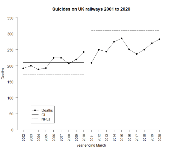
Here, I have stratified the data into two groups: the first 9 observations and the following 10. I have done this just by looking at what the observations suggest. That is permitted because of the Terry Weight rule. Here I have a steady process with a sudden jump around 2010 to 2011 after which the whole thing again becomes steady. That is, in some ways, an attractive picture. It means that deaths have stabilised and are not growing inexorably. But I am looking for an event that happened about 2010 to 2011 that might have led to the jump. I go back to the cause and effect diagram.

SuicideCne

Whenever we see a signal we look for its cause. We don’t always find it, or even a candidate. And if at first we don’t succeed we file it away in case it’s elucidated by future data or insight. Knowledge management. I have a suspicion that this is a measurement issue. Why else so signal a step change? But it’s important to watch out for cognitive biases and try to keep an open mind.

A better model?

All models are wrong, but some are useful.

George E P Box

Is this a “better” model than the linear trend? Well if I identified a credible causative event around 2010 it would be. But what about just looking at the data? Is my step change model a “better fit”? One way I can look at this is by comparing residual mean square (“rMS”), a measure of how much “noise” there is after I’ve applied my model. Less noise, better model.

But, before I do the calculation, what about this idea? What if I try putting the break point at 2009/10?

RailwaySuicides20204

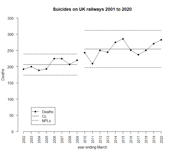
I have no more idea as to why there should be a break point in 2009/10 rather than 2010/11. Which is the better fit? Here are the rMSs.

Model rMS (relative units)
Linear trend 255
Break point at 2010 433
Break point at 2011 298

The break-point models don’t look so good from the single stand-point of fitting the data, but they might make more sense with a bit more context. An explanation for the break-point might be compelling as to one model or another. A 2010/11 break point looks a better fit than 2009/10. On the death statistics alone.

I am going to wait until 2021, when I will have 20 observations, before I commit myself. Even then, I reserve the right to go back and change the analysis if future data or insight suggest it. As British mathematician John Maynard Keynes said, “When the facts change, I change my mind – what do you do, sir?”.

Measurement Systems Analysis

I have already suggested here that there may be measurement issues with these numbers. I commented on this back in 2016, in the context of how verdicts of suicides are found in British coroners’ courts. There I noted that coroners could only return a verdict of suicide where they were persuaded of that cause beyond reasonable doubt. I also noted how much that position had been much criticised in the context that findings in the coroners’ courts are generally on the basis of the balance of probabilities, a lower threshold.

In July 2018, an appeal on that point finally reached the High Court who confirmed that verdicts as to suicide ought to be given where the evidence supported the verdict on the balance of probabilities, a less exacting standard than that of beyond reasonable doubt. That decision was confirmed, firstly by the Court of Appeal and then by the Supreme Court of the United Kingdom on 13 November 2020.

That means that there was a definite change in the measurement process in 2018. That ought to go on the chart though, to date, it does not look as though it is reflected in the data. Of course, it only affects the date from the March 2019 statistics onwards. Here is the up to date chart, where I have adopted, purely on the basis of rMS and a prior belief that a step is more likely than a trend, a breakpoint at 2010/11.

RailwaySuicides2020-1

From nylon to a Covid vaccine: The good news about innovation

1024px-SARS-CoV-2_without_backgroundThus, an activity will in general have two valuable consequences: the physical outputs themselves and the change in information about other activities.

Kenneth J Arrow
Essays in the Theory of Risk-Bearing

That seems like an obscure theoretical point in academic economics but there are plenty of illustrations. Arrow himself drew attention to the development of nylon. DuPont developed the polymer nylon during the interval between the World Wars of the twentieth century. It was an enormous commercial success for them. That was the obvious valuable consequence of the “development of nylon” activity. Arrow’s point was that, if we look at this from the perspective of global wealth, the contribution of nylon itself was tiny compared with the value to society of knowing that things like nylon are possible and valuable. Once other companies knew that, they were emboldened and incentivised to revisit the physio-chemical fundamentals, learn the chemical engineering technologies and build their own knowledge base. DuPont now themselves had a lead in knowledge and an advantage in know-how teeming with commercial potential. The fast followers had the advantage of enjoying a big chunk of the risk already having been sunk by DuPont. The industrial development and marketing of polymers during the twentieth century played an important role in global wealth creation. You probably have to be a certain age to remember papier maché washing-up bowls. Or just washing-up bowls.

Arrow’s proposition is a broad and general economic principle not a mathematical theorem. My hunch is that it’s going to be validated again with the global response to the Covid-19 pandemic. On 9 November 2020, the news media covered the announcement by Pfizer and BioNTech that they had, in partnership, developed the first candidate for an effective vaccination against Covid-19. That is blessed news. My hunch is that the knowledge won in developing that vaccine will benefit society far beyond ridding us of this ghastly pestillance.

Since then there have already been other vaccines announced. The intellectual effort in developing the BioNTech vaccine was driven by two individuals, Uğur Şahin and Özlem Türeci. Şahin and Türeci’s discovery represents the unfashionable globalist, liberal intellectual culture of Europe and the Levant. But their ideas would have gone nowhere without the, equally unfashionable, American systematic productivity, capital and risk appetite of DuPont. It is a similar story to the development of penicillin. European creativity and American energy. British artist David Hockney loved California because he felt it offered the best of both worlds. Pace Harold Macmillan, the Europeans are ever the Greeks to the American Romans.

The Covid-19 vaccine itself was developed from the technologies that BioNTech had already fostered and exploited in the different field of individualised cancer immunotherapy. I have to confess that my scientific tastes are more for the mechanical and the electrical and I understand nothing of the science here. However, I can see that the benefits of novel cancer treatments have turned out to have created value in a wholly different area of medicine. As Arrow would have predicted. My bet is that the scientific and technological advances spurred by Covid-19, not least the management skills in expediting clinical trials, will turn out to have wider external benefits, individually unpredictable but a moral certainty as an engine of wealth creation.

Faith in economic laws is a useful mindset. Julian Simon used to remark that people in general find no difficulty in accepting that, if there exist conducive economic conditions, cheese will be manufactured. However, the proposition that, if there exist conducive economic conditions, technological innovation will occur, meets more skeptical resistance. Surely technological innovation is different from cheese. But is it?

There are lots of books about innovation around at the moment. They rehearse many fascinating anecdotes but I find there is no useful over-arching theory. I find anecdotes useful. So should you, but you need to be savvy about uncertainty and causation. I have some favourite anecdotes. That said, I think the following is an essential, and almost true, insight. Certainly for business.

While knowledge is orderly and cumulative, information is random and miscellaneous.

Daniel J Boorstin

Convivial knowledge management

If you want to teach people a new way of thinking, don’t bother trying to teach them. Instead, give them a tool, the use of which will lead to new ways of thinking.

Buckminster Fuller

All that suggests that the most important thing that any organisation should be working on is Knowledge Management, capturing as much of the byproduct learning the organisation produces that is not oriented to immediate goals. Again, software packages, holding themselves out as tools abound. I am sure many are worth the license fee. Try them and see. But do keep an account of costs and benefits.

I would like to suggest two simple technologies, what Ivan Illich would have called convivial tools. One I have talked a lot about on this blog is the Shewhart chart. The other remains, I think, under explored and under exploited, that is the Wiki. Wikipedia is one of those things that only works in practice, a collaborative encyclopaedia with no editorial authority. It’s for you to judge whether it has been a success.

My view is that the scope for using Wikis in intra-organisational knowledge building has yet to be fully exploited. Wikis can be used for collaborative development of searchable and structured manuals of fact, insight and open questions. A Shewhart chart that could be collaboratively edited would be a very powerful thing. But that was Shewhart’s original intention, a live document continually noted-up with the insights of the workers using it. Perhaps in modern times we would want this to be all cloud based rather than a sheet of paper on a workshop wall. A wiki-Shewhart chart.

Where can we buy the software?

The “Graph of Doom” 9 years on

I first blogged about this soi-disant “Graph of Doom” (“the Graph”) back 2013. Recent global developments have put everyone in mind of how dependent we are on predictions and forecasts and just how important it is to challenge them with actual data. Then we should learn something about what we are talking about in the process.

GraphofDoom

I first came across the Graph in a piece by David Brindle in The Guardian on 15 May 2012. As far as I can see this comes from a slide pack delivered at Barnet London Borough dated 29 November 2011.

The Graph was shared widely on social media in the context of alarm as to an impending crisis, not just in Barnet but, by implication, local government funding and spending and social care across the UK. To be fair to Brindle, and most of the other mainstream commentators, they did make it clear that this was a projection. As he said, “The graph should not be taken too literally: by making no provision for Barnet’s anticipated rise in income through regeneration schemes, for instance, it overstates the bleakness of the outlook.”.

I blogged about this in 2013 I made the following points about the Graph and the charted predictions, forecasts and projections in particular.

  • Use ink on data rather than speculation.
  • Ditto for chart space.
  • Chart predictions using a distinctive colour or symbol so as to be less prominent than measured data.
  • Use historical data to set predictions in context.
  • Update chart as soon as predictions become data.
  • Ensure everybody who got the original chart gets the updated chart.
  • Leave the prediction on the updated chart.

Nine years on, as far as I can see from my web search, points 5 to 7 have not been addressed, certainly not in the public domain. I am disappointed that none of the commentators has taken the opportunity to return to it. As I set out below, there’s a great story here. I decided it was down to me.

I went to look at Barnet’s website to search for published accounts. I wanted to see if I could find out how this actually evolved. I did not find this easy. The relevant accounts are not easy to find on the website. I am not an accountant. Perhaps a large proportion of Barnet’s residents are. Firstly, I could not find any figures before 2012/13 so I am still unsure as to whether the 2010/11 picture is forecast, preliminary or actual. There also seemed to be a number of different analysis models within which accounts were given. After a bit of judicious guesswork matching numbers, I decided that the projected budget was referring to the General Fund Revenue Budget (“the GFRB”) which is the account that revenue expenditure and income is charged for the council’s services (excluding the Housing Revenue Account). It says. The service budgets must then refer to the expenditures charged against the account. I found finalised accounts for 2012/13 to 2018/19. There were provisional accounts for 2019/20 but, as far as I could see, those did not include the GFRB so didn’t really assist.

I’m happy to be corrected on this by anybody who has a better view on the relevant numbers.

I didn’t have the original data to plot afresh, or the forecasting model. I have had to over-plot a bitmap. Not a perfect situation. I could not address all the data visualisation criticisms I made in my earlier post. That said, here is the Graph with the actual budgets and expenditures.

GoDU1

I am guessing that the original Graph adjusted future revenues and expenditures to 2011 prices. I have, therefore, replotted adjusting for CPIH, the government’s preferred inflation measure. This is a measure of consumer price inflation but I found nothing better for indexing local government expenditure. I am not an economist. Here is the adjusted chart.

GoDU2

There’s actually a great story here for somebody. This is not boring! It certainly looks as though forecasts of total funding held up well, a little below predicted. However, expenditure on social care appears to have diminished well below the parlous levels projected in the Graph of Doom. It has gone down rather than up. That must be because:

  1. Barnet have done a wonderful job in performing these services more efficiently.
  2. The effectiveness and performance of the services has deteriorated.
  3. The demographic forecasts were inaccurate..

I am betting against (3) because demographic forecasts over so short a period don’t have many ways of going wrong. I am surprised that, if (1) is the case, then Conservative members of Barnet London Borough aren’t shouting very loudly about it. Conversely, if (2), I’m surprised that Labour members are silent. What I’m looking for is somebody to put the Graph of Doom back on the stage and use it to celebrate success or attack an opponent. I would expect the national party principals to find capital in the data. Data. Perhaps it is more “nuanced” but that still sounds like an interesting story. Of course, I would also like to see some data about the effectiveness of the social services. That’s a huge part of this narrative too. Perhaps I shall look for that myself.

I would have thought that there was a good story here for a data journalist. Our mainstream media still have, thankfully, plenty of left and of right sympathies.

We need improvement stories to inspire, motivate and educate to broader and more diverse improvement efforts. We need warnings of scandal and failed public provision to inspire, motivate and educate to broader and more diverse improvement efforts. We need to show not tell.

I do just note that Barnet’s accounts also have forecasts for each succeeding year. These are so good I haven’t felt it worth blogging about them. Perhaps it all carries the spoor of rule 4 of Nelson’s funnel. But that is another story. Worth a journalist’s time I think.

I’ll be back.

Data versus modelling

Life can only be understood backwards; but it must be lived forwards.

Søren Kierkegaard

Journalist James Forsyth was brave enough to write the following in The Spectator, 4 July 2020 in the context of reform of the UK civil service.

The new emphasis on data must properly distinguish between data and modelling. Data has real analytical value – it enables robust discussion of what has worked and what has not. Modelling is a far less exact science. In this [Covid-19] crisis, as in the 2008 financial crisis, models have been more of a hinderance than a help.

Now, this glosses a number of issues that I have gone on about a lot on this blog. It’s a good opportunity for me to challenge again what I think I have learned from a career in data, modelling and evidence.

Data basics

Pick up your undergraduate statistics text. Turn to page one. You will find this diagram.

Frame

The population, and be assured I honestly hate that term but I am stuck with it, is the collection of all things or events, individuals, that I passionately want to know about. All that I am willing to pay money to find out about. Many practical facets of life prevent me from measuring every single individual. Sometimes it’s worth the effort and that’s called a census. Then I know everything, subject to the performance of my measurement process. And if you haven’t characterised that beforehand you will be in trouble. #MSA

In many practical situations, we take a sample. Even then, not every single individual in the population will be available for sampling within my budget. Suppose I want to market soccer merchandise to all the people who support West Bromwich Albion. I have no means to identify who all those people are. I might start with season ticket holders, or individuals who have bought a ticket on line from the club in the past year, or paid for multiple West Brom games on subscription TV. I will not even have access to all those. Some may have opted to protect their details from marketing activities under GDPRUK. What is left, no matter how I chose to define it, is called the sampling frame. That is the collection of individuals that I have access to and can interrogate, in principle.  The sampling frame is all those items I can put on a list from one to whatever. I can interrogate any of them. I will probably, just because of cost, take a subset of the frame as my sample. As a matter of pure statistical theory, I can analyse and quantify the uncertainty in my conclusions that arises from the limited extent of my sampling within the frame, at least if I have adopted one of the canonical statistical sampling plans.

However, statistical theory tells me nothing about the uncertainty that arises in extrapolating (yes it is!) from frame to population. Many supporters will not show up in my frame, those who follow from the sports bar for example. Some in the frame may not even be supporters but parents who buy tickets for offspring who have rebelled against family tradition. In this illustration, I have a suspicion that the differences between frame and population are not so great. Nearly all the people in my frame will be supporters and neglecting those outside it may not be so great a matter. The overlap between frame and population is large, even though it may not be perfect. However, in general, extrapolation from frame to population is a matter for my subjective subject matter insight, market and product knowledge. Statistical theory is the trivial bit. Using domain knowledge to go from frame to population is the hard work. Not only is it hard work, it bears the greater part of the risk.

Enumerative and analytic statistics

W Edwards Deming was certainly the most famous statistician of the twentieth century. So long ago now. He made a famous distinction between two types of statistical study.

Enumerative study: A statistical study in which action will be taken on the material in the frame being studied.

Analytic study: A statistical study in which action will be taken on the process or cause-system that produced the frame being studied. The aim being to improve practice in the future.

Suppose that a company manufactures 1000 overcoats for sale on-line. An inspector checks each overcoat of the 1000 to make sure it has all three buttons. All is well. The 1000 overcoats are released for sale. No way to run a business, I know, but an example of an enumerative study. The 1000 overcoats are the frame. The inspector has sampled 100% of them. Action has been taken on the 1000 overcoats, the 1000 overcoats that were, themselves, the sampling frame. Sadly, this is what so many people think statistics is all about. There is no ambiguity here in extrapolating from frame to population as the frame is the population.

Deming’s definition of an analytic study is a bit more obscure with its reference to cause systems. But let’s take a case that is, at once, extreme and routine.

When we are governing or running a commercial enterprise or a charity, we are in the business of predicting the future. The past has happened and we are stuck with it. This is what our world looks like.

Frame

The frame available for sampling is the historical past. The data that you have is a sample from that past frame. The population you want to know about is the future. There is no area of overlap between past and future, between frame and population. All that stuff in statistics books about enumerative studies, that is most of the contents, will not help you. Issues of extrapolating from frame to sample, the tame statistical matters in the text books, are dwarfed by the audacity of projecting the frame onto an ineffable future.

And, as an aside, just think about what that means when we are drawing conclusions about future human health from past experiments on mice.

What Deming pointed towards, with his definition of analytic study, is that, in many cases, we have enough faith to believe that both the past and future are determined by a common system of factors, drivers, mechanisms, phenomena and causes, physiochemical and economic, likely interacting in a complicated but regular way. This is what Deming meant by the cause system.

Managing and governing are both about pulling levers to effect change. Dwelling on the past will only yield beneficial future change if exploited, mercilessly, to understand the cause system. To characterise what are the levers that will deliver future beneficial outcomes. That was Deming’s big challenge.

The inexact science of modelling

And to predict, we need a model of the cause system. This is unavoidable. Sometimes we are able to use the simplest model of all. That the stream of data we are bothered about is exchangeable, or if you prefer stable and predicable. As I have stressed so many times before on this blog, to do that we need:

  • Trenchant criticism of the experience base that shows an historical record of exchangeability; and
  • Enough subject matter insight into the cause system to believe that such exchangeability will be maintained, at least into an immediate future where foresight would be valuable.

Here, there is no need quantitatively to map out the cause system in detail. We are simply relying on its presumed persistence into the future. It’s still a model. Of course, the price of extrapolation is eternal vigilance. Philip Tetlock drew similar conclusions in Superforecasting.

But often we know that critical influences on the past are pray to change and variation. Climates, councils, governments … populations, tastes, technologies, creeds and resources never stand still. As visible change takes place we need to be able to map its influence onto those outcomes that bother us. We need to be able to do that in advance. Predicting sales of diesel motor vehicles based on historical data will have little prospect of success unless we know that they are being regulated out of existence, in the UK at least. And we have to account for that effect. Quantitatively. This requires more sophisticated modelling. But it remains essential to any form of prediction.

I looked at some of the critical ideas in modelling here, here and here.

Data v models

The purpose of models is not to fit the data but to sharpen the questions.

Samuel Karlin

Nothing is more useless than the endless collection of data without a will to action. Action takes place in the present with the intention of changing the future. To use historical data to inform our actions we need models. Forsyth wants to know what has worked in the past and what has not. That was then, this is now. And it is not even now we are bothered about but the future. Uncritical extrapolation is not robust analysis. We need models.

If we don’t understand these fundamental issues then models will seem more a hinderance than a help.

But … eternal vigilance.

Social distancing and the Theory of Constraints

WarningPoster1

An organised queue or line1

I was listening to the BBC News the other evening. There was discussion of return to work in the construction industry. A site foreman was interviewed and he was clear in his view that work could be resumed, social distancing observed, safety protected and valuable work done.

Workplace considerations are quite different from those in my recent post in which I was speculating how an “invisible hand” might co-ordinate independently acting and relatively isolated agents who were aspiring to socially isolate. The foreman in the interview had the power to define and enforce a business process, repeatable, measurable, improvable and adaptable.

Of course, the restrictions imposed by Covid-19 will be a nuisance. But how much? To understand the real impact they may have on efficiency requires a deeper analysis of the business process. I’m sure that the foreman and his colleagues had done it.

There won’t be anyone reading this blog who hasn’t read Eliyahu Goldratt’s book, The Goal.2 The big “takeaway” of Goldratt’s book is that some of the most critical outcomes of a business process are fundamentally limited by, perhaps, a single constraint in the value chain. The constraint imposes a ceiling on sales, throughput, cash flow and profit. It has secondary effects on quality, price, fixed costs and delivery. In many manufacturing processes it will be easy to identify the constraint. It will be the machine with the big pile of work-in-progress in front of it. In more service-oriented industries, finding the constraint may require some more subtle investigation. The rate at which the constraint works determines how fast material moves through the process towards the customer.

The simple fact is that much management energy expended in “improving efficiency” has nil (positive) effect on effectiveness, efficiency or flexibility (the “3Fs”). Working furiously will not, of itself, promote the throughput of the constraint. Measures such as Overall Equipment Effectiveness (OEE) are useless and costly if applied to business steps that, themselves, are limited by the performance of a constraint that lies elsewhere.

That is the point about the construction industry, and much else. The proximity of the manual workers is not necessarily the constraint. That must be the case in many other businesses and processes.

I did a quick internet search on the Theory of Constraints and the current Covid-19 pandemic. I found only this, rather general, post by Domenico Lepore. There really wasn’t anything else on the internet that I could find. Lepore is the author of, probably, the most systematic and practical explanation of how to implement Goldratt’s theories.3 Once the constraint is identified:

  • Prioritise the constraint. Make sure it is never short of staff, inputs or consumables. Eliminate unplanned downtime by rationalising maintenance. Plan maintenance when it will cause least disruption but work on the maintenance process too. Measure OEE if you like. On the constraint.
  • Make the constraint’s performance “sufficiently regular to be predictable”.4 You can now forecast and plan. At last.
  • Improve the throughput of the constraint until it is no longer the constraint. Now there is a new constraint to attack.
  • Don’t forget to keep up the good work on the old constraint.

This is, I think, a useful approach to some Covid-19 problems. Where is the constraint? Is it physical proximity? If so, work to manage it. Is it something else? Then you are already stuck with the throughput of the constraint. Serve it in a socially-distanced way.

The court system of England and Wales

Here is a potential example that I was thinking about. Throughput in the court system of England and Wales has, since the onset of Covid-19, collapsed. Certainly in the civil courts, personal injury cases, debt recovery, commercial cases, property disputes, professional negligence claims. There has been more action in criminal and family courts, as far as I can see. Some hearings have taken place by telephone or by video but throughput has been miserable. Most civil courts remain closed other than for matters that need the urgent attention of a judge.

And that is the point of it. The judge, judicial time, is the constraint in the court system. Judgment, or at least the prospect thereof, is the principal way the courts add value. Much of civil procedure is aimed at getting the issues in a proper state for the judge to assess them efficiently and justly. The byproduct of that is that, once the parties have each clarified the issues in dispute, there may then be a window for settlement.

What has horrified the court service is the prospect of the sort of scrum of lawyers and litigants that is common in the inadequate waiting and conference facilities of most courts. That scrum is seen as important. It gives trial counsel an opportunity to review the evidence with their witnesses. It provides an opportunity for negotiation and settlement. Trial counsel will be there face to face with their clients. Offer and counter offer can pass quickly and intuitively between seasoned professionals. Into the mix are added the ushers and clerks who manage the parties securely into the court room. It is a concentrated mass of individuals, beset with frequently inadequate washing facilities.

Court rooms themselves present little problem. Most civil courts in England and Wales are embarrassingly expansive for the few people that generally attend hearings. Very commonly just the judge and two advocates. I cannot think of that many occasions when there will have been any real difficulty in keeping two metres apart.

With the judge as the constraint and the court room not, what remains is the issue of getting people into court. Why is that mass of people routinely in the waiting room? Well, to some extent it serves, in the language of Lean Production, as a “supermarket”,5 a reservoir of inputs that guarantees the judicial constraint does not run dry of work.6 Effective but not necessarily efficient. This  is needed because hearing lengths are difficult to predict. Moreover, some matters settle at court, as set out above. Some the afternoon before. For some matters, nobody turns up. The parties have moved on and not felt it important to inform the court.

As to providing the opportunity for taking instructions and negotiation that is, surely, a matter that the parties can be compelled to address, by telephone or video, on the previous afternoon. The courts here can borrow ideas from Single-Minute Exchange of Dies. This, in any event, seems a good idea. The parties would then be attending court ready to go. The waiting facilities would not be needed for their benefit. The court door settlements would have been dealt with.

The only people who need waiting accommodation are the participants in the next hearing. In most cases they can be accommodated, distanced and will have sufficient, even if sparse, washing facilities. These ideas are not foreign to the court system. It has been many years since a litigant or lawyer could just turn up at the court counter without first telephoning for an appointment, even on an urgent matter.

That probably involves some less ambitious listing of hearings. It may well have moved the constraint away from the judge to the queuing of parties into court. However, once the system is established, and recognised as the constraint, it is there to be improved. Worked on constantly. Thought about in the bath. Worried at on a daily basis.

Generate data. Analyse it. Act on it. Work. Use an improvement process. DMAIC is great but other improvement processes are available.

I’m sure all this thinking is going on. I can say no more.

References

  1. Image courtesy of Wikipedia and subject to Creative Commons license – for details see here
  2. Goldratt, E M & Cox, J (1984) The Goal: A Process of Ongoing Improvement, Gower
  3. Lepore, D & Cohen, O (1999) Deming and Goldratt: The Theory of Constraints and the System of Profound Knowledge, North River Press
  4. Kahneman, D (2011) Thinking, Fast and Slow, Allen Lane, p240
  5. What a good supermarket looks like“, Planet Lean, 4 April 2019, retrieved 24/5/20
  6. Rother, M & Shook, J (2003) Learning to See: Value-stream Mapping to Create Value and Eliminate Muda, Lean Enterprise Institute, p46