Again, much talk in the UK media recently about weak productivity statistics. Chancellor of the Exchequer (Finance Minister) George Osborne has launched a 15 point macroeconomic strategy aimed at improving national productivity. Some of the points are aimed at incentivising investment and training. There will be few who argue against that though I shall come back to the investment issue when I come to talk about signal and noise. I have already discussed training here. In any event, the strategy is fine as far as these things go. Which is not very far.
There remains the microeconomic task for all of us of actually improving our own productivity and that of the systems we manage. That is not the job of government.
Neither can I offer any generalised system for improving productivity. It will always be industry and organisation dependent. However, I wanted to write about some of the things that you have to understand if your efforts to improve output are going to be successful and sustainable.
- Customer value and waste.
- The difference between signal and noise.
- How to recognise flow and manage a constraint.
Before going on to those in future weeks I first wanted to go back and look at what has become the foundational narrative of productivity improvement, the Hawthorne experiments. They still offer some surprising insights.
The Hawthorne experiments
In 1923, the US electrical engineering industry was looking to increase the adoption of electric lighting in American factories. Uptake had been disappointing despite the claims being made for increased productivity.
[Tests in nine companies have shown that] raising the average initial illumination from about 2.3 to 11.2 foot-candles resulted in an increase in production of more than 15%, at an additional cost of only 1.9% of the payroll.
Earl A Anderson
General Electric
Electrical World (1923)
E P Hyde, director of research at GE’s National Lamp Works, lobbied government for the establishment of a Committee on Industrial Lighting (“the CIL”) to co-ordinate marketing-oriented research. Western Electric volunteered to host tests at their Hawthorne Works in Cicero, IL.
Western Electric came up with a study design that comprised a team of experienced workers assembling relays, winding their coils and inspecting them. Tests commenced in November 1924 with active support from an elite group of academic and industrial engineers including the young Vannevar Bush, who would himself go on to an eminent career in government and science policy. Thomas Edison became honorary chairman of the CIL.
It’s a tantalising historical fact that Walter Shewhart was employed at the Hawthorne Works at the time but I have never seen anything suggesting his involvement in the experiments, nor that of his mentor George G Edwards, nor protégé Joseph Juran. In later life, Juran was dismissive of the personal impact that Shewhart had had on operations there.
However, initial results showed no influence of light level on productivity at all. Productivity rose throughout the test but was wholly uncorrelated with lighting level. Theories about the impact of human factors such as supervision and motivation started to proliferate.
A further schedule of tests was programmed starting in September 1926. Now, the lighting level was to be reduced to near darkness so that the threshold of effective work could be identified. Here is the summary data (from Richard Gillespie Manufacturing Knowledge: A History of the Hawthorne Experiments, Cambridge, 1991).
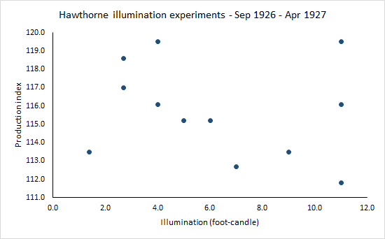
It requires no sophisticated statistical analysis to see that the data is all noise and no signal. Much to the disappointment of the CIL, and the industry, there was no evidence that illumination made any difference at all, even down to conditions of near darkness. It’s striking that the highest lighting levels embraced the full range of variation in productivity from the lowest to the highest. What had seemed so self evidently a boon to productivity was purely incidental. It is never safe to assume that a change will be an improvement. As W Edwards Deming insisted, “In God was trust. All others bring data.”
But the data still seemed to show a relentless improvement of productivity over time. The participants were all very experienced in the task at the start of the study so there should have been no learning by doing. There seemed no other explanation than that the participants were somehow subliminally motivated by the experimental setting. Or something.

That subliminally motivated increase in productivity came to be known as the Hawthorne effect. Attempts to explain it led to the development of whole fields of investigation and organisational theory, by Elton Mayo and others. It really was the foundation of the management consulting industry. Gillespie (supra) gives a rich and intriguing account.
A revisionist narrative
Because of the “failure” of the experiments’ purpose there was a falling off of interest and only the above summary results were ever published. The raw data were believed destroyed. Now “you know, at least you ought to know, for I have often told you so” about Shewhart’s two rules for data presentation.
- Data should always be presented in such a way as to preserve the evidence in the data for all the predictions that might be made from the data.
- Whenever an average, range or histogram is used to summarise observations, the summary must not mislead the user into taking any action that the user would not take if the data were presented in context.
The lack of any systematic investigation of the raw data led to the development of a discipline myth that every single experimental adjustment had led forthwith to an increase in productivity.
In 2009, Steven Levitt, best known to the public as the author of Freakonomics, along with John List and their research team, miraculously discovered a microfiche of the raw study data at a “small library in Milwaukee, WI” and the remainder in Boston, MA. They went on to analyse the data from scratch (Was there Really a Hawthorne Effect at the Hawthorne Plant? An Analysis of the Original Illumination Experiments, National Bureau of Economic Research, Working Paper 15016, 2009).

Figure 3 of Levitt and List’s paper (reproduced above) shows the raw productivity measurements for each of the experiments. Levitt and List show how a simple plot such as this reveals important insights into how the experiments developed. It is a plot that yields a lot of information.
Levitt and List note that, in the first phase of experiments, productivity rose then fell when experiments were suspended. They speculate as to whether there was a seasonal effect with lower summer productivity.
The second period of experiments is that between the third and fourth vertical lines in the figure. Only room 1 experienced experimental variation in this period yet Levitt and List contend that productivity increased in all three rooms, falling again at the end of experimentation.
During the final period, data was only collected from room 1 where productivity continued to rise, even beyond the end of the experiment. Looking at the data overall, Levitt and List find some evidence that productivity responded more to changes in artificial light than to natural light. The evidence that increases in productivity were associated with every single experimental adjustment is weak. To this day, there is no compelling explanation of the increases in productivity.
Lessons in productivity improvement
Deming used to talk of “disappointment in great ideas”, the propensity for things that looked so good on paper simply to fail to deliver the anticipated benefits. Nobel laureate psychologist Daniel Kahneman warns against our individual bounded rationality.
To guard against entrapment by the vanity of imagination we need measurement and data to answer the ineluctable question of whether the change we implemented so passionately resulted in improvement. To be able to answer that question demands the separation of signal from noise. That requires trenchant data criticism.
And even then, some factors may yet be beyond our current knowledge. Bounded rationality again. That is why the trick of continual improvement in productivity is to use the rigorous criticism of historical data to build collective knowledge incrementally.
If you torture the data enough, nature will always confess.
Eventually.