Regression done right: Part 1: Can I predict the future?

I recently saw an article in the Harvard Business Review called “Refresher on Regression Analysis”. I thought it was horrible so I wanted to set the record straight.

Linear regression from the viewpoint of machine learning

Linear regression is important, not only because it is a useful tool in itself, but because it is (almost) the simplest statistical model. The issues that arise in a relatively straightforward form are issues that beset the whole of statistical modelling and predictive analytics. Anyone who understands linear regression properly is able to ask probing questions about more complicated models. The complex internal algorithms of Kalman filters, ARIMA processes and artificial neural networks are accessible only to the specialist mathematician. However, each has several general features in common with simple linear regression. A thorough understanding of linear regression enables a due diligence of the claims made by the machine learning advocate. Linear regression is the paradigmatic exemplar of machine learning.

There are two principal questions that I want to talk about that are the big takeaways of linear regression. They are always the first two questions to ask in looking at any statistical modelling or machine learning scenario.

  1. What predictions can I make (if any)?
  2. Is it worth the trouble?

I am going to start looking at (1) in this blog and complete it in a future Part 2. I will then look at (2) in a further Part 3.

Variation, variation, variation

Variation is a major problem for business, the tendency of key measures to fluctuate irregularly. Variation leads to uncertainty. Will the next report be high or low? Or in the middle? Because of the uncertainty we have to allow safety margins or swallow some non-conformancies. We have good days and bad days, good products and not so good. We have to carry costly working capital because of variation in cash flow. And so on.

We learned in our high school statistics class to characterise variation in a key process measure, call it the Big Y, by an histogram of observations. Perhaps we are bothered by the fluctuating level of monthly sales.

RegressionHistogram

The variation arises from a whole ecology of competing and interacting effects and factors that we call the cause-system of the outcome. In general, it is very difficult to single out individual factors as having been the cause of a particular observation, so entangled are they. It is still useful to capture them for reference on a cause and effect diagram.

RegressionIshikawa

One of the strengths of the cause and effect diagram is that it may prompt the thought that one of the factors is particularly important, call it Big X, perhaps it is “hours of TV advertising” (my age is showing). Motivated by that we can generate a sample of corresponding measurements data of both the Y and X and plot them on a scatter plot.

RegressionScatter1

Well what else is there to say? The scatter plot shows us all the information in the sample. Scatter plots are an important part of what statistician John Tukey called Exploratory Data Analysis (EDA). We have some hunches and ideas, or perhaps hardly any idea at all, and we attack the problem by plotting the data in any way we can think of. So much easier now than when W Edwards Deming wrote:1

[Statistical practice] means tedious work, such as studying the data in various forms, making tables and charts and re-making them, trying to use and preserve the evidence in the results and to be clear enough to the reader: to endure disappointment and discouragement.

Or as Chicago economist Ronald Coase put it.

If you torture the data enough, nature will always confess.

The scatter plot is a fearsome instrument of data torture. It tells me everything. It might even tempt me to think that I have a basis on which to make predictions.

Prediction

In machine learning terms, we can think of the sample used for the scatter plot as a training set of data. It can be used to set up, “train”, a numerical model that we will then fix and use to predict future outcomes. The scatter plot strongly suggests that if we know a future X alone we can have a go at predicting the corresponding future Y. To see that more clearly we can draw a straight line by hand on the scatter plot, just as we did in high school before anybody suggested anything more sophisticated.

RegressionScatter2

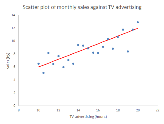
Given any particular X we can read off the corresponding Y.

RegressionScatter3

The immediate insight that comes from drawing in the line is that not all the observations lie on the line. There is variation about the line so that there is actually a range of values of Y that seem plausible and consistent for any specified X. More on that in Parts 2 and 3.

In understanding machine learning it makes sense to start by thinking about human learning. Psychologists Gary Klein and Daniel Kahneman investigated how firefighters were able to perform so successfully in assessing a fire scene and making rapid, safety critical decisions. Lives of the public and of other firefighters were at stake. This is the sort of human learning situation that machines, or rather their expert engineers, aspire to emulate. Together, Klein and Kahneman set out to describe how the brain could build up reliable memories that would be activated in the future, even in the agony of the moment. They came to the conclusion that there are two fundamental conditions for a human to acquire a skill.2

  • An environment that is sufficiently regular to be predictable.
  • An opportunity to learn these regularities through prolonged practice

The first bullet point is pretty much the most important idea in the whole of statistics. Before we can make any prediction from the regression, we have to be confident that the data has been sampled from “an environment that is sufficiently regular to be predictable”. The regression “learns” from those regularities, where they exist. The “learning” turns out to be the rather prosaic mechanics of matrix algebra as set out in all the standard texts.3 But that, after all, is what all machine “learning” is really about.

Statisticians capture the psychologists’ “sufficiently regular” through the mathematical concept of exchangeability. If a process is exchangeable then we can assume that the distribution of events in the future will be like the past. We can project our historic histogram forward. With regression we can do better than that.

Residuals analysis

Formally, the linear regression calculations calculate the characteristics of the model:

Y = mX + c + “stuff”

The “mX+c” bit is the familiar high school mathematics equation for a straight line. The “stuff” is variation about the straight line. What the linear regression mathematics does is (objectively) to calculate the m and c and then also tell us something about the “stuff”. It splits the variation in Y into two components:

  • What can be explained by the variation in X; and
  • The, as yet unexplained, variation in the “stuff”.

The first thing to learn about regression is that it is the “stuff” that is the interesting bit. In 1849 British astronomer Sir John Herschel observed that:

Almost all the greatest discoveries in astronomy have resulted from the consideration of what we have elsewhere termed RESIDUAL PHENOMENA, of a quantitative or numerical kind, that is to say, of such portions of the numerical or quantitative results of observation as remain outstanding and unaccounted for after subducting and allowing for all that would result from the strict application of known principles.

The straight line represents what we guessed about the causes of variation in Y and which the scatter plot confirmed. The “stuff” represents the causes of variation that we failed to identify and that continue to limit our ability to predict and manage. We call the predicted Ys that correspond to the measured Xs, and lie on the fitted straight line, the fits.

fiti = mXic

The residual values, or residuals, are obtained by subtracting the fits from the respective observed Y values. The residuals represent the “stuff”. Statistical software does this for us routinely. If yours doesn’t then bin it.

residuali = Yi – fiti

RegressionScatter4

There are a number of properties that the residuals need to satisfy for the regression to work. Investigating those properties is called residuals analysis.4 As far as use for prediction in concerned, it is sufficient that the “stuff”, the variation about the straight line, be exchangeable.5 That means that the “stuff” so far must appear from the data to be exchangeable and further that we have a rational belief that such a cause system will continue unchanged into the future. Shewhart charts are the best heuristics for checking the requirement for exchangeability, certainly as far as the historical data is concerned. Our first and, be under no illusion, mandatory check on the ability of the linear regression, or any statistical model, to make predictions is to plot the residuals against time on a Shewhart chart.

RegressionPBC

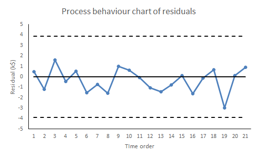
If there are any signals of special causes then the model cannot be used for prediction. It just can’t. For prediction we need residuals that are all noise and no signal. However, like all signals of special causes, such will provide an opportunity to explore and understand more about the cause system. The signal that prevents us from using this regression for prediction may be the very thing that enables an investigation leading to a superior model, able to predict more exactly than we ever hoped the failed model could. And even if there is sufficient evidence of exchangeability from the training data, we still need to continue vigilance and scrutiny of all future residuals to look out for any novel signals of special causes. Special causes that arise post-training provide fresh information about the cause system while at the same time compromising the reliability of the predictions.

Thorough regression diagnostics will also be able to identify issues such as serial correlation, lack of fit, leverage and heteroscedasticity. It is essential to regression and its ommision is intolerable. Residuals analysis is one of Stephen Stigler’s Seven Pillars of Statistical Wisdom.6 As Tukey said:

The greatest value of a picture is when it forces us to notice what we never expected to see.

To come:

Part 2: Is my regression significant? … is a dumb question.
Part 3: Quantifying predictions with statistical intervals.

References

  1. Deming, W E (‎1975) “On probability as a basis for action”, The American Statistician 29(4) pp146-152
  2. Kahneman, D (2011) Thinking, Fast and Slow, Allen Lane, p240
  3. Draper, N R & Smith, H (1998) Applied Regression Analysis, 3rd ed., Wiley, p44
  4. Draper & Smith (1998) Chs 2, 8
  5. I have to admit that weaker conditions may be adequate in some cases but these are far beyond any other than a specialist mathematician.
  6. Stigler, S M (2016) The Seven Pillars of Statistical Wisdom, Harvard University Press, Chapter 7
Advertisement

UK railway suicides – 2015 update

The latest UK rail safety statistics were published in September 2015 absent the usual press fanfare. Regular readers of this blog will know that I have followed the suicide data series, and the press response, closely in 2014, 2013 and 2012.

This year I am conscious that one of those units is not a mere statistic but a dear colleague, Nigel Clements. It was poet W B Yeats who observed, in his valedictory verse Under Ben Bulben that “Measurement began our might.” He ends the poem by inviting us to “Cast a cold eye/ On life, on death.” Sometimes, with statistics, we cast the cold eye but the personal reminds us that it must never be an academic exercise.

Nigel’s death gives me an additional reason for following this series. I originally latched onto it because I felt that exaggerated claims  as to trends were being made. It struck me as a closely bounded problem that should be susceptible to taught measurement. And it was something important.  Again I have re-plotted the data myself on a Shewhart chart.

RailwaySuicides4

Readers should note the following about the chart.

  • Some of the numbers for earlier years have been updated by the statistical authority.
  • I have recalculated natural process limits as there are still no more than 20 annual observations.
  • The signal noted last year has persisted (in red) with two consecutive observations above the upper natural process limit. There are also now eight points below the centre line at the beginning of the series.

As my colleague Terry Weight always taught me, a signal gives us license to interpret the ups and downs on the chart. This increasingly looks like a gradual upward trend.

Though there was this year little coverage in the press, I did find this article in The Guardian newspaper. I had previously wondered whether the railway data simply reflected an increasing trend in UK suicide in general. The Guardian report is eager to emphasise:

The total number [of suicides] in the UK has risen in recent years, with the latest Office for National Statistics figures showing 6,233 suicides registered in the UK in 2013, a 4% increase on the previous year.

Well, #executivetimeseries! I have low expectations of press data journalism so I do not know why I am disappointed. In any event I decided to plot the data. There were a few problems. The railway data is not collected by calendar year so the latest observation is 2014/15. I have not managed to identify which months are included though, while I was hunting I found out that the railway data does not include London Underground. I can find no railway data before 2001/02. The national suicide data is collected by calendar year and the last year published is 2013. I have done my best by (not quite) arbitrarily identifying 2013/14 in the railway data with 2013 nationally. I also tried the obvious shift by one year and it did not change the picture.

RailwaySuicides5

I have added a LOWESS line (with smoothing parameter 0.4) to the national data the better to pick out the minimum around 2007, just before the start of the financial crisis. That is where the steady decline over the previous quarter century reverses. It is in itself an arresting statistic. But I don’t see the national trend mirrored in the railway data, thereby explaining that trend.

Previously I noted proposals to repeat a strategy from Japan of bathing railway platforms with blue light. Professor Michiko Ueda of Syracuse University was kind enough to send me details of the research. The conclusions were encouraging but tentative and, unfortunately, the Japanese rail companies have not made any fresh data available for analysis since 2010. In the UK, I understand that such lights were installed at Gatwick in summer 2014 but I have not seen any data.

A huge amount of sincere endeavour has gone into this issue but further efforts have to be against the background that there is an escalating and unexplained problem.

Things and actions are what they are and the consequences of them will be what they will be: why then should we desire to be deceived?

Joseph Butler

How to predict floods

File:Llanrwst Floods 2015 1.ogvI started my grown-up working life on a project seeking to predict extreme ocean currents off the north west coast of the UK. As a result I follow environmental disasters very closely. I fear that it’s natural that incidents in my own country have particular salience. I don’t want to minimise disasters elsewhere in the world when I talk about recent flooding in the north of England. It’s just that they are close enough to home for me to get a better understanding of the essential features.

The causes of the flooding are multi-factorial and many of the factors are well beyond my expertise. However, The Times (London) reported on 28 December 2015 that “Some scientists say that [the UK Environment Agency] has been repeatedly caught out by the recent heavy rainfall because it sets too much store by predictions based on historical records” (p7). Setting store by predictions based on historical records is very much where my hands-on experience of statistics began.

The starting point of prediction is extreme value theory, developed by Sir Ronald Fisher and L H C Tippett in the 1920s. Extreme value analysis (EVA) aims to put probabilistic bounds on events outside the existing experience base by predicating that such events follow a special form of probability distribution. Historical data can be used to fit such a distribution using the usual statistical estimation methods. Prediction is then based on a double extrapolation: firstly in the exact form of the tail of the extreme value distribution and secondly from the past data to future safety. As the old saying goes, “Interpolation is (almost) always safe. Extrapolation is always dangerous.”

EVA rests on some non-trivial assumptions about the process under scrutiny. No statistical method yields more than was input in the first place. If we are being allowed to extrapolate beyond the experience base then there are inevitably some assumptions. Where the real world process doesn’t follow those assumptions the extrapolation is compromised. To some extent there is no cure for this other than to come to a rational decision about the sensitivity of the analysis to the assumptions and to apply a substantial safety factor to the physical engineering solutions.

One of those assumptions also plays to the dimension of extrapolation from past to future. Statisticians often demand that the data be independent and identically distributed. However, that is a weird thing to demand of data. Real world data is hardly ever independent as every successive observation provides more information about the distribution and alters the probability of future observations. We need a better idea to capture process stability.

Historical data can only be projected into the future if it comes from a process that is “sufficiently regular to be predictable”. That regularity is effectively characterised by the property of exchangeability. Deciding whether data is exchangeable demands, not only statistical evidence of its past regularity, but also domain knowledge of the physical process that it measures. The exchangeability must continue into the predicable future if historical data is to provide any guide. In the matter of flooding, knowledge of hydrology, climatology, planning and engineering, law, in addition to local knowledge about economics and infrastructure changes already in development, is essential. Exchangeability is always a judgment. And a critical one.

Predicting extreme floods is a complex business and I send my good wishes to all involved. It is an example of something that is essentially a team enterprise as it demands the co-operative inputs of diverse sets of experience and skills.

In many ways this is an exemplary model of how to act on data. There is no mechanistic process of inference that stands outside a substantial knowledge of what is being measured. The secret of data analysis, which often hinges on judgments about exchangeability, is to visualize the data in a compelling and transparent way so that it can be subjected to collaborative criticism by a diverse team.

The Iron Law at Volkswagen

So Michael Horn, VW’s US CEO has made a “sincere apology” for what went on at VW.

And like so many “sincere apologies” he blamed somebody else. “My understanding is that it was a couple of software engineers who put these in.”

As an old automotive hand I have always been very proud of the industry. I have held it up as a model of efficiency, aesthetic aspiration, ambition, enlightenment and probity. My wife will tell you how many times I have responded to tales of workplace chaos with “It couldn’t happen in a car plant”. Fortunately we don’t own a VW but I still feel betrayed by this. Here’s why.

A known risk

Everybody knew from the infancy of emissions testing, which came along at about the same time as the adoption of engine management systems, the risks of a “cheat device”. It was obvious to all that engineers might be tempted to manoeuvre a recalcitrant engine through a challenging emissions test by writing software so as to detect test conditions and thereon modify performance.

In the better sort of motor company, engineers were left in no doubt that this was forbidden and the issue was heavily policed with code reviews and process surveillance.

This was not something that nobody saw coming, not a blind spot of risk identification.

The Iron Law

I wrote before about the Iron Law of Oligarchy. Decision taking executives in an organisation try not to pass information upwards. That will only result in interference and enquiry. Supervisory boards are well aware of this phenomenon because, during their own rise to the board, they themselves were the senior managers who constituted the oligarchy and who kept all the information to themselves. As I guessed last time I wrote, decisions like this don’t get taken at board level. They are taken out of the line of sight of the board.

Governance

So here we have a known risk. A threat that would likely not be detected in the usual run of line management. And it was of such a magnitude as would inflict hideous ruin on Volkswagen’s value, accrued over decades of hard built customer reputation. Volkswagen, an eminent manufacturer with huge resources, material, human and intellectual. What was the governance function to do?

Borrowing strength again

It would have been simple, actually simple, to secret shop the occasional vehicle and run it through an on-road emissions test. Any surprising discrepancy between the results and the regulatory tests would then have been a signal that the company was at risk and triggered further investigation. An important check on any data integrity is to compare it with cognate data collected by an independent route, data that shares borrowing strength.

Volkswagen’s governance function simply didn’t do the simple thing. Never have so many ISO 31000 manuals been printed in vain. Theirs were the pot odds of a jaywalker.

Knowledge

In the English breach of trust case of Baden, Delvaux and Lecuit v Société Générale [1983] BCLC 325, Mr Justice Peter Gibson identified five levels of knowledge that might implicate somebody in wrongdoing.

  • Actual knowledge.
  • Wilfully shutting one’s eyes to the obvious (Nelsonian knowledge).
  • Wilfully and recklessly failing to make such enquiries as an honest and reasonable man would make.
  • Knowledge of circumstances that would indicate the facts to an honest and reasonable man.
  • Knowledge of circumstances that would put an honest and reasonable man on enquiry.

I wonder where VW would place themselves in that.

How do you sound when you feel sorry?

… is the somewhat barbed rejoinder to an ungracious apology. Let me explain how to be sorry. There are three “R”s.

  • Remorse: Different from the “regret” that you got caught. A genuine internal emotional reaction. The public are good at spotting when emotions are genuine but it is best evidenced by the following two “R”s.
  • Reparation: Trying to undo the damage. VW will not have much choice about this as far as the motorists are concerned but the shareholders may be a different matter. I don’t think Horn’s director’s insurance will go very far.
  • Reform: This is the barycentre of repentance. Can VW now change the way it operates to adopt genuine governance and systematic risk management?

Mr Horn tells us that he has little control over what happens in his company. That is probably true. I trust that he will remember that at his next remuneration review. If there is one.

When they said, “Repent!”, I wonder what they meant.

Leonard Cohen
The Future

Amazon II: The sales story

Jeff Bezos' iconic laugh.jpgI recently commented on an item in the New York Times about Amazon’s pursuit of “rigorous data driven management”. Dina Vaccari, one of the employees cited in the original New York Times article, has taken the opportunity to tell her own story in this piece. I found it enlightening as to what goes on at Amazon. Of course, it is only another anecdote from a former employee, a data source of notoriously limited quality. However, as Arthur Koestler once observed:

Without the hard little bits of marble which are called ‘facts’ or ‘data’ one cannot compose a mosaic; what matters, however, are not so much the individual bits, but the successive patterns into which you arrange them, then break them up and rearrange them.

Vaccari’s role was to sell Amazon gift cards. The measure of her success was how many she sold. Vaccari had read Timothy Ferriss’ transgressive little book The 4-Hour Workweek. She decided to employ a subcontractor from Chennai, India to generate for her 100 leads daily for $10. The idea worked out well. Another illustration of the law of comparative advantage.

Vaccari them emailed the leads, not with the standard email that she had been instructed to use by Amazon, but with a formula of her own. Vacarri claims a 10 to 50% response rate. She then followed up using her traditional sales skills, exceeding her sales target and besting the rest of the sales team.

That drew attention from her supervisor. Not unnaturally he wanted to capture good practice. When he saw Vaccari’s non-standard email he was critical. We now know that process discipline is important at Amazon. Nothing wrong with that though if you really want to exercise your mind on the topic you would do well to watch the Hollywood movie Crimson Tide.

What is more interesting is that, when Vaccari answered the criticism by pointing to her response and sales figures, the supervisor retorted that this was “just luck”.

So there we have it. Somebody made a change and the organisation couldn’t agree whether or not it was an improvement. Vaccari said she saw a signal. Her supervisor said that it was just noise.

The supervisor’s response was particularly odd as he was shadowing Vacarri because of his favourable perception of her performance. It is as though his assessment as to whether Vacarri’s results were signal or noise depended on his approval or disapproval of how she had achieved them. It certainly seems that this is not normative behaviour at Amazon. Vaccari criticises her supervisor for failing to display Amazon Leadership Principles. The exchange illustrates what happens if an organisation generates data but is then unable to turn it into a reliable basis for action because there is no systematic and transparent method for creating a consensus around what is signal and what, noise. Vicarri’s exchange with her supervisor is reassuring in that both recognised that there is an important distinction. Vacarri knew that a signal should be a tocsin for action, in this case to embed a successful innovation through company wide standardisation. Her supervisor knew that to mistake noise for a signal would lead to a degraded process performance. Or at least he hid behind that to project his disapproval. Vacarri’s recall of the incident makes her “cringe”. Numbers aren’t just about numbers.

Trenchant data criticism, motivated by the rigorous segregation of signal and noise, is the catalyst of continual improvement in sales, product quality, economic efficiency and market agility.

The goal is not to be driven by data but to be led by the insights it yields.