How to use data to scare people …

… and how to use data for analytics.

Crisis hit GP surgeries forced to turn away millions of patients

That was the headline on the Royal College of General Practitioners (“RCGP” – UK family physicians) website today. The catastrophic tone was elaborated in The (London) Times: Millions shut out of doctors’ surgeries (paywall).
Blutdruck.jpg
The GPs’ alarm was based on data from the GP Patient Survey which is a survey conducted on behalf or the National Health Service (“NHS”) by pollsters Ipsos MORI. The study is conducted by way of a survey questionnaire sent out to selected NHS patients. You can find the survey form here. Ipsos MORI’s careful analysis is here.

Participants were asked to recall their experience of making an appointment last time they wanted to. From this, the GPs have extracted the material for their blog’s lead paragraph.

GP surgeries are so overstretched due to the lack of investment in general practice that in 2015 on more than 51.3m occasions patients in England will be unable to get an appointment to see a GP or nurse when they contact their local practice, according to new research.

Now, this is not analysis. For the avoidance of doubt, the Ipsos MORI report cited above does not suffer from such tendentious framing. The RCGP blog features the following tropes of Langian statistical method.

  • Using emotive language such as “crisis”, “forced” and “turn away”.
  • Stating the cause of the avowed problem, “lack of investment”, without presenting any supporting argument.
  • Quoting an absolute number of affected patients rather than a percentage which would properly capture individual risk.
  • Casually extrapolating to a future round number, over 50 million.
  • Seeking to bolster their position by citing “new research”.
  • Failing to recognise the inevitable biases that beset human descriptions of past events.

Humans are notoriously susceptible to bias in how they recall and report past events. Psychologist Daniel Kahneman has spent a lifetime mapping out the various cognitive biases that afflict our thinking. The Ipsos MORI survey appears to me rigorously designed but no degree of rigour can eliminate the frailties of human memory, especially about an uneventful visit to the GP. An individual is much more likely to recall a frustrating attempt to make an appointment than a straightforward encounter.

Sometimes, such survey data will be the best we can do and will be the least bad guide to action though in itself flawed. As Charles Babbage observed:

Errors using inadequate data are much less than those using no data at all.

Yet the GPs’ use of this external survey data to support their funding campaign looks particularly out of place in this situation. This is a case where there is a better source of evidence. The point is that the problem under investigation lies entirely within the GPs’ own domain. The GPs themselves are in a vastly superior position to collect data on frustrated appointments, within their own practices. Data can be generated at the moment an appointment is sought. Memory biases and patient non-responses can be eliminated. The reasons for any diary difficulties can be recorded as they are encountered. And investigated before the trail has gone cold. Data can be explored within the practice, improvements proposed, gains measured, solutions shared on social media. The RCGP could play the leadership role of aggregating the data and fostering sharing of ideas.

It is only with local data generation that the capability of an appointments system can be assessed. Constraints can be identified, managed and stabilised. It is only when the system is shown to be incapable that a case can be made for investment. And the local data collected is exactly the data needed to make that case. Not only does such data provide a compelling visual narrative of the appointment system’s inability to heal itself but, when supported by rigorous analysis, it liquidates the level of investment and creates its own business case. Rigorous criticism of data inhibits groundless extrapolation. At the very least, local data would have provided some borrowing strength to validate the patient survey.

Looking to external data to support a case when there is better data to be had internally, both to improve now what is in place and to support the business case for new investment, is neither pretty nor effective. And it is not analysis.

A personal brush with existential risk

Blutdruck.jpgI visited my GP (family physician) last week on a minor matter which I am glad to say is now cleared up totally. However, the receptionist was very eager to point out that I had not taken up my earlier invitation to a cardiovascular assessment. I suspect there was some financial incentive for the practice. I responded that I was uninterested. I knew the general lifestyle advice being handed out and how I felt about it. However, she insisted and it seemed she would never book me in for my substantive complaint unless I agreed. So I agreed.

I had my blood pressure measured (ok), and good and bad cholesterol (both ok which was a surprise). Finally, the nurse gave me a percentage risk of cardiovascular disease. The number wasn’t explained and I had to ask if the number quoted was the annual risk of contracting cardiovascular disease (that’s what I had assumed) or something else. However, it turned out to be the total risk over the next decade. The quoted risk was much lower than I would have guessed so I feel emboldened in my lifestyle. The campaign’s efforts to get me to mend my ways backfired.

Of course, I should not take this sort of thing at face value. The nurse was unable to provide me with any pseudo-R2 for the logistic regression or even the Hosmer–Lemeshow statistic for that matter.

I make light of the matter but logistic regression is very much in vogue at the moment. It provides some of the trickiest issues in analysing model quality and any user would be naïve to rely on it as a basis for action without understanding whether it really was explaining any variation in outcome. Issues of stability and predictability (see Rear View tab at the head of this page) get even less attention because of their difficulty. However, issues of model quality and exchangeability do not go away because they are alien to the analysis.

When governments offer statistics such as this, we risk cynicism and disengagement if we ask the public to take them more glibly than we would ourselves.


Rationing in UK health care – signal or noise?

The NHS in England appears to be rationing access to vital non-emergency hospital care, a review suggests.

This was the rather weaselly BBC headline last Friday. It referred to a report from Dr Foster Intelligence which appears to be a trading arm of Imperial College London.

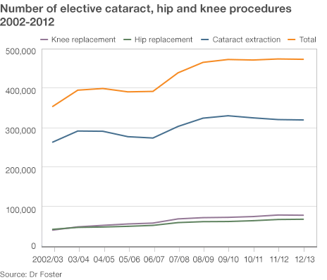
The analysis alleged that the number of operations in three categories (cataract, knee and hip) had risen steadily between 2002 and 2008 but then “plateaued”. As evidence for this the BBC reproduced the following chart.

NHS_DrFoster_Dec13

Dr Foster Intelligence apparently argued that, as the UK population had continued to age since 2008, a “plateau” in the number of such operations must be evidence of “rationing”. Otherwise the rising trend would have continued. I find myself using a lot of quotes when I try to follow the BBC’s “data journalism”.

Unfortunately, I was unable to find the report or the raw data on the Dr Foster Intelligence website. It could be that my search skills are limited but I think I am fairly typical of the sort of people who might be interested in this. I would be very happy if somebody pointed me to the report and data. If I try to interpret the BBC’s journalism, the argument goes something like this.

  1. The rise in cataract, knee and hip operations has “plateaued”.
  2. Need for such operations has not plateaued.
  3. That is evidence of a decreased tendency to perform such operations when needed.
  4. Such a decreased tendency is because of “rationing”.

Now there are a lot of unanswered questions and unsupported assertions behind 2, 3 and 4 but I want to focus on 1. What the researchers say is that the experience base showed a steady rise in operations but that ceased some time around 2008. In other words, since 2008 there has been a signal that something has changed over the historical data.

Signals are seldom straightforward to spot. As Nate Silver emphasises, signals need to be contrasted with, and understood in the context of, noise, the irregular variation that is common to the whole of the historical data. The problem with common cause variation is that it can lead us to be, as Nassim Taleb puts it, fooled by randomness.

Unfortunately, without the data, I cannot test this out on a process behaviour chart. Can I be persuaded that this data represents an increasing trend then a signal of a “plateau”?

The first question is whether there is a signal of a trend at all. I suspect that in this case there is if the data is plotted on a process behaviour chart. The next question is whether there is any variation in the slope of that trend. One simple approach to this is to fit a linear regression line through the data and put the residuals on a process behaviour chart. Only if there is a signal on the residuals chart is an inference of a “plateau” left open. Looking at the data my suspicion is that there would be no such signal.

More complex analyses are possible. One possibility would be to adjust the number of operations by a measure of population age then look at the stability and predictability of those numbers. However, I see no evidence of that analysis either.

I think that where anybody claims to have detected a signal, the legal maxim should prevail: He who asserts must prove. I see no evidence in the chart alone to support the assertion of a rising trend followed by a “plateau”.

Risks of Paediatric heart surgery in the NHS

I thought, before posting, I would let the controversy die down around this topic and in particular the anxieties and policy changes around Leeds General Infirmary. However, I had a look at this report and found there were some interesting things in it worth blogging about.

Readers will remember that there was anxiety in the UK about mortality rates from paediatric surgery and whether differential mortality rates from the limited number of hospitals was evidence of relative competence and, moreover, patient safety. For a time Leeds General Infirmary suspended all such surgery. The report I’ve been looking at was a re-analysis of the data after some early data quality problems had been resolved. Leeds was exonerated and recommenced surgery.

The data analysed is from 2009 to 2012. The headline graphic in the report is this. The three letter codes indicate individual hospitals.

Heart Summary

I like this chart as it makes an important point. There is nothing, in itself, significant about having the highest mortality rate. There will always be exactly two hospitals at the extremes of any league table. The task of data analysis is to tell us whether that is simply a manifestation of the noise in the system or whether it is a signal of an underlying special cause. Nate Silver makes these points very well in his book The Signal and the Noise. Leeds General Infirmary had the greatest number of deaths, relative to expectations, but then somebody had to. It may feel emotionally uncomfortable being at the top but it is no guide to executive action.

Statisticians like the word “significant” though I detest it. It is a “word worn smooth by a million tongues”. The important idea is that of a sign or signal that stands out in unambiguous contrast to the noise. As Don Wheeler observed, all data has noise, some data also has signals. Even the authors of the report seem to have lost confidence in the word as they enclose it in quotes in their introduction. However, what this report is all about is trying to separate signal from noise. Against all the variation in outcomes in paediatric heart surgery, is there a signal? If so, what does the signal tell us and what ought we to do?

The authors go about their analysis using p-values. I agree with Stephen Ziliak and Deirdre McCloskey in their criticism of p-values. They are a deeply unreliable as a guide to action. I do not think they do much harm they way they are used in this report but I would have preferred to see the argument made in a different way.

The methodology of the report starts out by recognising that the procedural risks will not be constant for all hospitals. Factors such as differential distributions of age, procedural complexity and the patient’s comorbidities will affect the risk. The report’s analysis is predicated on a model (PRAiS) that predicts the number of deaths to be expected in a given year as a function of these sorts of variables. The model is based on historical data, I presume from before 2009. I shall call this the “training” data. The PRAiS model endeavours to create a “level playing field”. If the PRAiS adjusted mortality figures are stable and predictable then we are simply observing noise. The noise is the variation that the PRAiS model cannot explain. It is caused by factors as yet unknown and possibly unknowable. What we are really interested in is whether any individual hospital in an individual year shows a signal, a mortality rate that is surprising given the PRAiS prediction.

The authors break down the PRAiS adjusted data by year and hospital. They then take a rather odd approach to the analysis. In each year, they make a further adjustment to the observed deaths based on the overall mortality rate for all hospitals in that year. I fear that there is no clear explanation as to why this was adopted.

I suppose that this enables them to make an annual comparison between hospitals. However, it does have some drawbacks. Any year-on-year variation not explained by the PRAiS model is part of the common cause variation, the noise, in the system. It ought to have been stable and predictable over the data with which the model was “trained”. It seems odd to adjust data on the basis of noise. If there were a deterioration common to all hospitals, it would not be picked up in the authors’ p-values. Further, a potential signal of deterioration in one hospital might be masked by a moderately bad, but unsurprising, year in general.

What the analysis does mask is that there is a likely signal here suggesting a general improvement in mortality rates common across the hospitals. Look at 2009-10 for example. Most hospitals reported fewer deaths than the PRAiS model predicted. The few that didn’t, barely exceeded the prediction.

Hear0910

In total, over the three years and 9930 procedures studied, the PRAiS model predicted 291 deaths. There were 243. For what it’s worth, I get a p-value of 0.002. Taking that at face value, there is a signal that mortality has dropped. Not a fact that I would want to disguise.

The plot that I would like to have seen, as an NHS user, would be a chart of PRAiS adjusted annual deaths against time for the “training” data. That chart should then have natural process limits (“NPLs”) added, calculated from the PRAiS adjusted deaths. This must show stable and predictable PRAiS adjusted deaths. Otherwise, the usefulness of the model and the whole approach is compromised. The NPLs could then be extended forwards in time and subsequent PRAiS adjusted mortalities charted on an annual basis. There would be individual hospital charts and a global chart. New points would be added annually.

I know that there is a complexity with the varying number of patients each year but if plotted in the aggregate and by hospital there is not enough variation, I think, to cause a problem.

The chart I suggest has some advantages. It would show performance over time in a manner transparent to NHS users. Every time the data comes in issue we could look and see that we have the same chart as last time we looked with new data added. We could see the new data in the context of the experience base. That helps build trust in data. There would be no need for an ad hoc analysis every time a question was raised. Further, the “training” data would give us the residual process variation empirically. We would not have to rely on simplifying assumptions such as the Poisson distribution when we are looking for a surprise.

There is a further point. The authors of the report recognise a signal against two criteria, an “Alert area” and an “Alarm area”. I’m not sure how clinicians and managers respond to a signal in these respective areas. It is suggestive of the old-fashioned “warning limits” that used to be found on some control charts. However, the authors of the report compound matters by then stating that hospitals “approaching the alert threshold may deserve additional scrutiny and monitoring of current performance”. The simple truth is that, as Terry Weight used to tell me, a signal is a signal is a signal. As soon as we see a signal we protect the customer and investigate its cause. That’s all there is to it. There is enough to do in applying that tactic diligently. Over complicating the urgency of response does not, I think, help people to act effectively on data. If we act when there is no signal then we have a strategy that will make outcomes worse.

Of course, I may have misunderstood the report and I’m happy for the authors to post here and correct me.

If we wish to make data the basis for action then we have to move from reactive ad hoc analysis to continual and transparent measurement along with a disciplined pattern of response. Medical safety strikes me as exactly the sort of system that demands such an approach.