Get rich predicting the next recession – just watch the fertility statistics

… we are told. Or perhaps not. This was the research reported last week, with varying degrees of credulity, by the BBC here and The (London) Times here (£paywall). This turned out to be a press release about some academic research by Kasey Buckles of Notre Dame University and others. You have to pay USD 5 to get the academic paper. I shall come back to that.

The paper’s abstract claims as follows.

Many papers show that aggregate fertility is pro-cyclical over the business cycle. In this paper we do something else: using data on more than 100 million births and focusing on within-year changes in fertility, we show that for recent recessions in the United States, the growth rate for conceptions begins to fall several quarters prior to economic decline. Our findings suggest that fertility behavior is more forward-looking and sensitive to changes in short-run expectations about the economy than previously thought.

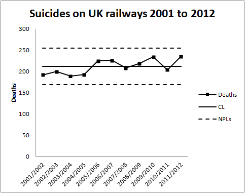
Now, here is a chart shared by the BBC.

Pregnancy and recession

The first thing to notice here is that we have exactly three observations. Three recession events with which to learn about any relationship between human sexual activity and macroeconomics. If you are the sort of person obsessed with “sample size”, and I know some of you are, ignore the misleading “100 million births” hold-out. Focus on the fact that n=3.

We are looking for a leading indicator, something capable of predicting a future event or outcome that we are bothered about. We need it to go up/ down before the up/ down event that we anticipate/ fear. Further it needs consistently to go up/ down in the right direction, by the right amount and in sufficient time for us to take action to correct, mitigate or exploit.

There is a similarity here to the hard and sustained thinking we have to do when we are looking for a causal relationship, though there is no claim to cause and effect here (c.f. the Bradford Hill guidelines). One of the most important factors in both is temporality. A leading indicator really needs to lead, and to lead in a regular way. Making predictions like, “There will be a recession some time in the next five years,” would be a shameless attempt to re-imagine the unsurprising as a signal novelty.

Having recognised the paucity of the data and the subtlety of identifying a usefully predictive effect, we move on to the chart. The chart above is pretty useless for the job at hand. Run charts with multiple variables are very weak tools for assessing association between factors, except in the most unambiguous cases. The chart broadly suggests some “association” between fertility and economic growth. It is possible to identify “big falls” both in fertility and growth and to persuade ourselves that the collapses in pregnancy statistics prefigure financial contraction. But the chart is not compelling evidence that one variable tracks the other reliably, even with a time lag. There looks like no evident global relationship between the variation in the two factors. There are big swings in each to which no corresponding event stands out in the other variable.

We have to go back and learn the elementary but universal lessons of simple linear regression. Remember that I told you that simple linear regression is the prototype of all successful statistical modelling and prediction work. We have to know whether we have a system that is sufficiently stable to be predictable. We have to know whether it is worth the effort. We have to understand the uncertainties in any prediction we make.

We do not have to go far to realise that the chart above cannot give a cogent answer to any of those. The exercise would, in any event, be a challenge with three observations. I am slightly resistant to spending GBP 3.63 to see the authors’ analysis. So I will reserve my judgment as to what the authors have actually done. I will stick to commenting on data journalism standards. However, I sense that the authors don’t claim to be able to predict economic growth simpliciter, just some discrete events. Certainly looking at the chart, it is not clear which of the many falls in fertility foreshadow financial and political crisis. With the myriad of factors available to define an “event”, it should not be too difficult, retrospectively, to define some fertility “signal” in the near term of the bull market and fit it astutely to the three data points.

As The Times, but not the BBC, reported:

However … the correlation between conception and recession is far from perfect. The study identified several periods when conceptions fell but the economy did not.

“It might be difficult in practice to determine whether a one-quarter drop in conceptions is really signalling a future downturn. However, this is also an issue with many commonly used economic indicators,” Professor Buckles told the Financial Times.

Think of it this way. There are, at most, three independent data points on your scatter plot. Really. And even then the “correlation … is far from perfect”.

And you have had the opportunity to optimise the time lag to maximise the “correlation”.

This is all probably what we suspected. What we really want is to see the authors put their money where their mouth is on this by wagering on the next recession, a point well made by Nassim Taleb’s new book Skin in the Game. What distinguishes a useful prediction is that the holder can use it to get the better of the crowd. And thinks the risks worth it.

As for the criticisms of economic forecasting generally, we get it. I would have thought though that the objective was to improve forecasting, not to satirise it.

Imagine …

Ben Bernanke official portrait.jpgNo, not John Lennon’s dreary nursery rhyme for hippies.

In his memoir of the 2007-2008 banking crisis, The Courage to ActBen Benanke wrote about his surprise when the crisis materialised.

We saw, albeit often imperfectly, most of the pieces of the puzzle. But we failed to understand – “failed to imagine” might be a better phrase – how those pieces would fit together to produce a financial crisis that compared to, and arguably surpassed, the financial crisis that ushered in the Great Depression.

That captures the three essentials of any attempt to foresee a complex future.

  • The pieces
  • The fit
  • Imagination

In any well managed organisation, “the pieces” consist of the established Key Performance Indicators (KPIs) and leading measures. Diligent and rigorous criticism of historical data using process behaviour charts allows departures from stability to be identified timeously. A robust and disciplined system of management and escalation enables an agile response when special causes arise.

Of course, “the fit” demands a broader view of the data, recognising interactions between factors and the possibility of non-simple global responses remote from a locally well behaved response surface. As the old adage goes, “Fit locally. Think globally.” This is where the Cardinal Newman principle kicks in.

“The pieces” and “the fit”, taken at their highest, yield a map of historical events with some limited prediction as to how key measures will behave in the future. Yet it is common experience that novel factors persistently invade. The “bow wave” of such events will not fit a recognised pattern where there will be a ready consensus as to meaning, mechanism and action. These are the situations where managers are surprised by rapidly emerging events, only to protest, “We never imagined …”.

Nassim Taleb’s analysis of the financial crisis hinged on such surprises and took him back to the work of British economist G L S Shackle. Shackle had emphasised the importance of imagination in economics. Put at its most basic, any attempt to assign probabilities to future events depends upon the starting point of listing the alternatives that might occur. Statisticians call it the sample space. If we don’t imagine some specific future we won’t bother thinking about the probability that it might come to be. Imagination is crucial to economics but it turns out to be much more pervasive as an engine of improvement that at first is obvious.

Imagination and creativity

Frank Whittle had to imagine the jet engine before he could bring it into being. Alan Turing had to imagine the computer. They were both fortunate in that they were able to test their imagination by construction. It was all realised in a comparatively short period of time. Whittle’s and Turing’s respective imaginations were empirically verified.

What is now proved was once but imagined.

William Blake

Not everyone has had the privilege of seeing their imagination condense into reality within their lifetime. In 1946, Sir George Paget Thomson and Moses Blackman imagined a plentiful source of inexpensive civilian power from nuclear fusion. As of writing, prospects of a successful demonstration seem remote. Frustratingly, as far as I can see, the evidence still refuses to tip the balance as to whether future success is likely or that failure is inevitable.

Something as illusive as imagination can have a testable factual content. As we know, not all tests are conclusive.

Imagination and analysis

Imagination turns out to be essential to something as prosaic as Root Cause Analysis. And essential in a surprising way. Establishing an operative cause of a past event is an essential task in law and engineering. It entails the search for a counterfactual, not what happened but what might have happened to avoid the  regrettable outcome. That is inevitably an exercise in imagination.

In almost any interesting situation there will be multiple imagined pasts. If there is only one then it is time to worry. Sometimes it is straightforward to put our ideas to the test. This is where the Shewhart cycle comes into its own. In other cases we are in the realms of uncomfortable science. Sometimes empirical testing is frustrated because the trail has gone cold.

The issues of counterfactuals, Root Cause Analysis and causation have been explored by psychologists Daniel Kahneman1 and Ruth Byrne2 among others. Reading their research is a corrective to the optimistic view that Root Cause analysis is some sort of inevitably objective process. It is distorted by all sorts of heuristics and biases. Empirical testing is vital, if only through finding some data with borrowing strength.

Imagine a millennium bug

In 1984, Jerome and Marilyn Murray published Computers in Crisis in which they warned of a significant future risk to global infrastructure in telecommunications, energy, transport, finance, health and other domains. It was exactly those areas where engineers had been enthusiastic to exploit software from the earliest days, often against severe constraints of memory and storage. That had led to the frequent use of just two digits to represent a year, “71” for 1971, say. From the 1970s, software became more commonly embedded in devices of all types. As the year 2000 approached, the Murrays envisioned a scenario where the dawn of 1 January 2000 was heralded by multiple system failures where software registers reset to the year 1900, frustrating functions dependent on timing and forcing devices into a fault mode or a graceless degradation. Still worse, systems may simply malfunction abruptly and without warning, the only sensible signal being when human wellbeing was compromised. And the ruinous character of such a threat would be that failure would be inherently simultaneous and global, with safeguarding systems possibly beset with the same defects as the primary devices. It was easy to imagine a calamity.

Risk matrixYou might like to assess that risk yourself (ex ante) by locating it on the Risk Assessment Matrix to the left. It would be a brave analyst who would categorise it as “Low”, I think. Governments and corporations were impressed and embarked on a massive review of legacy software and embedded systems, estimated to have cost around $300 billion at year 2000 prices. A comprehensive upgrade programme was undertaken by nearly all substantial organisations, public and private.

Then, on 1 January 2000, there was no catastrophe. And that caused consternation. The promoters of the risk were accused of having caused massive expenditure and diversion of resources against a contingency of negligible impact. Computer professionals were accused, in terms, of self-serving scare mongering. There were a number of incidents which will not have been considered minor by the people involved. For example, in a British hospital, tests for Down’s syndrome were corrupted by the bug resulting in contra-indicated abortions and births. However, there was no global catastrophe.

This is the locus classicus of a counterfactual. Forecasters imagined a catastrophe. They persuaded others of their vision and the necessity of vast expenditure in order to avoid it. The preventive measures were implemented at great costs. The Catastrophe did not occur. Ex post, the forecasters were disbelieved. The danger had never been real. Even Cassandra would have sympathised.

Critics argued that there had been a small number of relatively minor incidents that would have been addressed most economically on a “fix on failure” basis. Much of this turns out to be a debate about the much neglected column of the risk assessment headed “Detectability”. Where a failure will inflict immediate pain, it is so much more critical as to management and mitigation than a failure that will present the opportunity for detection and protection in advance of a broader loss. Here, forecasting Detectability was just as important as Probability and Consequences in arriving at an economic strategy for management.

It is the fundamental paradox of risk assessment that, where control measures eliminate a risk, it is not obvious whether the benign outcome was caused by the control or whether the risk assessment was just plain wrong and the risk never existed. Another counterfactual. Again, finding some alternative data with borrowing strength can help though it will ever be difficult to build a narrative appealing to a wide population. There are links to some sources of data on the Wikipedia article about the bug. I will leave it to the reader.

Imagine …

Of course it is possible to find this all too difficult and to adopt the Biblical outlook.

I returned, and saw under the sun, that the race is not to the swift, nor the battle to the strong, neither yet bread to the wise, nor yet riches to men of understanding, nor yet favour to men of skill; but time and chance happeneth to them all.

Ecclesiastes 9:11
King James Bible

That is to adopt the outlook of the lady on the level crossing. Risk professionals look for evidence that their approach works.

The other day, I was reading the annual report of the UK Health and Safety Executive (pdf). It shows a steady improvement in the safety of people at work though oddly the report is too coy to say this in terms. The improvement occurs over the period where risk assessment has become ubiquitous in industry. In an individual work activity it will always be difficult to understand whether interventions are being effective. But using the borrowing strength of the overall statistics there is potent evidence that risk assessment works.

References

  1. Kahneman, D & Tversky, A (1979) “The simulation heuristic”, reprinted in Kahneman et al. (1982) Judgment under Uncertainty: Heuristics and Biases, Cambridge, p201
  2. Byrne, R M J (2007) The Rational Imagination: How People Create Alternatives to Reality, MIT Press

It was 20 years ago today …

W._Edwards_Deming[1]Today, 20 December 2013, marks the twentieth anniversary of the death of W Edwards Deming. Deming was a hugely influential figure in management science, in Japan during the 1950s, 1960s and 1970s, then internationally from the early 1980s until his death. His memory persists in a continuing debate about his thinking among a small and aging sector of the operational excellence community, and in a broader reputation as a “management guru”, one of the writers who from the 1980s onwards championed and popularised the causes of employee engagement and business growth through customer satisfaction.

Deming’s training had been in mathematics and physics but in his professional life he first developed into a statistician, largely because of the influence of Walter Shewhart, an early mentor. It was fundamental to Deming’s beliefs that an organisation could only be managed effectively with widespread business measurement and trenchant statistical criticism of data. In that way he anticipated writers of a later generation such as Nate Silver and Nassim Taleb.

Since Deming’s death the operational excellence landscape has become more densely populated. In particular, lean operations and Six Sigma have variously been seen as competitors for Deming’s approach, as successors, usurpers, as complementary, as development, or as tools or tool sets to be deployed within Deming’s business strategy. In many ways, the pragmatic development of lean and Six Sigma have exposed the discursive, anecdotal and sometimes gnomic way Deming liked to communicate. In his book Out of the Crisis: Quality, Productivity and Competitive Position (1982) minor points are expanded over whole chapters while major ideas are finessed in a few words. Having elevated the importance of measurement and a proper system for responding to data he goes on to observe that the most important numbers are unknown and unknowable. I fear that this has often been an obstacle to managers finding the hard science in Deming.

For me, the core of Deming’s thinking remains this. There is only one game in town, the continual improvement of the alignment between the voice of the process and the voice of the customer. That improvement is achieved by the diligent use of process behaviour charts. Pursuit of that aim will collaterally reduce organisational costs.

Deming pursued the idea further. He asked what kind of organisation could most effectively exploit process behaviour charts. He sought philosophical justifications for successful heuristics. It is here that his writing became more difficult to accept for many people. In his last book, The New Economics for Industry, Government, Education, he trespassed on broader issues usually reserved to politics and social science, areas in which he was poorly qualified to contribute. The problem with Deming’s later work is that where it is new, it is not economics, and where it is economics, it is not new. It is this part of his writing that has tended to attract a few persistent followers. What is sad about Deming’s continued following is the lack of challenge. Every seminal thinker’s works are subject to repeated criticism, re-evaluation and development. Not simply development by accumulation but development by revision, deletion and synthesis. It is here that Deming’s memory is badly served. At the top of the page is a link to Deming’s Wikipedia entry. It is disturbing that everything is stated as though a settled and triumphant truth, a treatment that contrasts with the fact that his work is now largely ignored in mainstream management. Managers have found in lean and Six Sigma systems they could implement, even if only partially. In Deming they have not.

What Deming deserves, now that a generation, a global telecommunications system and a world wide web separate us from him, is a robust criticism and challenge of his work. The statistical thinking at the heart is profound. For me, the question of what sort of organisation is best placed to exploit that thinking remains open. Now is the time for the re-evaluation because I believe that out of it we can join in reaching new levels of operational excellence.

Rationing in UK health care – signal or noise?

The NHS in England appears to be rationing access to vital non-emergency hospital care, a review suggests.

This was the rather weaselly BBC headline last Friday. It referred to a report from Dr Foster Intelligence which appears to be a trading arm of Imperial College London.

The analysis alleged that the number of operations in three categories (cataract, knee and hip) had risen steadily between 2002 and 2008 but then “plateaued”. As evidence for this the BBC reproduced the following chart.

NHS_DrFoster_Dec13

Dr Foster Intelligence apparently argued that, as the UK population had continued to age since 2008, a “plateau” in the number of such operations must be evidence of “rationing”. Otherwise the rising trend would have continued. I find myself using a lot of quotes when I try to follow the BBC’s “data journalism”.

Unfortunately, I was unable to find the report or the raw data on the Dr Foster Intelligence website. It could be that my search skills are limited but I think I am fairly typical of the sort of people who might be interested in this. I would be very happy if somebody pointed me to the report and data. If I try to interpret the BBC’s journalism, the argument goes something like this.

  1. The rise in cataract, knee and hip operations has “plateaued”.
  2. Need for such operations has not plateaued.
  3. That is evidence of a decreased tendency to perform such operations when needed.
  4. Such a decreased tendency is because of “rationing”.

Now there are a lot of unanswered questions and unsupported assertions behind 2, 3 and 4 but I want to focus on 1. What the researchers say is that the experience base showed a steady rise in operations but that ceased some time around 2008. In other words, since 2008 there has been a signal that something has changed over the historical data.

Signals are seldom straightforward to spot. As Nate Silver emphasises, signals need to be contrasted with, and understood in the context of, noise, the irregular variation that is common to the whole of the historical data. The problem with common cause variation is that it can lead us to be, as Nassim Taleb puts it, fooled by randomness.

Unfortunately, without the data, I cannot test this out on a process behaviour chart. Can I be persuaded that this data represents an increasing trend then a signal of a “plateau”?

The first question is whether there is a signal of a trend at all. I suspect that in this case there is if the data is plotted on a process behaviour chart. The next question is whether there is any variation in the slope of that trend. One simple approach to this is to fit a linear regression line through the data and put the residuals on a process behaviour chart. Only if there is a signal on the residuals chart is an inference of a “plateau” left open. Looking at the data my suspicion is that there would be no such signal.

More complex analyses are possible. One possibility would be to adjust the number of operations by a measure of population age then look at the stability and predictability of those numbers. However, I see no evidence of that analysis either.

I think that where anybody claims to have detected a signal, the legal maxim should prevail: He who asserts must prove. I see no evidence in the chart alone to support the assertion of a rising trend followed by a “plateau”.

Suicide statistics for British railways

I chose a prosaic title because it’s not a subject about which levity is appropriate. I remain haunted by this cyclist on the level crossing. As a result I thought I would delve a little into railway accident statistics. The data is here. Unfortunately, the data only goes back to 2001/2002. This is a common feature of government data. There is no long term continuity in measurement to allow proper understanding of variation, trends and changes. All this encourages the “executive time series” that are familiar in press releases. I think that I shall call this political amnesia. When I have more time I shall look for a longer time series. The relevant department is usually helpful if contacted directly.

However, while I was searching I found this recent report on Railway Suicides in the UK: risk factors and prevention strategies. The report is by Kamaldeep Bhui and Jason Chalangary of the Wolfson Institute of Preventive Medicine, and Edgar Jones of the Institute of Psychiatry, King’s College, London. Originally, I didn’t intend to narrow my investigation to suicides but there were some things in the paper that bothered me and I felt were worth blogging about.

Obviously this is really important work. No civilised society is indifferent to tragedies such as suicide whose consequences are absorbed deeply into the community. The report analyses a wide base of theories and interventions concerning railway suicide risk. There is a lot of information and the authors have done an important job in bringing together and seeking conclusions. However, I was bothered by this passage (at p5).

The Rail Safety and Standards Board (RSSB) reported a progressive rise in suicides and suspected suicides from 192 in 2001-02 to a peak 233 in 2009-10, the total falling to 208 in 2010-11.

Oh dear! An “executive time series”. Let’s look at the data on a process behaviour chart.

RailwaySuicides1

There is no signal, even ignoring the last observation in 2011/2012 which the authors had not had to hand. There has been no increasing propensity for suicide since 2001. The writers have been, as Nassim Taleb would put it, “fooled by randomness”. In the words of Nate Silver, they have confused signal and noise. The common cause variation in the data has been over interpreted by zealous and well meaning policy makers as an upward trend. However, all diligent risk managers know that interpretation of a chart is forbidden if there is no signal. Over interpretation will lead to (well meaning) over adjustment and admixture of even more variation into a stable system of trouble.

Looking at the development of the data over time I can understand that there will have been a temptation to perform a regression analysis and calculate a p-value for the perceived slope. This is an approach to avoid in general. It is beset with the dangers of testing effects suggested by the data and the general criticisms of p-values made by McCloskey and Ziliak. It is not a method that will be a reliable guide to future action. For what it’s worth I got a p-value of 0.015 for the slope but I am not impressed. I looked to see if I could find a pattern in the data then tested for the pattern my mind had created. It is unsurprising that it was “significant”.

The authors of the report go on to interpret the two figures for 2009/2010 (233 suicides) and 2010/2011 (208 suicides) as a “fall in suicides”. It is clear from the process behaviour chart that this is not a signal of a fall in suicides. It is simply noise, common cause variation from year to year.

Having misidentified this as a signal they go on to seek a cause. Of course they “find” a potential cause. A partnership between Network Rail and the Samaritans, Men on the Ropes, had started in January 2010. The programme’s aim was to reduce suicides by 20% over five years. I genuinely hope that the programme shows success. However, the programme will not be assisted by thinking that it has yet shown signs of improvement.

With the current mean annual total at 211, a 20% reduction entails a new mean of 169 annual suicides.That is an ambitious target I think, and I want to emphasise that the programme is entirely laudable and plausible. However, whether it succeeds is to be judged by the figures on the process behaviour chart, not by any post hoc rationalisation. This is the tough discipline of the charts. It is no longer possible to claim an improvement where that is not supported by the data.

I will come back to this data next year and look to see if there are any signs of encouragement.