Shewhart chart basics 1 – The environment sufficiently stable to be predictable

Everybody wants to be able to predict the future. Here is the forecaster’s catechism.

  • We can do no more that attach a probability to future events.
  • Where we have data from an environment that is sufficiently stable to be predictable we can project historical patterns into the future.
  • Otherwise, prediction is largely subjective;
  • … but there are tactics that can help.
  • The Shewhart chart is the tool that helps us know whether we are working with an environment that is sufficiently stable to be predictable.

Now let’s get to work.

What does a stable/ predictable environment look like?

Every trial lawyer knows the importance of constructing a narrative out of evidence, an internally consistent and compelling arrangement of the facts that asserts itself above competing explanations. Time is central to how a narrative evolves. It is time that suggests causes and effects, motivations, barriers and enablers, states of knowledge, external influences, sensitisers and cofactors. That’s why exploration of data always starts with plotting it in time order. Always.

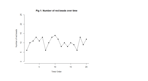
Let’s start off by looking at something we know to be predictable. Imagine a bucket of thousands of spherical beads. Of the beads, 80% are white and 20%, red. You are given a paddle that will hold 50 beads. Use the paddle to stir the beads then draw out 50 with the paddle. Count the red beads. Now you may, at this stage, object. Surely, this is just random and inherently unpredictable. But I want to persuade you that this is the most predictable data you have ever seen. Let’s look at some data from 20 sequential draws. In time order, of course, in Fig. 1.
Shew Chrt 1

Just to look at the data from another angle, always a good idea, I have added up how many times a particular value, 9, 10, 11, … , turns up and tallied them on the right hand side. For example, here is the tally for 12 beads in Fig. 2.

Shew Chrt 2

We get this in Fig. 3.

Shew Chrt 3

Here are the important features of the data.

  • We can’t predict what the exact value will be on any particular draw.
  • The numbers vary irregularly from draw to draw, as far as we can see.
  • We can say that draws will vary somewhere between 2 (say) and 19 (say).
  • Most of the draws are fairly near 10.
  • Draws near 2 and 19 are much rarer.

I would be happy to predict that the 21st draw will be between 2 and 19, probably not too far from 10. I have tried to capture that in Fig. 4. There are limits to variation suggested by the experience base. As predictions go, let me promise you, that is as good as it gets.

Even statistical theory would point to an outcome not so very different from that. That theoretical support adds to my confidence.

Shew Chrt 4

But there’s something else. Something profound.

A philosopher, an engineer and a statistician walk into a bar …

… and agree.

I got my last three bullet points above from just looking at the tally on the right hand side. What about the time order I was so insistent on preserving? As Daniel Kahneman put it “A random event does not … lend itself to explanation, but collections of random events do behave in a highly regular fashion.” What is this “regularity” when we can see how irregularly the draws vary? This is where time and narrative make their appearance.

If we take the draw data above, the exact same data, and “shuffle” it into a fresh order, we get this, Fig. 5.

Shew Chrt 5

Now the bullet points still apply to the new arrangement. The story, the narrative, has not changed. We still see the “irregular” variation. That is its “regularity”, that is tells the same story when we shuffle it. The picture and its inferences are the same. We cannot predict an exact value on any future draw yet it is all but sure to be between 2 and 19 and probably quite close to 10.

In 1924, British philosopher W E Johnson and US engineer Walter Shewhart, independently, realised that this was the key to describing a predicable process. It shows the same “regular irregularity”, or shall we say stable irregularity, when you shuffle it. Italian statistician Bruno de Finetti went on to derive the rigorous mathematics a few years later with his famous representation theorem. The most important theorem in the whole of statistics.

This is the exact characterisation of noise. If you shuffle it, it makes no difference to what you see or the conclusions you draw. It makes no difference to the narrative you construct (sic). Paradoxically, it is noise that is predictable.

To understand this, let’s look at some data that isn’t just noise.

Events, dear boy, events.

That was the alleged response of British Prime Minister Harold Macmillan when asked what had been the most difficult aspect of governing Britain.

Suppose our data looks like this in Fig. 6.

Shew Chrt 6

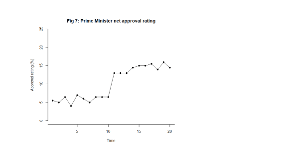
Let’s make it more interesting. Suppose we are looking at the net approval rating of a politician (Fig. 7).
Shew Chrt 7

What this looks like is noise plus a material step change between the 10th and 11th observation. Now, this is a surprise. The regularity, and the predictability, is broken. In fact, my first reaction is to ask What happened? I research political events and find at that same time there was an announcement of universal tax cuts (Fig. 8). This is just fiction of course. That then correlates with the shift in the data I observe. The shift is a signal, a flag from the data telling me that something happened, that the stable irregularity has become an unstable irregularity. I use the time context to identify possible explanations. I come up with the tentative idea about tax cuts as an explanation of the sudden increase in popularity.

The bullet points above no longer apply. The most important feature of the data now is the shift, I say, caused by the Prime Minister’s intervention.
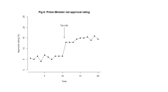
Shew Chrt 8

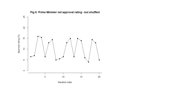
What happens when I shuffle the data into a random order though (Fig. 9)?
Shew Chrt 9

Now, the signal is distorted, hard to see and impossible to localise in time. I cannot tie it to a context. The message in the data is entirely different. The information in the chart is not preserved. The shuffled data does not bear the same narrative as the time ordered data. It does not tell the same story. It does not look the same. That is how I know there is a signal. The data changes its story when shuffled. The time order is crucial.

Of course, if I repeated the tally exercise that I did on Fig. 4, the tally would look the same, just as it did in the noise case in Fig. 5.

Is data with signals predictable?

The Prime Minister will say that they predicted that their tax cuts would be popular and they probably did so. My response to that would be to ask how big an improvement they predicted. While a response in the polls may have been foreseeable, specifying its magnitude is much more difficult and unlikely to be exact.

We might say that the approval data following the announcement has returned to stability. Can we not now predict the future polls? Perhaps tentatively in the short term but we know that “events” will continue to happen. Not all these will be planned by the government. Some government initiatives, triumphs and embarrassments will not register with the public. The public has other things to be interested in. Here is some UK data.
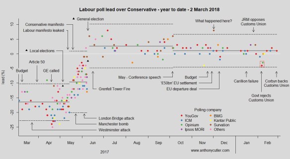
poll20180302

You can follow regular updates here if you are interested.

Shewhart’s ingenious chart

While Johnson and de Finetti were content with theory, Shewhart, working in the manufacture of telegraphy equipment, wanted a practical tool for his colleagues that would help them answer the question of predictability. A tool that would help users decide whether they were working with an environment sufficiently stable to be predictable. Moreover, he wanted a tool that would be easy to use by people who were short of time time for analysing data and had minds occupied by the usual distractions of the work place. He didn’t want people to have to run off to a statistician whenever they were perplexed by events.

In Part 2 I shall start to discuss how to construct Shewhart’s chart. In subsequent parts, I shall show you how to use it.

Advertisement

UK railway suicides – 2017 update

The latest UK rail safety statistics were published on 23 November 2017, again absent much of the press fanfare we had seen in the past. Regular readers of this blog will know that I have followed the suicide data series, and the press response, closely in 2016, 20152014, 2013 and 2012. Again I have re-plotted the data myself on a Shewhart chart.

RailwaySuicides20171

Readers should note the following about the chart.

  • Many thanks to Tom Leveson Gower at the Office of Rail and Road who confirmed that the figures are for the year up to the end of March.
  • Some of the numbers for earlier years have been updated by the statistical authority.
  • I have recalculated natural process limits (NPLs) as there are still no more than 20 annual observations, and because the historical data has been updated. The NPLs have therefore changed but, this year, not by much.
  • Again, the pattern of signals, with respect to the NPLs, is similar to last year.

The current chart again shows two signals, an observation above the upper NPL in 2015 and a run of 8 below the centre line from 2002 to 2009. As I always remark, the Terry Weight rule says that a signal gives us license to interpret the ups and downs on the chart. So I shall have a go at doing that.

It will not escape anybody’s attention that this is now the second year in which there has been a fall in the number of fatalities.

I haven’t yet seen any real contemporaneous comment on the numbers from the press. This item appeared on the BBC, a weak performer in the field of data journalism but clearly with privileged access to the numbers, on 30 June 2017, confidently attributing the fall to past initiatives.

Sky News clearly also had advanced sight of the numbers and make the bold claim that:

… for every death, six more lives were saved through interventions.

That item goes on to highlight a campaign to encourage fellow train users to engage with anybody whose behaviour attracted attention.

But what conclusions can we really draw?

In 2015 I was coming to the conclusion that the data increasingly looked like a gradual upward trend. The 2016 data offered a challenge to that but my view was still that it was too soon to say that the trend had reversed. There was nothing in the data incompatible with a continuing trend. This year, 2017, has seen 2016’s fall repeated. A welcome development but does it really show conclusively that the upward trending pattern is broken? Regular readers of this blog will know that Langian statistics like “lowest for six years” carry no probative weight here.

Signal or noise?

Has there been a change to the underlying cause system that drives the suicide numbers? Last year, I fitted a trend line through the data and asked which narrative best fitted what I observed, a continuing increasing trend or a trend that had plateaued or even reversed. You can review my analysis from last year here.

Here is the data and fitted trend updated with this year’s numbers, along with NPLs around the fitted line, the same as I did last year.

RailwaySuicides20172

Let’s think a little deeper about how to analyse the data. The first step of any statistical investigation ought to be the cause and effect diagram.

SuicideCne

The difficulty with the suicide data is that there is very little reproducible and verifiable knowledge as to its causes. I have seen claims, of whose provenance I am uncertain, that railway suicide is virtually unknown in the USA. There is a lot of useful thinking from common human experience and from more general theories in psychology. But the uncertainty is great. It is not possible to come up with a definitive cause and effect diagram on which all will agree, other from the point of view of identifying candidate factors.

The earlier evidence of a trend, however, suggests that there might be some causes that are developing over time. It is not difficult to imagine that economic trends and the cumulative awareness of other fatalities might have an impact. We are talking about a number of things that might appear on the cause and effect diagram and some that do not, the “unknown unknowns”. When I identified “time” as a factor, I was taking sundry “lurking” factors and suspected causes from the cause and effect diagram that might have a secular impact. I aggregated them under the proxy factor “time” for want of a more exact analysis.

What I have tried to do is to split the data into two parts:

  • A trend (linear simply for the sake of exploratory data analysis (EDA); and
  • The residual variation about the trend.

The question I want to ask is whether the residual variation is stable, just plain noise, or whether there is a signal there that might give me a clue that a linear trend does not hold.

There is no signal in the detrended data, no signal that the trend has reversed. The tough truth of the data is that it supports either narrative.

  • The upward trend is continuing and is stable. There has been no reversal of trend yet.
  • The data is not stable. True there is evidence of an upward trend in the past but there is now evidence that deaths are decreasing.

Of course, there is no particular reason, absent the data, to believe in an increasing trend and the initiative to mitigate the situation might well be expected to result in an improvement.

Sometimes, with data, we have to be honest and say that we do not have the conclusive answer. That is the case here. All that can be done is to continue the existing initiatives and look to the future. Nobody ever likes that as a conclusion but it is no good pretending things are unambiguous when that is not the case.

Next steps

Previously I noted proposals to repeat a strategy from Japan of bathing railway platforms with blue light. In the UK, I understand that such lights were installed at Gatwick in summer 2014. In fact my wife and I were on the platform at Gatwick just this week and I had the opportunity to observe them. I also noted, on my way back from court the other day, blue strip lights along the platform edge at East Croydon. I think they are recently installed. However, I have not seen any data or heard of any analysis.

A huge amount of sincere endeavour has gone into this issue but further efforts have to be against the background that there is still no conclusive evidence of improvement.

Suggestions for alternative analyses are always welcomed here.

Regression done right: Part 3: Forecasts to believe in

There are three Sources of Uncertainty in a forecast.

  1. Whether the forecast is of “an environment that is sufficiently regular to be predictable”.1
  2. Uncertainty arising from the unexplained (residual) system variation.
  3. Technical statistical sampling error in the regression calculation.

Source of Uncertainty (3) is the one that fascinates statistical theorists. Sources (1) and (2) are the ones that obsess the rest of us. I looked at the first in Part 1 of this blog and, the second in Part 2. Now I want to look at the third Source of Uncertainty and try to put everything together.

If you are really most interested in (1) and (2), read “Prediction intervals” then skip forwards to “The fundamental theorem of forecasting”.

Prediction intervals

A prediction interval2 captures the range in which a future observation is expected to fall. Bafflingly, not all statistical software generates prediction intervals automatically so it is necessary, I fear, to know how to calculate them from first principles. However, understanding the calculation is, in itself, instructive.

But I emphasise that prediction intervals rely on a presumption that what is being forecast is “an environment that is sufficiently regular to be predictable”, that the (residual) business process data is exchangeable. If that presumption fails then all bets are off and we have to rely on a Cardinal Newman analysis. Of course, when I say that “all bets are off”, they aren’t. You will still be held to your existing contractual commitments even though your confidence in achieving them is now devastated. More on that another time.

Sources of variation in predictions

In the particular case of linear regression we need further to break down the third Source of Uncertainty.

  1. Uncertainty arising from the unexplained (residual) variation.
  2. Technical statistical sampling error in the regression calculation.
    1. Sampling error of the mean.
    2. Sampling error of the slope

Remember that we are, for the time being, assuming Source of Uncertainty (1) above can be disregarded. Let’s look at the other Sources of Uncertainty in turn: (2), (3A) and (3B).

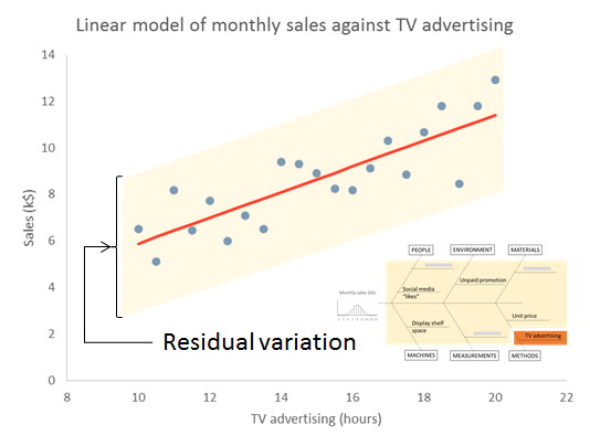
Source of Variation (2) – Residual variation

We start with the Source of Uncertainty arising from the residual variation. This is the uncertainty because of all the things we don’t know. We talked about this a lot in Part 2. We are content, for the moment, that they are sufficiently stable to form a basis for prediction. We call this common cause variation. This variation has variance s2, where s is the residual standard deviation that will be output by your regression software.

RegressionResExpl2

Source of Variation (3A) – Sampling error in mean

To understand the next Source of Variation we need to know a little bit about how the regression is calculated. The calculations start off with the respective means of the X values ( X̄ ) and of the Y values ( Ȳ ). Uncertainty in estimating the mean of the Y , is the next contribution to the global prediction uncertainty.

An important part of calculating the regression line is to calculate the mean of the Ys. That mean is subject to sampling error. The variance of the sampling error is the familiar result from the statistics service course.

RegEq2

— where n is the number of pairs of X and Y. Obviously, as we collect more and more data this term gets more and more negligible.

RegressionMeanExpl

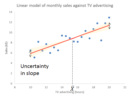
Source of Variation (3B) – Sampling error in slope

This is a bit more complicated. Skip forwards if you are already confused. Let me first give you the equation for the variance of predictions referable to sampling error in the slope.

RegEq3

This has now introduced the mysterious sum of squaresSXX. However, before we learn exactly what this is, we immediately notice two things.

  1. As we move away from the centre of the training data the variance gets larger.3
  2. As SXX gets larger the variance gets smaller.

The reason for the increasing sampling error as we move from the mean of X is obvious from thinking about how variation in slope works. The regression line pivots on the mean. Travelling further from the mean amplifies any disturbance in the slope.

RegressionSlopeExpl

Let’s look at where SXX comes from. The sum of squares is calculated from the Xs alone without considering the Ys. It is a characteristic of the sampling frame that we used to train the model. We take the difference of each X value from the mean of X, and then square that distance. To get the sum of squares we then add up all those individual squares. Note that this is a sum of the individual squares, not their average.

RegressionSXXTable

Two things then become obvious (if you think about it).

  1. As we get more and more data, SXX gets larger.
  2. As the individual Xs spread out over a greater range of XSXX gets larger.

What that (3B) term does emphasise is that even sampling error escalates as we exploit the edge of the original training data. As we extrapolate clear of the original sampling frame, the pure sampling error can quickly exceed even the residual variation.

Yet it is only a lower bound on the uncertainty in extrapolation. As we move away from the original range of Xs then, however happy we were previously with Source of Uncertainty (1), that the data was from “an environment that is sufficiently regular to be predictable”, then the question barges back in. We are now remote from our experience base in time and boundary. Nothing outside the original X-range will ever be a candidate for a comfort zone.

The fundamental theorem of prediction

Variances, generally, add up so we can sum the three Sources of Variation (2), (3A) and (3B). That gives the variance of an individual prediction, spred2. By an individual prediction I mean that somebody gives me an X and I use the regression formula to give them the (as yet unknown) corresponding Ypred.

RegEq4

It is immediately obvious that s2 is common to all three terms. However, the second and third terms, the sampling errors, can be made as small as we like by collecting more and more data. Collecting more and more data will have no impact on the first term. That arises from the residual variation. The stuff we don’t yet understand. It has variance s2, where s is the residual standard deviation that will be output by your regression software.

This, I say, is the fundamental theorem of prediction. The unexplained variation provides a hard limit on the precision of forecasts.

It is then a very simple step to convert the variance into a standard deviation, spred. This is the standard error of the prediction.4,5

RegEq5

Now, in general, where we have a measurement or prediction that has an uncertainty that can be characterised by a standard error u, there is an old trick for putting an interval round it. Remember that u is a measure of the variation in z. We can therefore put an interval around z as a number of standard errors, z±ku. Here, k is a constant of your choice. A prediction interval for the regression that generates prediction Ypred then becomes:

RegEq7

Choosing k=3 is very popular, conservative and robust.6,7 Other choices of k are available on the advice of a specialist mathematician.

It was Shewhart himself who took this all a bit further and defined tolerance intervals which contain a given proportion of future observations with a given probability.8 They are very much for the specialist.

Source of Variation (1) – Special causes

But all that assumes that we are sampling from “an environment that is sufficiently regular to be predictable”, that the residual variation is solely common cause. We checked that out on our original training data but the price of predictability is eternal vigilance. It can never be taken for granted. At any time fresh causes of variation may infiltrate the environment, or become newly salient because of some sensitising event or exotic interaction.

The real trouble with this world of ours is not that it is an unreasonable world, nor even that it is a reasonable one. The commonest kind of trouble is that it is nearly reasonable, but not quite. Life is not an illogicality; yet it is a trap for logicians. It looks just a little more mathematical and regular than it is; its exactitude is obvious, but its inexactitude is hidden; its wildness lies in wait.

G K Chesterton

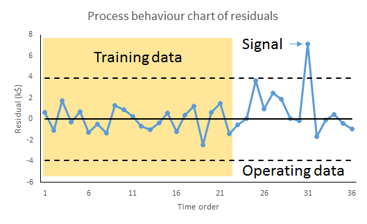
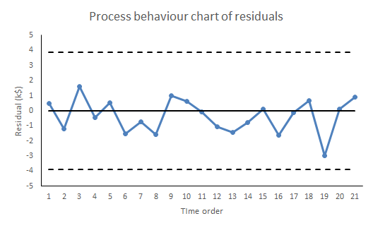
The remedy for this risk is to continue plotting the residuals, the differences between the observed value and, now, the prediction. This is mandatory.

RegressionPBC2

Whenever we observe a signal of a potential special cause it puts us on notice to protect the forecast-user because our ability to predict the future has been exposed as deficient and fallible. But it also presents an opportunity. With timely investigation, a signal of a possible special cause may provide deeper insight into the variation of the cause-system. That in itself may lead to identifying further factors to build into the regression and a consequential reduction in s2.

It is reducing s2, by progressively accumulating understanding of the cause-system and developing the model, that leads to more precise, and more reliable, predictions.

Notes

  1. Kahneman, D (2011) Thinking, Fast and Slow, Allen Lane, p240
  2. Hahn, G J & Meeker, W Q (1991) Statistical Intervals: A Guide for Practitioners, Wiley, p31
  3. In fact s2/SXX is the sampling variance of the slope. The standard error of the slope is, notoriously, s/√SXX. A useful result sometimes. It is then obvious from the figure how variation is slope is amplified as we travel father from the centre of the Xs.
  4. Draper, N R & Smith, H (1998) Applied Regression Analysis, 3rd ed., Wiley, pp81-83
  5. Hahn & Meeker (1991) p232
  6. Wheeler, D J (2000) Normality and the Process Behaviour Chart, SPC Press, Chapter 6
  7. Vysochanskij, D F & Petunin, Y I (1980) “Justification of the 3σ rule for unimodal distributions”, Theory of Probability and Mathematical Statistics 21: 25–36
  8. Hahn & Meeker (1991) p231

Regression done right: Part 1: Can I predict the future?

I recently saw an article in the Harvard Business Review called “Refresher on Regression Analysis”. I thought it was horrible so I wanted to set the record straight.

Linear regression from the viewpoint of machine learning

Linear regression is important, not only because it is a useful tool in itself, but because it is (almost) the simplest statistical model. The issues that arise in a relatively straightforward form are issues that beset the whole of statistical modelling and predictive analytics. Anyone who understands linear regression properly is able to ask probing questions about more complicated models. The complex internal algorithms of Kalman filters, ARIMA processes and artificial neural networks are accessible only to the specialist mathematician. However, each has several general features in common with simple linear regression. A thorough understanding of linear regression enables a due diligence of the claims made by the machine learning advocate. Linear regression is the paradigmatic exemplar of machine learning.

There are two principal questions that I want to talk about that are the big takeaways of linear regression. They are always the first two questions to ask in looking at any statistical modelling or machine learning scenario.

  1. What predictions can I make (if any)?
  2. Is it worth the trouble?

I am going to start looking at (1) in this blog and complete it in a future Part 2. I will then look at (2) in a further Part 3.

Variation, variation, variation

Variation is a major problem for business, the tendency of key measures to fluctuate irregularly. Variation leads to uncertainty. Will the next report be high or low? Or in the middle? Because of the uncertainty we have to allow safety margins or swallow some non-conformancies. We have good days and bad days, good products and not so good. We have to carry costly working capital because of variation in cash flow. And so on.

We learned in our high school statistics class to characterise variation in a key process measure, call it the Big Y, by an histogram of observations. Perhaps we are bothered by the fluctuating level of monthly sales.

RegressionHistogram

The variation arises from a whole ecology of competing and interacting effects and factors that we call the cause-system of the outcome. In general, it is very difficult to single out individual factors as having been the cause of a particular observation, so entangled are they. It is still useful to capture them for reference on a cause and effect diagram.

RegressionIshikawa

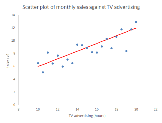
One of the strengths of the cause and effect diagram is that it may prompt the thought that one of the factors is particularly important, call it Big X, perhaps it is “hours of TV advertising” (my age is showing). Motivated by that we can generate a sample of corresponding measurements data of both the Y and X and plot them on a scatter plot.

RegressionScatter1

Well what else is there to say? The scatter plot shows us all the information in the sample. Scatter plots are an important part of what statistician John Tukey called Exploratory Data Analysis (EDA). We have some hunches and ideas, or perhaps hardly any idea at all, and we attack the problem by plotting the data in any way we can think of. So much easier now than when W Edwards Deming wrote:1

[Statistical practice] means tedious work, such as studying the data in various forms, making tables and charts and re-making them, trying to use and preserve the evidence in the results and to be clear enough to the reader: to endure disappointment and discouragement.

Or as Chicago economist Ronald Coase put it.

If you torture the data enough, nature will always confess.

The scatter plot is a fearsome instrument of data torture. It tells me everything. It might even tempt me to think that I have a basis on which to make predictions.

Prediction

In machine learning terms, we can think of the sample used for the scatter plot as a training set of data. It can be used to set up, “train”, a numerical model that we will then fix and use to predict future outcomes. The scatter plot strongly suggests that if we know a future X alone we can have a go at predicting the corresponding future Y. To see that more clearly we can draw a straight line by hand on the scatter plot, just as we did in high school before anybody suggested anything more sophisticated.

RegressionScatter2

Given any particular X we can read off the corresponding Y.

RegressionScatter3

The immediate insight that comes from drawing in the line is that not all the observations lie on the line. There is variation about the line so that there is actually a range of values of Y that seem plausible and consistent for any specified X. More on that in Parts 2 and 3.

In understanding machine learning it makes sense to start by thinking about human learning. Psychologists Gary Klein and Daniel Kahneman investigated how firefighters were able to perform so successfully in assessing a fire scene and making rapid, safety critical decisions. Lives of the public and of other firefighters were at stake. This is the sort of human learning situation that machines, or rather their expert engineers, aspire to emulate. Together, Klein and Kahneman set out to describe how the brain could build up reliable memories that would be activated in the future, even in the agony of the moment. They came to the conclusion that there are two fundamental conditions for a human to acquire a skill.2

  • An environment that is sufficiently regular to be predictable.
  • An opportunity to learn these regularities through prolonged practice

The first bullet point is pretty much the most important idea in the whole of statistics. Before we can make any prediction from the regression, we have to be confident that the data has been sampled from “an environment that is sufficiently regular to be predictable”. The regression “learns” from those regularities, where they exist. The “learning” turns out to be the rather prosaic mechanics of matrix algebra as set out in all the standard texts.3 But that, after all, is what all machine “learning” is really about.

Statisticians capture the psychologists’ “sufficiently regular” through the mathematical concept of exchangeability. If a process is exchangeable then we can assume that the distribution of events in the future will be like the past. We can project our historic histogram forward. With regression we can do better than that.

Residuals analysis

Formally, the linear regression calculations calculate the characteristics of the model:

Y = mX + c + “stuff”

The “mX+c” bit is the familiar high school mathematics equation for a straight line. The “stuff” is variation about the straight line. What the linear regression mathematics does is (objectively) to calculate the m and c and then also tell us something about the “stuff”. It splits the variation in Y into two components:

  • What can be explained by the variation in X; and
  • The, as yet unexplained, variation in the “stuff”.

The first thing to learn about regression is that it is the “stuff” that is the interesting bit. In 1849 British astronomer Sir John Herschel observed that:

Almost all the greatest discoveries in astronomy have resulted from the consideration of what we have elsewhere termed RESIDUAL PHENOMENA, of a quantitative or numerical kind, that is to say, of such portions of the numerical or quantitative results of observation as remain outstanding and unaccounted for after subducting and allowing for all that would result from the strict application of known principles.

The straight line represents what we guessed about the causes of variation in Y and which the scatter plot confirmed. The “stuff” represents the causes of variation that we failed to identify and that continue to limit our ability to predict and manage. We call the predicted Ys that correspond to the measured Xs, and lie on the fitted straight line, the fits.

fiti = mXic

The residual values, or residuals, are obtained by subtracting the fits from the respective observed Y values. The residuals represent the “stuff”. Statistical software does this for us routinely. If yours doesn’t then bin it.

residuali = Yi – fiti

RegressionScatter4

There are a number of properties that the residuals need to satisfy for the regression to work. Investigating those properties is called residuals analysis.4 As far as use for prediction in concerned, it is sufficient that the “stuff”, the variation about the straight line, be exchangeable.5 That means that the “stuff” so far must appear from the data to be exchangeable and further that we have a rational belief that such a cause system will continue unchanged into the future. Shewhart charts are the best heuristics for checking the requirement for exchangeability, certainly as far as the historical data is concerned. Our first and, be under no illusion, mandatory check on the ability of the linear regression, or any statistical model, to make predictions is to plot the residuals against time on a Shewhart chart.

RegressionPBC

If there are any signals of special causes then the model cannot be used for prediction. It just can’t. For prediction we need residuals that are all noise and no signal. However, like all signals of special causes, such will provide an opportunity to explore and understand more about the cause system. The signal that prevents us from using this regression for prediction may be the very thing that enables an investigation leading to a superior model, able to predict more exactly than we ever hoped the failed model could. And even if there is sufficient evidence of exchangeability from the training data, we still need to continue vigilance and scrutiny of all future residuals to look out for any novel signals of special causes. Special causes that arise post-training provide fresh information about the cause system while at the same time compromising the reliability of the predictions.

Thorough regression diagnostics will also be able to identify issues such as serial correlation, lack of fit, leverage and heteroscedasticity. It is essential to regression and its ommision is intolerable. Residuals analysis is one of Stephen Stigler’s Seven Pillars of Statistical Wisdom.6 As Tukey said:

The greatest value of a picture is when it forces us to notice what we never expected to see.

To come:

Part 2: Is my regression significant? … is a dumb question.
Part 3: Quantifying predictions with statistical intervals.

References

  1. Deming, W E (‎1975) “On probability as a basis for action”, The American Statistician 29(4) pp146-152
  2. Kahneman, D (2011) Thinking, Fast and Slow, Allen Lane, p240
  3. Draper, N R & Smith, H (1998) Applied Regression Analysis, 3rd ed., Wiley, p44
  4. Draper & Smith (1998) Chs 2, 8
  5. I have to admit that weaker conditions may be adequate in some cases but these are far beyond any other than a specialist mathematician.
  6. Stigler, S M (2016) The Seven Pillars of Statistical Wisdom, Harvard University Press, Chapter 7

Imagination, data and leadership

I had an intriguing insight into the nature of imagination the other evening when I was watching David Eagleman’s BBC documentary The Brain which you can catch on iPlayer until 27 February 2016 if you have a UK IP address.

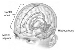
Eagleman told the strange story of Henry Molaison. Molaison suffered from debilitating epilepsy following a bicycle accident when he was nine years old. At age 27, Molaison underwent radical brain surgery that removed, all but completely, his hippocampi. The intervention stabilised the epilepsy but left Molaison’s memory severely impaired. Though he could recall his childhood, Molaison had no recall of events in the years leading up to his surgery and was unable to create new long-term memories. The case was important evidence for the theory that the hippocampus is critical to memory function. Molaison, having lost his, was profoundly compromised as to recall.

But Eagleman’s analysis went further and drew attention to a passage in a interview with Molaison later in his life.1 Though his presenting symptoms post-intervention were those of memory loss, Molaison also encountered difficulty in talking about what he would do the following day. Eagleman advances the theory that the hippocampus is critical, not only to memory, but to imagining the future. The systems that create memories are common to those that generate a model by which we can forecast, predict and envision novel outcomes.

I blogged about imagination back in November and how it was pivotal to core business activities from invention and creativity to risk management and root cause analysis. If Eagleman’s theory about the entanglement of memory and imagination is true then it might have profound implications for management. Perhaps our imagination will only function as well as our memory. That was, apparently, the case with Molaison. It could just be that an organisation’s ability to manage the future depends upon the same systems as those by which it critically captures the past.

That chimes with a theory of innovation put forward by W Brian Arthur of the Santa Fe Institute.2 Arthur argues that purportedly novel inventions are no more than combinations of known facts. There are no great leaps of creativity, just the incremental variation of a menagerie of artifacts and established technologies. Ideas similar to Arthur’s have been advanced by Matt Ridley,3,4 and Steven Berlin Johnson.5 Only mastery of the present exposes the opportunities to innovate. They say.

Data

This all should be no surprise to anybody experienced in business improvement. Diligent and rigorous criticism of historical data is the catalyst of change and the foundation of realising a vivid future. This is a good moment to remind ourselves of the power of the process behaviour chart in capturing learning and creating an organisational memory.

GenericPBC

The process behaviour chart provides a cogent record of the history of operation of a business process, its surprises and disappointments, existential risks and epochs of systematic productivity. It records attempted business solutions, successful, failed, temporary and partial work-rounds. It segregates signal from noise. It suggests realistic bounds on prediction. It is the focus of inclusive discussion about what the data means. It is the live report of experimentation and investigation, root cause analysis and problem solving. It matches data with its historical context. It is the organisation’s memory of development of a business process, and the people who developed it. It is the basis for creating the future.

If you are not familiar with how process behaviour charts work in this context then have a look at Don Wheeler’s example of A Japanese Control Chart.6

Leadership

Tim Harford tries to take the matter further.7 On Harford’s account of invention, “trial and error” consistently outperform “expert leadership” through a Darwinian struggle of competing ideas. The successful innovations, Harford says, propagate by adoption and form an ecology of further random variation, out of which the best ideas emergently repeat the cycle or birth and death. Of course, Leo Tolstoy wrote War and Peace, his “airport novel” avant la lettre, (also currently being dramatised by the BBC) to support exactly this theory of history. In Tolsoy’s intimate descriptions of the Battles of Austerlitz and Borodino, combatants lose contact with their superiors, battlefields are obscured by smoke from the commanding generals, individuals act on impulse and in despite of field discipline. How, Tolstoy asked in terms, could anyone claim to be the organising intelligence of victory or the culpable author of defeat?

However, I think that a view of war at odds with Tolstoy’s is found in the career of General George Marshall.8 Marshall rose to the rank of General of the Army of the USA as an expert in military logistics rather than as a commander in the field. Reading a biography of Marshall presents an account of war as a contest of supply chains. The events of the theatre of operations may well be arbitrary and capricious. It was the delivery of superior personnel and materiel to the battlefield that would prove decisive. That does not occur without organisation and systematic leadership. I think.

Harford and the others argue that, even were the individual missing from history, the innovation would still have occurred. But even though it could have been anyone, it still had to be someone. And what that someone had to provide was leadership to bring the idea to market or into operation. We would still have motor cars without Henry Ford and tablet devices without Steve Jobs but there would have been two other names who had put themselves on the line to create something out of nothing.

In my view, the evolutionary model of innovation is interesting but stretches a metaphor too far. Innovation demands leadership. The history of barbed wire is instructive.9 In May 1873, at a county fair in Illinois, Henry B Rose displayed a comical device to prevent cattle beating down primitive fencing, a “wooden strip with metallic points”. The device hung round the cattle’s horns and any attempts to butt the fence drove the spikes into the beast’s head. It didn’t catch on but at the fair that day were Joseph Glidden, Isaac L Ellwood and Jacob Haish. The three went on, within a few months, each to invent barbed wire. The winning memes often come from failed innovation.

Leadership is critical, not only in scrutinising innovation but in organising the logistics that will bring it to market.10 More fundamentally, leadership is pivotal in creating the organisation in which diligent criticism of historical data is routine and where it acts as a catalyst for innovation.11

References

  1. http://www.sciencemuseum.org.uk/visitmuseum_OLD/galleries/who_am_i/~/media/8A897264B5064BC7BE1D5476CFCE50C5.ashx, retrieved 29 January 2016, at p5
  2. Arthur, W B (2009) The Nature of Technology: What it is and How it Evolves, The Free Press/ Penguin Books.
  3. Ridley, M (2010) The Rational Optimist, Fourth Estate
  4. — (2015) The Evolution of Everything, Fourth Estate
  5. Johnson, S B (2010) Where Good Ideas Come From: The Seven Patterns of Innovation, Penguin
  6. Wheeler, D J (1992) Understanding Statistical Process Control, SPC Press
  7. Harford, T (2011) Adapt: Why Success Always Starts with Failure, Abacus
  8. Cray, E (2000) General of the Army: George C. Marshall, Soldier and Statesman, Cooper Square Press
  9. Krell, A (2002) The Devil’s Rope: A Cultural History of Barbed Wire, Reaktion Books
  10. Armytage, W H G (1976) A Social History of Engineering, 4th ed., Faber
  11. Nonaka, I & Takeuchi, H (1995) The Knowledge-Creating Company: How Japanese Companies Create the Dynamics of Innovation, Oxford University Press