Shewhart chart basics 1 – The environment sufficiently stable to be predictable

Everybody wants to be able to predict the future. Here is the forecaster’s catechism.

  • We can do no more that attach a probability to future events.
  • Where we have data from an environment that is sufficiently stable to be predictable we can project historical patterns into the future.
  • Otherwise, prediction is largely subjective;
  • … but there are tactics that can help.
  • The Shewhart chart is the tool that helps us know whether we are working with an environment that is sufficiently stable to be predictable.

Now let’s get to work.

What does a stable/ predictable environment look like?

Every trial lawyer knows the importance of constructing a narrative out of evidence, an internally consistent and compelling arrangement of the facts that asserts itself above competing explanations. Time is central to how a narrative evolves. It is time that suggests causes and effects, motivations, barriers and enablers, states of knowledge, external influences, sensitisers and cofactors. That’s why exploration of data always starts with plotting it in time order. Always.

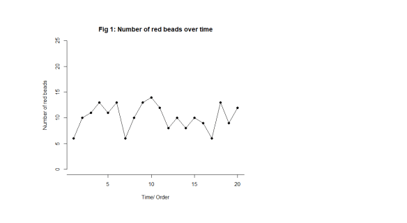
Let’s start off by looking at something we know to be predictable. Imagine a bucket of thousands of spherical beads. Of the beads, 80% are white and 20%, red. You are given a paddle that will hold 50 beads. Use the paddle to stir the beads then draw out 50 with the paddle. Count the red beads. Now you may, at this stage, object. Surely, this is just random and inherently unpredictable. But I want to persuade you that this is the most predictable data you have ever seen. Let’s look at some data from 20 sequential draws. In time order, of course, in Fig. 1.

Shew Chrt 1

Just to look at the data from another angle, always a good idea, I have added up how many times a particular value, 9, 10, 11, … , turns up and tallied them on the right hand side. For example, here is the tally for 12 beads in Fig. 2.

Shew Chrt 2

We get this in Fig. 3.

Shew Chrt 3

Here are the important features of the data.

  • We can’t predict what the exact value will be on any particular draw.
  • The numbers vary irregularly from draw to draw, as far as we can see.
  • We can say that draws will vary somewhere between 2 (say) and 19 (say).
  • Most of the draws are fairly near 10.
  • Draws near 2 and 19 are much rarer.

I would be happy to predict that the 21st draw will be between 2 and 19, probably not too far from 10. I have tried to capture that in Fig. 4. There are limits to variation suggested by the experience base. As predictions go, let me promise you, that is as good as it gets.

Even statistical theory would point to an outcome not so very different from that. That theoretical support adds to my confidence.

Shew Chrt 4

But there’s something else. Something profound.

A philosopher, an engineer and a statistician walk into a bar …

… and agree.

I got my last three bullet points above from just looking at the tally on the right hand side. What about the time order I was so insistent on preserving? As Daniel Kahneman put it “A random event does not … lend itself to explanation, but collections of random events do behave in a highly regular fashion.” What is this “regularity” when we can see how irregularly the draws vary? This is where time and narrative make their appearance.

If we take the draw data above, the exact same data, and “shuffle” it into a fresh order, we get this, Fig. 5.

Shew Chrt 5

Now the bullet points still apply to the new arrangement. The story, the narrative, has not changed. We still see the “irregular” variation. That is its “regularity”, that is tells the same story when we shuffle it. The picture and its inferences are the same. We cannot predict an exact value on any future draw yet it is all but sure to be between 2 and 19 and probably quite close to 10.

In 1924, British philosopher W E Johnson and US engineer Walter Shewhart, independently, realised that this was the key to describing a predicable process. It shows the same “regular irregularity”, or shall we say stable irregularity, when you shuffle it. Italian statistician Bruno de Finetti went on to derive the rigorous mathematics a few years later with his famous representation theorem. The most important theorem in the whole of statistics.

This is the exact characterisation of noise. If you shuffle it, it makes no difference to what you see or the conclusions you draw. It makes no difference to the narrative you construct (sic). Paradoxically, it is noise that is predictable.

To understand this, let’s look at some data that isn’t just noise.

Events, dear boy, events.

That was the alleged response of British Prime Minister Harold Macmillan when asked what had been the most difficult aspect of governing Britain.

Suppose our data looks like this in Fig. 6.

Shew Chrt 6

Let’s make it more interesting. Suppose we are looking at the net approval rating of a politician (Fig. 7).

Shew Chrt 7

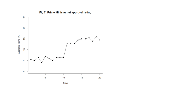
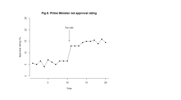
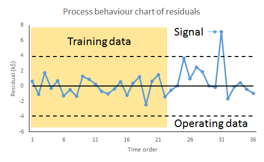
What this looks like is noise plus a material step change between the 10th and 11th observation. Now, this is a surprise. The regularity, and the predictability, is broken. In fact, my first reaction is to ask What happened? I research political events and find at that same time there was an announcement of universal tax cuts (Fig. 8). This is just fiction of course. That then correlates with the shift in the data I observe. The shift is a signal, a flag from the data telling me that something happened, that the stable irregularity has become an unstable irregularity. I use the time context to identify possible explanations. I come up with the tentative idea about tax cuts as an explanation of the sudden increase in popularity.

The bullet points above no longer apply. The most important feature of the data now is the shift, I say, caused by the Prime Minister’s intervention.

Shew Chrt 8

What happens when I shuffle the data into a random order though (Fig. 9)?

Shew Chrt 9

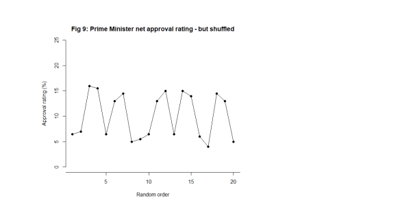
Now, the signal is distorted, hard to see and impossible to localise in time. I cannot tie it to a context. The message in the data is entirely different. The information in the chart is not preserved. The shuffled data does not bear the same narrative as the time ordered data. It does not tell the same story. It does not look the same. That is how I know there is a signal. The data changes its story when shuffled. The time order is crucial.

Of course, if I repeated the tally exercise that I did on Fig. 4, the tally would look the same, just as it did in the noise case in Fig. 5.

Is data with signals predictable?

The Prime Minister will say that they predicted that their tax cuts would be popular and they probably did so. My response to that would be to ask how big an improvement they predicted. While a response in the polls may have been foreseeable, specifying its magnitude is much more difficult and unlikely to be exact.

We might say that the approval data following the announcement has returned to stability. Can we not now predict the future polls? Perhaps tentatively in the short term but we know that “events” will continue to happen. Not all these will be planned by the government. Some government initiatives, triumphs and embarrassments will not register with the public. The public has other things to be interested in. Here is some UK data.

poll20180302

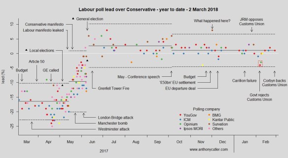
You can follow regular updates here if you are interested.

Shewhart’s ingenious chart

While Johnson and de Finetti were content with theory, Shewhart, working in the manufacture of telegraphy equipment, wanted a practical tool for his colleagues that would help them answer the question of predictability. A tool that would help users decide whether they were working with an environment sufficiently stable to be predictable. Moreover, he wanted a tool that would be easy to use by people who were short of time time for analysing data and had minds occupied by the usual distractions of the work place. He didn’t want people to have to run off to a statistician whenever they were perplexed by events.

In Part 2 I shall start to discuss how to construct Shewhart’s chart. In subsequent parts, I shall show you how to use it.

Advertisement

Get rich predicting the next recession – just watch the fertility statistics

… we are told. Or perhaps not. This was the research reported last week, with varying degrees of credulity, by the BBC here and The (London) Times here (£paywall). This turned out to be a press release about some academic research by Kasey Buckles of Notre Dame University and others. You have to pay USD 5 to get the academic paper. I shall come back to that.

The paper’s abstract claims as follows.

Many papers show that aggregate fertility is pro-cyclical over the business cycle. In this paper we do something else: using data on more than 100 million births and focusing on within-year changes in fertility, we show that for recent recessions in the United States, the growth rate for conceptions begins to fall several quarters prior to economic decline. Our findings suggest that fertility behavior is more forward-looking and sensitive to changes in short-run expectations about the economy than previously thought.

Now, here is a chart shared by the BBC.

Pregnancy and recession

The first thing to notice here is that we have exactly three observations. Three recession events with which to learn about any relationship between human sexual activity and macroeconomics. If you are the sort of person obsessed with “sample size”, and I know some of you are, ignore the misleading “100 million births” hold-out. Focus on the fact that n=3.

We are looking for a leading indicator, something capable of predicting a future event or outcome that we are bothered about. We need it to go up/ down before the up/ down event that we anticipate/ fear. Further it needs consistently to go up/ down in the right direction, by the right amount and in sufficient time for us to take action to correct, mitigate or exploit.

There is a similarity here to the hard and sustained thinking we have to do when we are looking for a causal relationship, though there is no claim to cause and effect here (c.f. the Bradford Hill guidelines). One of the most important factors in both is temporality. A leading indicator really needs to lead, and to lead in a regular way. Making predictions like, “There will be a recession some time in the next five years,” would be a shameless attempt to re-imagine the unsurprising as a signal novelty.

Having recognised the paucity of the data and the subtlety of identifying a usefully predictive effect, we move on to the chart. The chart above is pretty useless for the job at hand. Run charts with multiple variables are very weak tools for assessing association between factors, except in the most unambiguous cases. The chart broadly suggests some “association” between fertility and economic growth. It is possible to identify “big falls” both in fertility and growth and to persuade ourselves that the collapses in pregnancy statistics prefigure financial contraction. But the chart is not compelling evidence that one variable tracks the other reliably, even with a time lag. There looks like no evident global relationship between the variation in the two factors. There are big swings in each to which no corresponding event stands out in the other variable.

We have to go back and learn the elementary but universal lessons of simple linear regression. Remember that I told you that simple linear regression is the prototype of all successful statistical modelling and prediction work. We have to know whether we have a system that is sufficiently stable to be predictable. We have to know whether it is worth the effort. We have to understand the uncertainties in any prediction we make.

We do not have to go far to realise that the chart above cannot give a cogent answer to any of those. The exercise would, in any event, be a challenge with three observations. I am slightly resistant to spending GBP 3.63 to see the authors’ analysis. So I will reserve my judgment as to what the authors have actually done. I will stick to commenting on data journalism standards. However, I sense that the authors don’t claim to be able to predict economic growth simpliciter, just some discrete events. Certainly looking at the chart, it is not clear which of the many falls in fertility foreshadow financial and political crisis. With the myriad of factors available to define an “event”, it should not be too difficult, retrospectively, to define some fertility “signal” in the near term of the bull market and fit it astutely to the three data points.

As The Times, but not the BBC, reported:

However … the correlation between conception and recession is far from perfect. The study identified several periods when conceptions fell but the economy did not.

“It might be difficult in practice to determine whether a one-quarter drop in conceptions is really signalling a future downturn. However, this is also an issue with many commonly used economic indicators,” Professor Buckles told the Financial Times.

Think of it this way. There are, at most, three independent data points on your scatter plot. Really. And even then the “correlation … is far from perfect”.

And you have had the opportunity to optimise the time lag to maximise the “correlation”.

This is all probably what we suspected. What we really want is to see the authors put their money where their mouth is on this by wagering on the next recession, a point well made by Nassim Taleb’s new book Skin in the Game. What distinguishes a useful prediction is that the holder can use it to get the better of the crowd. And thinks the risks worth it.

As for the criticisms of economic forecasting generally, we get it. I would have thought though that the objective was to improve forecasting, not to satirise it.

UK Election of June 2017 – Polling review

Pollin2017Overview

Here are all the published opinion polls for the June 2017 UK general election, plotted as a Shewhart chart.

The Conservative lead over Labour had been pretty constant at 16% from February 2017, after May’s Lancaster House speech. The initial Natural Process Limits (“NPLs”) on the chart extend back to that date. Then something odd happened in the polls around Easter. There were several polls above the upper NPL. That does not seem to fit with any surrounding event. Article 50 had been declared two weeks before and had had no real immediate impact.

I suspect that the “fugue state” around Easter was reflected in the respective parties’ private polling. It is possible that public reaction to the election announcement somehow locked in the phenomenon for a short while.

Things then seem to settle down to the 16% lead level again. However, the local election results at the bottom of the range of polls ought to have sounded some alarm bells. Local election results are not a reliable predictor of general elections but this data should not have felt very comforting.

Then the slide in lead begins. But when exactly? A lot of commentators have assumed that it was the badly received Conservative Party manifesto that started the decline. It is not possible to be definitive from the chart but it is certainly arguable that it was the leak of the Labour Party manifesto that started to shift voting intention.

Then the swing from Conservative to Labour continued unabated to polling day.

Polling performance

How did the individual pollsters fair? I have, somewhat arbitrarily, summarised all polls conducted in the 10 days before the election (29 May to 7 June). Here is the plot along with the actual popular poll result which gave a 2.5% margin of Conservative over Labour. That is the number that everybody was trying to predict.

PollsterPerformance

The red points are the surveys from the 5 days before the election (3 to 7 June). Visually, they seem to be no closer, in general, than the other points (6 to 10 days before). The vertical lines are just an aid for the eye in grouping the points. The absence of “closing in” is confirmed by looking at the mean squared error (MSE) (in %2) for the points over 10 days (31.1) and 5 days (34.8). There is no evidence of polls closing in on the final result. The overall Shewhart chart certainly doesn’t suggest that.

Taking the polls over the 10 day period, then, here is the performance of the pollsters in terms of MSE. Lower MSE is better.

Pollster MSE
Norstat 2.25
Survation 2.31
Kantar Public 6.25
Survey Monkey 8.25
YouGov 9.03
Opinium 16.50
Qriously 20.25
Ipsos MORI 20.50
Panelbase 30.25
ORB 42.25
ComRes 74.25
ICM 78.36
BMG 110.25

Norstat and Survation pollsters will have been enjoying bonuses on the morning after the election. There are a few other commendable performances.

YouGov model

I should also mention the YouGov model (the green line on the Shewhart chart) that has an MSE of 2.25. YouGov conduct web-based surveys against at huge data base or around 50,000 registered participants. They also collect, with permission, deep demographic data on those individuals concerning income, profession, education and other factors. There is enough published demographic data from the national census to judge whether that is a representative frame from which to sample.

YouGov did not poll and publish the raw, or even adjusted, voting intention. They used their poll to  construct a model, perhaps a logistic regression or an artificial neural network, they don’t say, to predict voting intention from demographic factors. They then input into that model, not their own demographic data but data from the national census. That then gave their published forecast. I have to say that this looks about the best possible method for eliminating sampling frame effects.

It remains to be seen how widely this approach is adopted next time.

Regression done right: Part 3: Forecasts to believe in

There are three Sources of Uncertainty in a forecast.

  1. Whether the forecast is of “an environment that is sufficiently regular to be predictable”.1
  2. Uncertainty arising from the unexplained (residual) system variation.
  3. Technical statistical sampling error in the regression calculation.

Source of Uncertainty (3) is the one that fascinates statistical theorists. Sources (1) and (2) are the ones that obsess the rest of us. I looked at the first in Part 1 of this blog and, the second in Part 2. Now I want to look at the third Source of Uncertainty and try to put everything together.

If you are really most interested in (1) and (2), read “Prediction intervals” then skip forwards to “The fundamental theorem of forecasting”.

Prediction intervals

A prediction interval2 captures the range in which a future observation is expected to fall. Bafflingly, not all statistical software generates prediction intervals automatically so it is necessary, I fear, to know how to calculate them from first principles. However, understanding the calculation is, in itself, instructive.

But I emphasise that prediction intervals rely on a presumption that what is being forecast is “an environment that is sufficiently regular to be predictable”, that the (residual) business process data is exchangeable. If that presumption fails then all bets are off and we have to rely on a Cardinal Newman analysis. Of course, when I say that “all bets are off”, they aren’t. You will still be held to your existing contractual commitments even though your confidence in achieving them is now devastated. More on that another time.

Sources of variation in predictions

In the particular case of linear regression we need further to break down the third Source of Uncertainty.

  1. Uncertainty arising from the unexplained (residual) variation.
  2. Technical statistical sampling error in the regression calculation.
    1. Sampling error of the mean.
    2. Sampling error of the slope

Remember that we are, for the time being, assuming Source of Uncertainty (1) above can be disregarded. Let’s look at the other Sources of Uncertainty in turn: (2), (3A) and (3B).

Source of Variation (2) – Residual variation

We start with the Source of Uncertainty arising from the residual variation. This is the uncertainty because of all the things we don’t know. We talked about this a lot in Part 2. We are content, for the moment, that they are sufficiently stable to form a basis for prediction. We call this common cause variation. This variation has variance s2, where s is the residual standard deviation that will be output by your regression software.

RegressionResExpl2

Source of Variation (3A) – Sampling error in mean

To understand the next Source of Variation we need to know a little bit about how the regression is calculated. The calculations start off with the respective means of the X values ( X̄ ) and of the Y values ( Ȳ ). Uncertainty in estimating the mean of the Y , is the next contribution to the global prediction uncertainty.

An important part of calculating the regression line is to calculate the mean of the Ys. That mean is subject to sampling error. The variance of the sampling error is the familiar result from the statistics service course.

RegEq2

— where n is the number of pairs of X and Y. Obviously, as we collect more and more data this term gets more and more negligible.

RegressionMeanExpl

Source of Variation (3B) – Sampling error in slope

This is a bit more complicated. Skip forwards if you are already confused. Let me first give you the equation for the variance of predictions referable to sampling error in the slope.

RegEq3

This has now introduced the mysterious sum of squaresSXX. However, before we learn exactly what this is, we immediately notice two things.

  1. As we move away from the centre of the training data the variance gets larger.3
  2. As SXX gets larger the variance gets smaller.

The reason for the increasing sampling error as we move from the mean of X is obvious from thinking about how variation in slope works. The regression line pivots on the mean. Travelling further from the mean amplifies any disturbance in the slope.

RegressionSlopeExpl

Let’s look at where SXX comes from. The sum of squares is calculated from the Xs alone without considering the Ys. It is a characteristic of the sampling frame that we used to train the model. We take the difference of each X value from the mean of X, and then square that distance. To get the sum of squares we then add up all those individual squares. Note that this is a sum of the individual squares, not their average.

RegressionSXXTable

Two things then become obvious (if you think about it).

  1. As we get more and more data, SXX gets larger.
  2. As the individual Xs spread out over a greater range of XSXX gets larger.

What that (3B) term does emphasise is that even sampling error escalates as we exploit the edge of the original training data. As we extrapolate clear of the original sampling frame, the pure sampling error can quickly exceed even the residual variation.

Yet it is only a lower bound on the uncertainty in extrapolation. As we move away from the original range of Xs then, however happy we were previously with Source of Uncertainty (1), that the data was from “an environment that is sufficiently regular to be predictable”, then the question barges back in. We are now remote from our experience base in time and boundary. Nothing outside the original X-range will ever be a candidate for a comfort zone.

The fundamental theorem of prediction

Variances, generally, add up so we can sum the three Sources of Variation (2), (3A) and (3B). That gives the variance of an individual prediction, spred2. By an individual prediction I mean that somebody gives me an X and I use the regression formula to give them the (as yet unknown) corresponding Ypred.

RegEq4

It is immediately obvious that s2 is common to all three terms. However, the second and third terms, the sampling errors, can be made as small as we like by collecting more and more data. Collecting more and more data will have no impact on the first term. That arises from the residual variation. The stuff we don’t yet understand. It has variance s2, where s is the residual standard deviation that will be output by your regression software.

This, I say, is the fundamental theorem of prediction. The unexplained variation provides a hard limit on the precision of forecasts.

It is then a very simple step to convert the variance into a standard deviation, spred. This is the standard error of the prediction.4,5

RegEq5

Now, in general, where we have a measurement or prediction that has an uncertainty that can be characterised by a standard error u, there is an old trick for putting an interval round it. Remember that u is a measure of the variation in z. We can therefore put an interval around z as a number of standard errors, z±ku. Here, k is a constant of your choice. A prediction interval for the regression that generates prediction Ypred then becomes:

RegEq7

Choosing k=3 is very popular, conservative and robust.6,7 Other choices of k are available on the advice of a specialist mathematician.

It was Shewhart himself who took this all a bit further and defined tolerance intervals which contain a given proportion of future observations with a given probability.8 They are very much for the specialist.

Source of Variation (1) – Special causes

But all that assumes that we are sampling from “an environment that is sufficiently regular to be predictable”, that the residual variation is solely common cause. We checked that out on our original training data but the price of predictability is eternal vigilance. It can never be taken for granted. At any time fresh causes of variation may infiltrate the environment, or become newly salient because of some sensitising event or exotic interaction.

The real trouble with this world of ours is not that it is an unreasonable world, nor even that it is a reasonable one. The commonest kind of trouble is that it is nearly reasonable, but not quite. Life is not an illogicality; yet it is a trap for logicians. It looks just a little more mathematical and regular than it is; its exactitude is obvious, but its inexactitude is hidden; its wildness lies in wait.

G K Chesterton

The remedy for this risk is to continue plotting the residuals, the differences between the observed value and, now, the prediction. This is mandatory.

RegressionPBC2

Whenever we observe a signal of a potential special cause it puts us on notice to protect the forecast-user because our ability to predict the future has been exposed as deficient and fallible. But it also presents an opportunity. With timely investigation, a signal of a possible special cause may provide deeper insight into the variation of the cause-system. That in itself may lead to identifying further factors to build into the regression and a consequential reduction in s2.

It is reducing s2, by progressively accumulating understanding of the cause-system and developing the model, that leads to more precise, and more reliable, predictions.

Notes

  1. Kahneman, D (2011) Thinking, Fast and Slow, Allen Lane, p240
  2. Hahn, G J & Meeker, W Q (1991) Statistical Intervals: A Guide for Practitioners, Wiley, p31
  3. In fact s2/SXX is the sampling variance of the slope. The standard error of the slope is, notoriously, s/√SXX. A useful result sometimes. It is then obvious from the figure how variation is slope is amplified as we travel father from the centre of the Xs.
  4. Draper, N R & Smith, H (1998) Applied Regression Analysis, 3rd ed., Wiley, pp81-83
  5. Hahn & Meeker (1991) p232
  6. Wheeler, D J (2000) Normality and the Process Behaviour Chart, SPC Press, Chapter 6
  7. Vysochanskij, D F & Petunin, Y I (1980) “Justification of the 3σ rule for unimodal distributions”, Theory of Probability and Mathematical Statistics 21: 25–36
  8. Hahn & Meeker (1991) p231

Regression done right: Part 2: Is it worth the trouble?

In Part 1 I looked at linear regression from the point of view of machine learning and asked the question whether the data was from “An environment that is sufficiently regular to be predictable.”1 The next big question is whether it was worth it in the first place.

Variation explained

We previously looked at regression in terms of explaining variation. The original Big Y was beset with variation and uncertainty. We believed that some of that variation could be “explained” by a Big X. The linear regression split the variation in Y into variation that was explained by X and residual variation whose causes are as yet obscure.

I slipped in the word “explained”. Here it really means that we can draw a straight line relationship between X and Y. Of course, it is trite analytics that “association is not causation”. As long ago as 1710, Bishop George Berkeley observed that:2

The Connexion of Ideas does not imply the Relation of Cause and Effect, but only a Mark or Sign of the Thing signified.

Causation turns out to be a rather slippery concept, as all lawyers know, so I am going to leave it alone for the moment. There is a rather good discussion by Stephen Stigler in his recent book The Seven Pillars of Statistical Wisdom.3

That said, in real world practical terms there is not much point bothering with this if the variation explained by the X is small compared to the original variation in the Y with the majority of the variation still unexplained in the residuals.

Measuring variation

A useful measure of the variation in a quantity is its variance, familiar from the statistics service course. Variance is a good straightforward measure of the financial damage that variation does to a business.4 It also has the very nice property that we can add variances from sundry sources that aggregate together. Financial damage adds up. The very useful job that linear regression does is to split the variance of Y, the damage to the business that we captured with the histogram, into two components:

  • The contribution from X; and
  • The contribution of the residuals.

RegressionBlock1
The important thing to remember is that the residual variation is not some sort of technical statistical artifact. It is the aggregate of real world effects that remain unexamined and which will continue to cause loss and damage.

RegressionIshikawa2

Techie bit

Variance is the square of standard deviation. Your linear regression software will output the residual standard deviation, s, sometimes unhelpfully referred to as the residual standard error. The calculations are routine.5 Square s to get the residual variance, s2. The smaller is s2, the better. A small s2 means that not much variation remains unexplained. Small s2 means a very good understanding of the cause system. Large s2 means that much variation remains unexplained and our understanding is weak.
RegressionBlock2

The coefficient of determination

So how do we decide whether s2 is “small”? Dividing the variation explained by X by the total variance of Y, sY2,  yields the coefficient of determination, written as R2.6 That is a bit of a mouthful so we usually just call it “R-squared”. R2 sets the variance in Y to 100% and expresses the explained variation as a percentage. Put another way, it is the percentage of variation in Y explained by X.

RegressionBlock3
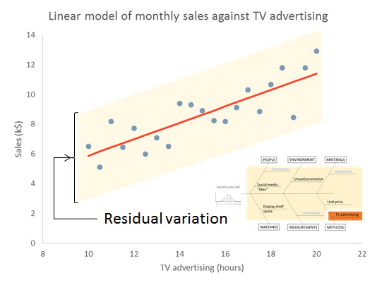
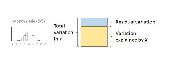
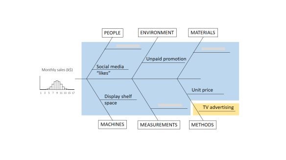
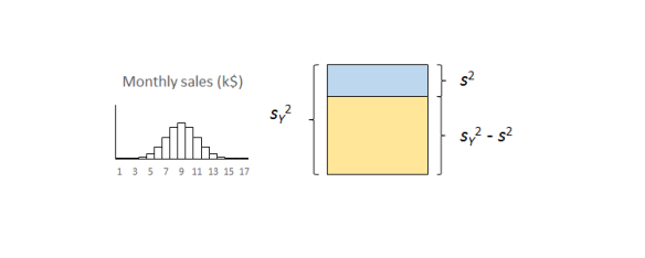
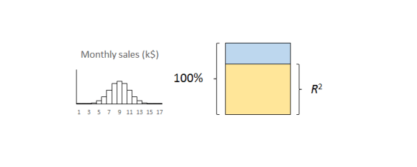
The important thing to remember is that the residual variation is not a statistical artifact of the analysis. It is part of the real world business system, the cause-system of the Ys.7 It is the part on which you still have little quantitative grasp and which continues to hurt you. Returning to the cause and effect diagram, we picked one factor X to investigate and took its influence out of the data. The residual variation is the variation arising from the aggregate of all the other causes.

As we shall see in more detail in Part 3, the residual variation imposes a fundamental bound on the precision of predictions from the model. It turns out that s is the limiting standard error of future predictions

Whether your regression was a worthwhile one or not so you will want to probe the residual variation further. A technique like DMAIC works well. Other improvement processes are available.

So how big should R2 be? Well that is a question for your business leaders not a statistician. How much does the business gain financially from being able to explain just so much variation in the outcome? Anybody with an MBA should be able to answer this so you should have somebody in your organisation who can help.

The correlation coefficient

Some people like to take the square root of R2 to obtain what they call a correlation coefficient. I have never been clear as to what this was trying to achieve. It always ends up telling me less than the scatter plot. So why bother? R2 tells me something important that I understand and need to know. Leave it alone.

What about statistical significance?

I fear that “significance” is, pace George Miller, “a word worn smooth by many tongues”. It is a word that I try to avoid. Yet it seems a natural practice for some people to calculate a p-value and ask whether the regression is significant.

I have criticised p-values elsewhere. I might calculate them sometimes but only because I know what I am doing. The terrible fact is that if you collect sufficient data then your regression will eventually be significant. Statistical significance only tells me that you collected a lot of data. That’s why so many studies published in the press are misleading. Collect enough data and you will get a “significant” result. It doesn’t mean it matters in the real world.

R2 is the real world measure of sensible trouble (relatively) impervious to statistical manipulation. I can make p as small as I like just by collecting more and more data. In fact there is an equation that, for any given R2, links p and the number of observations, n, for linear regression.8

FvR2 equation

Here, Fμ, ν(x) is the F-distribution with μ and ν degrees of freedom. A little playing about with that equation in Excel will reveal that you can make p as small as you like without R2 changing at all. Simply by making n larger. Collecting data until p is small is mere p-hacking. All p-values should be avoided by the novice. R2 is the real world measure (relatively) impervious to statistical manipulation. That is what I am interested in. And what your boss should be interested in.

Next time

Once we are confident that our regression model is stable and predictable, and that the regression is worth having, we can move on to the next stage.

Next time I shall look at prediction intervals and how to assess uncertainty in forecasts.

References

  1. Kahneman, D (2011) Thinking, Fast and Slow, Allen Lane, p240
  2. Berkeley, G (1710) A Treatise Concerning the Principles of Human Knowledge, Part 1, Dublin
  3. Stigler, S M (2016) The Seven Pillars of Statistical Wisdom, Harvard University Press, pp141-148
  4. Taguchi, G (1987) The System of Experimental Design: Engineering Methods to Optimize Quality and Minimize Costs, Quality Resources
  5. Draper, N R & Smith, H (1998) Applied Regression Analysis, 3rd ed., Wiley, p30
  6. Draper & Smith (1998) p33
  7. For an appealing discussion of cause-systems from a broader cultural standpoint see: Bostridge, I (2015) Schubert’s Winter Journey: Anatomy of an Obsession, Faber, pp358-365
  8. Draper & Smith (1998) p243