UK railway suicides – 2018 update

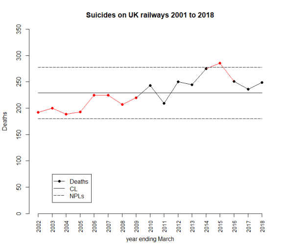
The latest UK rail safety statistics were published on 6 December 2018, again absent much of the press fanfare we had seen in the past. Regular readers of this blog will know that I have followed the suicide data series, and the press response, closely in 2017, 2016, 2015, 2014, 2013 and 2012. Again I have re-plotted the data myself on a Shewhart chart.
RailwaySuicides20181

Readers should note the following about the chart.

  • Many thanks to Tom Leveson Gower at the Office of Rail and Road who confirmed that the figures are for the year up to the end of March.
  • Some of the numbers for earlier years have been updated by the statistical authority.
  • I have recalculated natural process limits (NPLs) as there are still no more than 20 annual observations, and because the historical data has been updated. The NPLs have therefore changed but, this year, not by much.
  • Again, the pattern of signals, with respect to the NPLs, is similar to last year.

The current chart again shows the same two signals, an observation above the upper NPL in 2015 and a run of 8 below the centre line from 2002 to 2009. As I always remark, the Terry Weight rule says that a signal gives us license to interpret the ups and downs on the chart. So I shall have a go at doing that.

After two successive annual falls there has been an increase in the number of fatalities.

I haven’t yet seen any real contemporaneous comment on the numbers from the press this year. But what conclusions can we really draw?

In 2015 I was coming to the conclusion that the data increasingly looked like a gradual upward trend. The 2016 and 2017 data offered a challenge to that but my view was still that it was too soon to say that the trend had reversed. There was nothing in the data incompatible with a continuing trend. The decline has not continued but how much can we read into that? There is nothing inherently informative about a relative increase. Remember, the data would certainly have gone up or down. Then again, was there some sort of peak in 2015?

Signal or noise?

Has there been a change to the underlying cause system that drives the suicide numbers? Since the 2016 data, I have fitted a trend line through the data and asked which narrative best fitted what I observed, a continuing increasing trend or a trend that had plateaued or even reversed. You can review my analysis from 2016 here. And from 2017 here.

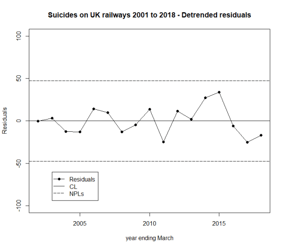
Here is the data and fitted trend updated with this year’s numbers, along with NPLs around the fitted line, the same as I did in 2016 and 2017.
RailwaySuicides20182

We always go back to the cause and effect diagram.

SuicideCne

As I always emphasise, the difficulty with the suicide data is that there is very little reproducible and verifiable knowledge as to its causes. There is a lot of useful thinking from common human experience and from more general theories in psychology. But the uncertainty is great. It is not possible to come up with a definitive cause and effect diagram on which all will agree, other from the point of view of identifying candidate factors. In statistical terminology, the problem lacks rigidity.

The earlier evidence of a trend, however, suggests that there might be some causes that are developing over time. It is not difficult to imagine that economic trends and the cumulative awareness of other fatalities might have an impact. We are talking about a number of things that might appear on the cause and effect diagram and some that do not, the “unknown unknowns”. When I identified “time” as a factor, I was taking sundry “lurking” factors and suspected causes from the cause and effect diagram that might have a secular impact. I aggregated them under the proxy factor “time” for want of a more refined analysis.

What I have tried to do is to split the data into two parts:

  • A trend (linear simply for the sake of exploratory data analysis (EDA)); and
  • The residual variation about the trend.

The question I want to ask is whether the residual variation is stable, just plain noise, or whether there is a signal there that might give me a clue that a linear trend does not hold.

There is no signal in the detrended data, no signal that the trend has reversed. The tough truth of the data is that it supports either narrative.

  • The upward trend is continuing and is stable. There has been no reversal of trend yet.
  • The raw data is not stable. True there is evidence of an upward trend in the past but there is now evidence that deaths are decreasing, notwithstanding the increase over the last year.

Of course, there is no particular reason, absent the data, to believe in an increasing trend and the initiative to mitigate the situation might well be expected to result in an improvement.

Sometimes, with data, we have to be honest and say that we do not have the conclusive answer. That is the case here. All that can be done is to continue the existing initiatives and look to the future. Nobody ever likes that as a conclusion but it is no good pretending things are unambiguous when that is not the case.

Next steps

Previously I noted proposals to repeat a strategy from Japan of bathing railway platforms with blue light. In the UK, I understand that such lights were installed at Gatwick in summer 2014. There is some recent commentary here from the BBC but I feel the absence of any real systematic follow up on this. I have certainly seen nothing from Gatwick. My wife and I returned through there mid-January this year and the lights are still in place.

A huge amount of sincere endeavour has gone into this issue but further efforts have to be against the background that there is still no conclusive evidence of improvement.

Suggestions for alternative analyses are always welcomed here.

Shewhart chart basics 1 – The environment sufficiently stable to be predictable

Everybody wants to be able to predict the future. Here is the forecaster’s catechism.

  • We can do no more that attach a probability to future events.
  • Where we have data from an environment that is sufficiently stable to be predictable we can project historical patterns into the future.
  • Otherwise, prediction is largely subjective;
  • … but there are tactics that can help.
  • The Shewhart chart is the tool that helps us know whether we are working with an environment that is sufficiently stable to be predictable.

Now let’s get to work.

What does a stable/ predictable environment look like?

Every trial lawyer knows the importance of constructing a narrative out of evidence, an internally consistent and compelling arrangement of the facts that asserts itself above competing explanations. Time is central to how a narrative evolves. It is time that suggests causes and effects, motivations, barriers and enablers, states of knowledge, external influences, sensitisers and cofactors. That’s why exploration of data always starts with plotting it in time order. Always.

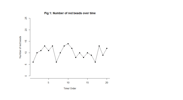
Let’s start off by looking at something we know to be predictable. Imagine a bucket of thousands of spherical beads. Of the beads, 80% are white and 20%, red. You are given a paddle that will hold 50 beads. Use the paddle to stir the beads then draw out 50 with the paddle. Count the red beads. Now you may, at this stage, object. Surely, this is just random and inherently unpredictable. But I want to persuade you that this is the most predictable data you have ever seen. Let’s look at some data from 20 sequential draws. In time order, of course, in Fig. 1.

Shew Chrt 1

Just to look at the data from another angle, always a good idea, I have added up how many times a particular value, 9, 10, 11, … , turns up and tallied them on the right hand side. For example, here is the tally for 12 beads in Fig. 2.

Shew Chrt 2

We get this in Fig. 3.

Shew Chrt 3

Here are the important features of the data.

  • We can’t predict what the exact value will be on any particular draw.
  • The numbers vary irregularly from draw to draw, as far as we can see.
  • We can say that draws will vary somewhere between 2 (say) and 19 (say).
  • Most of the draws are fairly near 10.
  • Draws near 2 and 19 are much rarer.

I would be happy to predict that the 21st draw will be between 2 and 19, probably not too far from 10. I have tried to capture that in Fig. 4. There are limits to variation suggested by the experience base. As predictions go, let me promise you, that is as good as it gets.

Even statistical theory would point to an outcome not so very different from that. That theoretical support adds to my confidence.

Shew Chrt 4

But there’s something else. Something profound.

A philosopher, an engineer and a statistician walk into a bar …

… and agree.

I got my last three bullet points above from just looking at the tally on the right hand side. What about the time order I was so insistent on preserving? As Daniel Kahneman put it “A random event does not … lend itself to explanation, but collections of random events do behave in a highly regular fashion.” What is this “regularity” when we can see how irregularly the draws vary? This is where time and narrative make their appearance.

If we take the draw data above, the exact same data, and “shuffle” it into a fresh order, we get this, Fig. 5.

Shew Chrt 5

Now the bullet points still apply to the new arrangement. The story, the narrative, has not changed. We still see the “irregular” variation. That is its “regularity”, that is tells the same story when we shuffle it. The picture and its inferences are the same. We cannot predict an exact value on any future draw yet it is all but sure to be between 2 and 19 and probably quite close to 10.

In 1924, British philosopher W E Johnson and US engineer Walter Shewhart, independently, realised that this was the key to describing a predicable process. It shows the same “regular irregularity”, or shall we say stable irregularity, when you shuffle it. Italian statistician Bruno de Finetti went on to derive the rigorous mathematics a few years later with his famous representation theorem. The most important theorem in the whole of statistics.

This is the exact characterisation of noise. If you shuffle it, it makes no difference to what you see or the conclusions you draw. It makes no difference to the narrative you construct (sic). Paradoxically, it is noise that is predictable.

To understand this, let’s look at some data that isn’t just noise.

Events, dear boy, events.

That was the alleged response of British Prime Minister Harold Macmillan when asked what had been the most difficult aspect of governing Britain.

Suppose our data looks like this in Fig. 6.

Shew Chrt 6

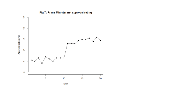
Let’s make it more interesting. Suppose we are looking at the net approval rating of a politician (Fig. 7).

Shew Chrt 7

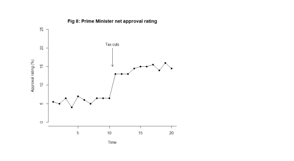
What this looks like is noise plus a material step change between the 10th and 11th observation. Now, this is a surprise. The regularity, and the predictability, is broken. In fact, my first reaction is to ask What happened? I research political events and find at that same time there was an announcement of universal tax cuts (Fig. 8). This is just fiction of course. That then correlates with the shift in the data I observe. The shift is a signal, a flag from the data telling me that something happened, that the stable irregularity has become an unstable irregularity. I use the time context to identify possible explanations. I come up with the tentative idea about tax cuts as an explanation of the sudden increase in popularity.

The bullet points above no longer apply. The most important feature of the data now is the shift, I say, caused by the Prime Minister’s intervention.

Shew Chrt 8

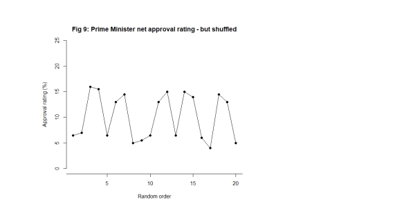
What happens when I shuffle the data into a random order though (Fig. 9)?

Shew Chrt 9

Now, the signal is distorted, hard to see and impossible to localise in time. I cannot tie it to a context. The message in the data is entirely different. The information in the chart is not preserved. The shuffled data does not bear the same narrative as the time ordered data. It does not tell the same story. It does not look the same. That is how I know there is a signal. The data changes its story when shuffled. The time order is crucial.

Of course, if I repeated the tally exercise that I did on Fig. 4, the tally would look the same, just as it did in the noise case in Fig. 5.

Is data with signals predictable?

The Prime Minister will say that they predicted that their tax cuts would be popular and they probably did so. My response to that would be to ask how big an improvement they predicted. While a response in the polls may have been foreseeable, specifying its magnitude is much more difficult and unlikely to be exact.

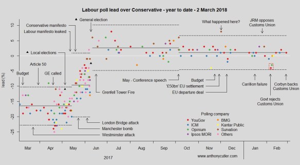
We might say that the approval data following the announcement has returned to stability. Can we not now predict the future polls? Perhaps tentatively in the short term but we know that “events” will continue to happen. Not all these will be planned by the government. Some government initiatives, triumphs and embarrassments will not register with the public. The public has other things to be interested in. Here is some UK data.

poll20180302

You can follow regular updates here if you are interested.

Shewhart’s ingenious chart

While Johnson and de Finetti were content with theory, Shewhart, working in the manufacture of telegraphy equipment, wanted a practical tool for his colleagues that would help them answer the question of predictability. A tool that would help users decide whether they were working with an environment sufficiently stable to be predictable. Moreover, he wanted a tool that would be easy to use by people who were short of time time for analysing data and had minds occupied by the usual distractions of the work place. He didn’t want people to have to run off to a statistician whenever they were perplexed by events.

In Part 2 I shall start to discuss how to construct Shewhart’s chart. In subsequent parts, I shall show you how to use it.

UK railway suicides – 2017 update

The latest UK rail safety statistics were published on 23 November 2017, again absent much of the press fanfare we had seen in the past. Regular readers of this blog will know that I have followed the suicide data series, and the press response, closely in 2016, 20152014, 2013 and 2012. Again I have re-plotted the data myself on a Shewhart chart.

RailwaySuicides20171

Readers should note the following about the chart.

  • Many thanks to Tom Leveson Gower at the Office of Rail and Road who confirmed that the figures are for the year up to the end of March.
  • Some of the numbers for earlier years have been updated by the statistical authority.
  • I have recalculated natural process limits (NPLs) as there are still no more than 20 annual observations, and because the historical data has been updated. The NPLs have therefore changed but, this year, not by much.
  • Again, the pattern of signals, with respect to the NPLs, is similar to last year.

The current chart again shows two signals, an observation above the upper NPL in 2015 and a run of 8 below the centre line from 2002 to 2009. As I always remark, the Terry Weight rule says that a signal gives us license to interpret the ups and downs on the chart. So I shall have a go at doing that.

It will not escape anybody’s attention that this is now the second year in which there has been a fall in the number of fatalities.

I haven’t yet seen any real contemporaneous comment on the numbers from the press. This item appeared on the BBC, a weak performer in the field of data journalism but clearly with privileged access to the numbers, on 30 June 2017, confidently attributing the fall to past initiatives.

Sky News clearly also had advanced sight of the numbers and make the bold claim that:

… for every death, six more lives were saved through interventions.

That item goes on to highlight a campaign to encourage fellow train users to engage with anybody whose behaviour attracted attention.

But what conclusions can we really draw?

In 2015 I was coming to the conclusion that the data increasingly looked like a gradual upward trend. The 2016 data offered a challenge to that but my view was still that it was too soon to say that the trend had reversed. There was nothing in the data incompatible with a continuing trend. This year, 2017, has seen 2016’s fall repeated. A welcome development but does it really show conclusively that the upward trending pattern is broken? Regular readers of this blog will know that Langian statistics like “lowest for six years” carry no probative weight here.

Signal or noise?

Has there been a change to the underlying cause system that drives the suicide numbers? Last year, I fitted a trend line through the data and asked which narrative best fitted what I observed, a continuing increasing trend or a trend that had plateaued or even reversed. You can review my analysis from last year here.

Here is the data and fitted trend updated with this year’s numbers, along with NPLs around the fitted line, the same as I did last year.

RailwaySuicides20172

Let’s think a little deeper about how to analyse the data. The first step of any statistical investigation ought to be the cause and effect diagram.

SuicideCne

The difficulty with the suicide data is that there is very little reproducible and verifiable knowledge as to its causes. I have seen claims, of whose provenance I am uncertain, that railway suicide is virtually unknown in the USA. There is a lot of useful thinking from common human experience and from more general theories in psychology. But the uncertainty is great. It is not possible to come up with a definitive cause and effect diagram on which all will agree, other from the point of view of identifying candidate factors.

The earlier evidence of a trend, however, suggests that there might be some causes that are developing over time. It is not difficult to imagine that economic trends and the cumulative awareness of other fatalities might have an impact. We are talking about a number of things that might appear on the cause and effect diagram and some that do not, the “unknown unknowns”. When I identified “time” as a factor, I was taking sundry “lurking” factors and suspected causes from the cause and effect diagram that might have a secular impact. I aggregated them under the proxy factor “time” for want of a more exact analysis.

What I have tried to do is to split the data into two parts:

  • A trend (linear simply for the sake of exploratory data analysis (EDA); and
  • The residual variation about the trend.

The question I want to ask is whether the residual variation is stable, just plain noise, or whether there is a signal there that might give me a clue that a linear trend does not hold.

There is no signal in the detrended data, no signal that the trend has reversed. The tough truth of the data is that it supports either narrative.

  • The upward trend is continuing and is stable. There has been no reversal of trend yet.
  • The data is not stable. True there is evidence of an upward trend in the past but there is now evidence that deaths are decreasing.

Of course, there is no particular reason, absent the data, to believe in an increasing trend and the initiative to mitigate the situation might well be expected to result in an improvement.

Sometimes, with data, we have to be honest and say that we do not have the conclusive answer. That is the case here. All that can be done is to continue the existing initiatives and look to the future. Nobody ever likes that as a conclusion but it is no good pretending things are unambiguous when that is not the case.

Next steps

Previously I noted proposals to repeat a strategy from Japan of bathing railway platforms with blue light. In the UK, I understand that such lights were installed at Gatwick in summer 2014. In fact my wife and I were on the platform at Gatwick just this week and I had the opportunity to observe them. I also noted, on my way back from court the other day, blue strip lights along the platform edge at East Croydon. I think they are recently installed. However, I have not seen any data or heard of any analysis.

A huge amount of sincere endeavour has gone into this issue but further efforts have to be against the background that there is still no conclusive evidence of improvement.

Suggestions for alternative analyses are always welcomed here.