Soccer management – signal, noise and contract negotiation

Some poor data journalism here from the BBC on 28 May 2015, concerning turnover in professional soccer managers in England. “Managerial sackings reach highest level for 13 years” says the headline. A classic executive time series. What is the significance of the 13 years? Other than it being the last year with more sackings than the present.

The data was purportedly from the League Managers’ Association (LMA) and their Richard Bevan thought the matter “very concerning”. The BBC provided a chart (fair use claimed).

MgrSackingsto201503

Now, I had a couple of thoughts as soon as I saw this. Firstly, why chart only back to 2005/6? More importantly, this looked to me like a stable system of trouble (for football managers) with the possible exception of this (2014/15) season’s Championship coach turnover. Personally, I detest multiple time series on a common chart unless there is a good reason for doing so. I do not think it the best way of showing variation and/ or association.

Signal and noise

The first task of any analyst looking at data is to seek to separate signal from noise. Nate Silver made this point powerfully in his book The Signal and the Noise: The Art and Science of Prediction. As Don Wheeler put it: all data has noise; some data has signal.

Noise is typically the irregular aggregate of many causes. It is predictable in the same way as a roulette wheel. A signal is a sign of some underlying factor that has had so large an effect that it stands out from the noise. Signals can herald a fundamental unpredictability of future behaviour.

If we find a signal we look for a special cause. If we start assigning special causes to observations that are simply noise then, at best, we spend money and effort to no effect and, at worst, we aggravate the situation.

The Championship data

In any event, I wanted to look at the data for myself. I was most interested in the Championship data as that was where the BBC and LMA had been quick to find a signal. I looked on the LMA’s website and this is the latest data I found. The data only records dismissals up to 31 March of the 2014/15 season. There were 16. The data in the report gives the total number of dismissals for each preceding season back to 2005/6. The report separates out “dismissals” from “resignations” but does not say exactly how the classification was made. It can be ambiguous. A manager may well resign because he feels his club have themselves repudiated his contract, a situation known in England as constructive dismissal.

The BBC’s analysis included dismissals right up to the end of each season including 2014/15. Reading from the chart they had 20. The BBC have added some data for 2014/15 that isn’t in the LMA report and not given the source. I regard that as poor data journalism.

I found one source of further data at website The Sack Race. That told me that since the end of March there had been four terminations.

Manager Club Termination Date
Malky Mackay Wigan Athletic Sacked 6 April
Lee Clark Blackpool Resigned 9 May
Neil Redfearn Leeds United Contract expired 20 May
Steve McClaren Derby County Sacked 25 May

As far as I can tell, “dismissals” include contract non-renewals and terminations by mutual consent. There are then a further three dismissals, not four. However, Clark left Blackpool amid some corporate chaos. That is certainly a termination that is classifiable either way. In any event, I have taken the BBC figure at face value though I am alerted as to some possible data quality issues here.
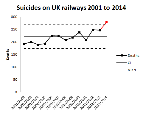
Signal and noise

Looking at the Championship data, this was the process behaviour chart, plotted as an individuals chart.

MgrSackingsto201503

There is a clear signal for the 2014/15 season with an observation, 20 dismissals,, above the upper natural process limit of 19.18 dismissals. Where there is a signal we should seek a special cause. There is no guarantee that we will find a special cause. Data limitations and bounded rationality are always constraints. In fact, there is no guarantee that there was a special cause. The signal could be a false positive. Such effects cannot be eliminated. However, signals efficiently direct our limited energy for, what Daniel Kahneman calls, System 2 thinking towards the most promising enquiries.

Analysis

The BBC reports one narrative woven round the data.

Bevan said the current tenure of those employed in the second tier was about eight months. And the demand to reach the top flight, where a new record £5.14bn TV deal is set to begin in 2016, had led to clubs hitting the “panic button” too quickly.

It is certainly a plausible view. I compiled a list of the dismissals and non-renewals, not the resignations, with data from Wikipedia and The Sack Race. I only identified 17 which again suggests some data quality issue around classification. I have then charted a scatter plot of date of dismissal against the club’s then league position.

MgrSackings201415

It certainly looks as though risk of relegation is the major driver for dismissal. Aside from that, Watford dismissed Billy McKinlay after only two games when they were third in the league, equal on points with the top two. McKinlay had been an emergency appointment after Oscar Garcia had been compelled to resign through ill health. Watford thought they had quickly found a better manager in Slavisa Jokanovic. Watford ended the season in second place and were promoted to the Premiership.

There were two dismissals after the final game on 2 May by disappointed mid-table teams. Beyond that, the only evidence for impulsive managerial changes in pursuit of promotion is the three mid-season, mid-table dismissals.

Club league position
Manager Club On dismissal At end of season
Nigel Adkins Reading 16 19
Bob Peeters Charlton Athletic 14 12
Stuart Pearce Nottingham Forrest 12 14

A table that speaks for itself. I am not impressed by the argument that there has been the sort of increase in panic sackings that Bevan fears. Both Blackpool and Leeds experienced chaotic executive management which will have resulted in an enhanced force of mortality on their respective coaches. That along with the data quality issues and the technical matter I have described below lead me to feel that there was no great enhanced threat to the typical Championship manager in 2014/15.

Next season I would expect some regression to the mean with a lower number of dismissals. Not much of a prediction really but that’s what the data tells me. If Bevan tries to attribute that to the LMA’s activism them I fear that he will be indulging in Langian statistical analysis. Will he be able to resist?

Techie bit

I have a preference for individuals charts but I did also try plotting the data on an np-chart where I found no signal. It is trite service-course statistics that a Poisson distribution with mean λ has standard deviation √λ so an upper 3-sigma limit for a (homogeneous) Poisson process with mean 11.1 dismissals would be 21.1 dismissals. Kahneman has cogently highlighted how people tend to see patterns in data as signals even where they are typical of mere noise. In this case I am aware that the data is not atypical of a Poisson process so I am unsurprised that I failed to identify a special cause.

A Poisson process with mean 11.1 dismissals is a pretty good model going forwards and that is the basis I would press on any managers in contract negotiations.

Of course, the clubs should remember that when they look for a replacement manager they will then take a random sample from the pool of job seekers. Really!

Advertisement

UK railway suicides – 2014 update

It’s taken me a while to sit down and blog about this news item from October 2014: Sharp Rise in Railway Suicides Say Network Rail . Regular readers of this blog will know that I have followed this data series closely in 2013 and 2012.

The headline was based on the latest UK government data. However, I baulk at the way these things are reported by the press. The news item states as follows.

The number of people who have committed suicide on Britain’s railways in the last year has almost reached 300, Network Rail and the Samaritans have warned. Official figures for 2013-14 show there have already been 279 suicides on the UK’s rail network – the highest number on record and up from 246 in the previous year.

I don’t think it’s helpful to characterise 279 deaths as “almost … 300”, where there is, in any event, no particular significance in the number 300. It arbitrarily conveys the impression that some pivotal threshold is threatened. Further, there is no especial significance in an increase from 246 to 279 deaths. Another executive time series. Every one of the 279 is a tragedy as is every one of the 246. The experience base has varied from year to year and there is no surprise that it has varied again. To assess the tone of the news report I have replotted the data myself.

RailwaySuicides3

Readers should note the following about the chart.

  • Some of the numbers for earlier years have been updated by the statistical authority.
  • I have recalculated natural process limits as there are still no more than 20 annual observations.
  • There is now a signal (in red) of an observation above the upper natural process limit.

The news report is justified, unlike the earlier ones. There is a signal in the chart and an objective basis for concluding that there is more than just a stable system of trouble. There is a signal and not just noise.

As my colleague Terry Weight always taught me, a signal gives us license to interpret the ups and downs on the chart. There are two possible narratives that immediately suggest themselves from the chart.

  • A sudden increase in deaths in 2013/14; or
  • A gradual increasing trend from around 200 in 2001/02.

The chart supports either story. To distinguish would require other sources of information, possibly historical data that can provide some borrowing strength, or a plan for future data collection. Once there is a signal, it makes sense to ask what was its cause. Building  a narrative around the data is a critical part of that enquiry. A manager needs to seek the cause of the signal so that he or she can take action to improve system outcomes. Reliably identifying a cause requires trenchant criticism of historical data.

My first thought here was to wonder whether the railway data simply reflected an increasing trend in suicide in general. Certainly a very quick look at the data here suggests that the broader trend of suicides has been downwards and certainly not increasing. It appears that there is some factor localised to railways at work.

I have seen proposals to repeat a strategy from Japan of bathing railway platforms with blue light. I have not scrutinised the Japanese data but the claims made in this paper and this are impressive in terms of purported incident reduction. If these modifications are implemented at British stations we can look at the chart to see whether there is a signal of fewer suicides. That is the only real evidence that counts.

Those who were advocating a narrative of increasing railway suicides in earlier years may feel vindicated. However, until this latest evidence there was no signal on the chart. There is always competition for resources and directing effort on a false assumptions leads to misallocation. Intervening in a stable system of trouble, a system featuring only noise, on the false belief that there is a signal will usually make the situation worse. Failing to listen to the voice of the process on the chart risks diverting vital resources and using them to make outcomes worse.

Of course, data in terms of time between incidents is much more powerful in spotting an early signal. I have not had the opportunity to look at such data but it would have provided more, better and earlier evidence.

Where there is a perception of a trend there will always be an instinctive temptation to fit a straight line through the data. I always ask myself why this should help in identifying the causes of the signal. In terms of analysis at this stage I cannot see how it would help. However, when we come to look for a signal of improvement in future years it may well be a helpful step.

Sad news on railway suicide statistics

I recently blogged about statistics of suicides on British railways here and here. Some very worthwhile programmes had been put in place with the objective of reducing these tragic deaths. However, my view at the point of my earlier posts was that this was a stable system of trouble, that there was neither a deteriorating trend nor any sign of improvement.

I now have the statistics for 2012/2013 to hand, released without any framing press notice. Here is the updated process behaviour chart.
RailwaySuicides2

Readers should note the following about the chart.

  • Some of the numbers for earlier years have been updated by the statistical authority.
  • I have recalculated natural process limits as there are still no more than 20 annual observations.
  • There is still no signal of improvement or deterioration.

I fear that this is the tough discipline of the chart. It confronts us with current reality and deprives us of the opportunity to find comforting messages. Only a signal on the chart would be evidence of improvement. Statistics are not there to be selectively reported only when they fit our wishes and hopes. Statistics are to be charted, and reported, and discussed, and used as a basis for managing any operation; year in, year out.

Remember that in leading any operation the manager is confined to the retreating picture in the rearview mirror. Without the process behaviour chart, the manager is deprived even of that rear view.

It is a sad picture but improvement only comes from confronting current failure and finding new ways to intervene and redesign. Nobody will benefit from an ultimately vain quest for comforting messages.

Suicide statistics for British railways

I chose a prosaic title because it’s not a subject about which levity is appropriate. I remain haunted by this cyclist on the level crossing. As a result I thought I would delve a little into railway accident statistics. The data is here. Unfortunately, the data only goes back to 2001/2002. This is a common feature of government data. There is no long term continuity in measurement to allow proper understanding of variation, trends and changes. All this encourages the “executive time series” that are familiar in press releases. I think that I shall call this political amnesia. When I have more time I shall look for a longer time series. The relevant department is usually helpful if contacted directly.

However, while I was searching I found this recent report on Railway Suicides in the UK: risk factors and prevention strategies. The report is by Kamaldeep Bhui and Jason Chalangary of the Wolfson Institute of Preventive Medicine, and Edgar Jones of the Institute of Psychiatry, King’s College, London. Originally, I didn’t intend to narrow my investigation to suicides but there were some things in the paper that bothered me and I felt were worth blogging about.

Obviously this is really important work. No civilised society is indifferent to tragedies such as suicide whose consequences are absorbed deeply into the community. The report analyses a wide base of theories and interventions concerning railway suicide risk. There is a lot of information and the authors have done an important job in bringing together and seeking conclusions. However, I was bothered by this passage (at p5).

The Rail Safety and Standards Board (RSSB) reported a progressive rise in suicides and suspected suicides from 192 in 2001-02 to a peak 233 in 2009-10, the total falling to 208 in 2010-11.

Oh dear! An “executive time series”. Let’s look at the data on a process behaviour chart.

RailwaySuicides1

There is no signal, even ignoring the last observation in 2011/2012 which the authors had not had to hand. There has been no increasing propensity for suicide since 2001. The writers have been, as Nassim Taleb would put it, “fooled by randomness”. In the words of Nate Silver, they have confused signal and noise. The common cause variation in the data has been over interpreted by zealous and well meaning policy makers as an upward trend. However, all diligent risk managers know that interpretation of a chart is forbidden if there is no signal. Over interpretation will lead to (well meaning) over adjustment and admixture of even more variation into a stable system of trouble.

Looking at the development of the data over time I can understand that there will have been a temptation to perform a regression analysis and calculate a p-value for the perceived slope. This is an approach to avoid in general. It is beset with the dangers of testing effects suggested by the data and the general criticisms of p-values made by McCloskey and Ziliak. It is not a method that will be a reliable guide to future action. For what it’s worth I got a p-value of 0.015 for the slope but I am not impressed. I looked to see if I could find a pattern in the data then tested for the pattern my mind had created. It is unsurprising that it was “significant”.

The authors of the report go on to interpret the two figures for 2009/2010 (233 suicides) and 2010/2011 (208 suicides) as a “fall in suicides”. It is clear from the process behaviour chart that this is not a signal of a fall in suicides. It is simply noise, common cause variation from year to year.

Having misidentified this as a signal they go on to seek a cause. Of course they “find” a potential cause. A partnership between Network Rail and the Samaritans, Men on the Ropes, had started in January 2010. The programme’s aim was to reduce suicides by 20% over five years. I genuinely hope that the programme shows success. However, the programme will not be assisted by thinking that it has yet shown signs of improvement.

With the current mean annual total at 211, a 20% reduction entails a new mean of 169 annual suicides.That is an ambitious target I think, and I want to emphasise that the programme is entirely laudable and plausible. However, whether it succeeds is to be judged by the figures on the process behaviour chart, not by any post hoc rationalisation. This is the tough discipline of the charts. It is no longer possible to claim an improvement where that is not supported by the data.

I will come back to this data next year and look to see if there are any signs of encouragement.

Adoption statistics for England – signals of improvement?

I am adopted so I follow the politics of adoption fairly carefully. I was therefore interested to see this report on the BBC, claiming a “record” increase in adoptions. The quotation marks are the BBC’s. The usual meaning of such quotes is that the word “record” is not being used with its usual meaning. I note that the story was repeated in several newspapers this morning.

The UK government were claiming a 15% increase in children adopted from local authority care over the last year and the highest total since data had been collected on this basis starting in 1992.

Most people will, I think, recognise what Don Wheeler calls an executive time series. A comparison of two numbers ignoring any broader historical trends or context. Of course, any two consecutive numbers will be different. One will be greater than the other. Without the context that gives rise to the data, a comparison of two numbers is uninformative.

I decided to look at the data myself by following the BBC link to the GOV.UK website. I found a spreadsheet there but only with data from 2009 to 2013. I dug around a little more and managed to find 2006 to 2008. However, the website told me that to find any earlier data I would have to consult the National Archives. At the same time it told me that the search function at the National Archives did not work. I ended up browsing 30 web pages of Department of Education documents and managed to get figures back to 2004. However, when I tried to browse back beyond documents dated January 2008, I got “Sorry, the page you were looking for can’t be found” and an invitation to use the search facility. Needless to say, I failed to find the missing data back to 1992, there or on the Office for National Statistics website. It could just be my internet search skills that are wanting but I spent an hour or so on this.

Gladly, Justin Ushie and Julie Glenndenning from the Department for Education were able to help me and provided much of the missing data. Many thanks to them both. Unfortunately, even they could not find the data for 1992 and 1993.

Here is the run chart.

Adoption1

Some caution is needed in interpreting this chart because there is clearly some substantial serial correlation in the annual data. That said, I am not able to quite persuade myself that the 2013 figure represents a signal. Things look much better than the mid-1990s but 2013 still looks consistent with a system that has been stable since the early years of the century.

The mid 1990s is a long time ago so I also wanted to look at adoptions as a percentage of children in care. I don’t think that that is automatically a better measure but I wanted to check that it didn’t yield a different picture.

Adoption2

That confirms the improvement since the mid-1990s but the 2013 figures now look even less remarkable against the experience base of the rest of the 21st century.

I would like to see these charts with all the interventions and policy changes of respective governments marked. That would then properly set the data in context and assist interpretation. There would be an opportunity to build a narrative, add natural process limits and come to a firmer view about whether there was a signal. Sadly, I have not found an easy way of building a chronology of intervention from government publications.

Anyone holding themselves out as having made an improvement must bring forward the whole of the relevant context for the data. That means plotting data over time and flagging background events. It is only then that the decision maker, or citizen, can make a proper assessment of whether there has been an improvement. The simple chart of data against time, even without natural process limits, is immensely richer than a comparison of two selected numbers.

Properly capturing context is the essence of data visualization and the beginnings of graphical excellence.

One my favourite slogans:

In God we trust. All else bring data.

W Edwards Deming

I plan to come back to this data in 2014.