Populism and p-values

Time for The Guardian to get the bad data-journalism award for this headline (25 February 2019).

Vaccine scepticism grows in line with rise of populism – study

Surges in measles cases map tightly to countries where populism is on the march

The report was a journalistic account of a paper by Jonathan Kennedy of the Global Health Unit, Centre for Primary Care and Public Health, Barts and the London School of Medicine and Dentistry, Queen Mary University of London, entitled Populist politics and vaccine hesitancy in Western Europe: an analysis of national-level data.1

Studies show a strong correlation between votes for populist parties and doubts that vaccines work, declared the newspaper, relying on support from the following single chart redrawn by The Guardian‘s own journalists.
PV Fig 1
It seemed to me there was more to the chart than the newspaper report. Is it possible this was all based on an uncritical regression line? Like this (hand drawn line but, believe me, it barely matters – you get the idea).
PV Fig 2
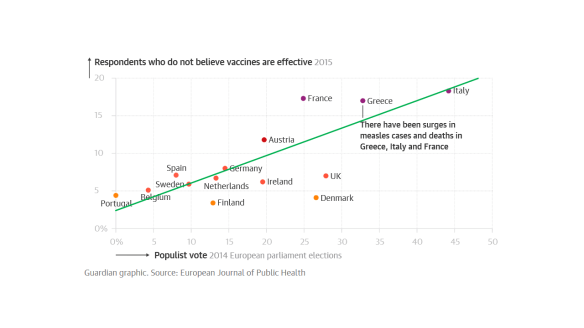
Perhaps there was a p-value too but I shall come back to that. However, looking back at the raw chart, I wondered if it wouldn’t bear a different analysis. The 10 countries, Portugal, …, Denmark and the UK all have “vaccine hesitancy” rates around 6%. That does not vary much with populist support varying between 0% and 27% between them. Again, France, Greece and Germany all have “hesitancy” rates of around 17%, such rate not varying much with populist support varying from 25% to 45%. In fact the Guardian journalist seems to have had that though too. The two groups are colour coded on the chart. So much for the relationship between “populism” and “vaccine hesitancy”. Austria seems not to fit into either group but perhaps that makes it interesting. France has three times the hesitancy of Denmark but is less “populist”.

So what about this picture?
PV Fig 3
Perhaps there are two groups, one with “hesitancy” around 6% and one, around 17%. Austria is an interesting exception. What differences are there between the two groups, aside from populist sentiment? I don’t know because it’s not my study or my domain of knowledge. But, whenever there is a contrast between two groups we ought to explore all the differences we can think of before putting forward an, even tentative, explanation. That’s what Ignaz Semmelweis did when he observed signal differences in post-natal mortality between two wards of the Vienna General Hospital in the 1840s.2 Austria again, coincidentally. He investigated all the differences that he could think of between the wards before advancing and testing his theory of infection. As to the vaccine analysis, we already suspect that there are particular dynamics in Italy around trust in bureaucracy. That’s where the food scare over hormone-treated beef seems to have started so there may be forces at work that make it atypical of the other countries.3, 4, 5

Slightly frustrated, I decided that I wanted to look at the original publication. This was available free of charge on the publisher’s website at the time I read The Guardian article. But now it isn’t. You will have to pay EUR 36, GBP 28 or USD 45 for 24 hour access. Perhaps you feel you already paid.

The academic research

The “populism” data comes from votes cast in the 2014 elections to the European Parliament. That means that the sampling frame was voters in that election. Turnout in the election was 42%. That is not the whole of the population of the respective countries and voters at EU elections are, I think I can safely say, are not representative of the population at large. The “hesitancy” data came from something called the Vaccine Confidence Project (“the VCP”) for which citations are given. It turns out that 65,819 individuals were sampled across 67 countries in 2015. I have not looked at details of the frame, sampling, handling of non-responses, adjustments and so on, but I start off by noting that the two variables are sampled from, inevitably, different frames and that is not really discussed in the paper. Of course here, We make no mockery of honest ad-hockery.6

The VCP put a number of questions to the respondents. It is not clear from the paper whether there were more questions than analysed here. Each question was answered “strongly agree”, “tend to agree”, “do not know”, “tend to disagree”, and “strongly disagree”. The “hesitancy” variable comes from the aggregate of the latter two categories. I would like to have seen the raw data.

The three questions are set out below, along with the associated R2s from the regression analysis.

Question R2
(1) Vaccines are important for children to have 63%
(2) Overall I think vaccines are effective 52%
(3) Overall I think vaccines are safe. 25%

Well the individual questions raise issues about variation in interpreting the respective meanings, notwithstanding translation issues between languages, fidelity and felicity.

As I guessed, there were p-values but, as usual, they add nil to the analysis.

We now see that the plot reproduced in The Guardian is for question (2) alone and has  R2 = 52%. I would have been interested in seeing R2 for my 2-level analysis. The plotted response for question (1) (not reproduced here) actually looks a bit more like a straight line and has better fit. However, in both cases, I am worried by how much leverage the Italy group has. Not discussed in the paper. No regression diagnostics.

So how about this picture, from Kennedy’s paper, for the response to question (3)?

PV Fig 5

Now, the variation in perceptions of vaccine safety, between France, Greece and Italy, is greater than between the remainder countries. Moreover, if anything, among that group, there is evidence that “hesitancy” falls as “populism” increases. There is certainly no evidence that it increases. In my opinion, that figure is powerful evidence that there are other important factors at work here. That is confirmed by the lousy R2 = 25% for the regression. And this is about perceptions of vaccine safety specifically.

I think that the paper also suffers from a failure to honour John Tukey’s trenchant distinction between exploratory data analysis and confirmatory data analysis. Such a failure always leads to trouble.

Confirmation bias

On the basis of his analysis, Kennedy felt confident to conclude as follows.

Vaccine hesitancy and political populism are driven by similar dynamics: a profound distrust in elites and experts. It is necessary for public health scholars and actors to work to build trust with parents that are reluctant to vaccinate their children, but there are limits to this strategy. The more general popular distrust of elites and experts which informs vaccine hesitancy will be difficult to resolve unless its underlying causes—the political disenfranchisement and economic marginalisation of large parts of the Western European population—are also addressed.

Well, in my opinion that goes a long way from what the data reveal. The data are far from from being conclusive as to association between “vaccine hesitancy” and “populism”. Then there is the unsupported assertion of a common causation in “political disenfranchisement and economic marginalisation”. While the focus remains there, the diligent search for other important factors is ignored and devalued.

We all suffer from a confirmation bias in favour of our own cherished narratives.7 We tend to believe and share evidence that we feel supports the narrative and ignore and criticise that which doesn’t. That has been particularly apparent over recent months in the energetic, even enthusiastic, reporting as fact of the scandalous accusations made against Nathan Phillips and dubious allegations made by Jussie Smollett. They fitted a narrative.

I am as bad. I hold to the narrative that people aren’t very good with statistics and constantly look for examples that I can dissect to “prove” that. Please tell me when you think I get it wrong.

Yet, it does seem to me the that the author here, and The Guardian journalist, ought to have been much more critical of the data and much more curious as to the factors at work. In my view, The Guardian had a particular duty of candour as the original research is not generally available to the public.

This sort of selective analysis does not build trust in “elites and experts”.

References

  1. Kennedy, J (2019) Populist politics and vaccine hesitancy in Western Europe: an analysis of national-level data, Journal of Public Health, ckz004, https://doi.org/10.1093/eurpub/ckz004
  2. Semmelweis, I (1860) The Etiology, Concept, and Prophylaxis of Childbed Fever, trans. K Codell Carter [1983] University of Wisconsin Press: Madison, Wisconsin
  3.  Kerr, W A & Hobbs, J E (2005). “9. Consumers, Cows and Carousels: Why the Dispute over Beef Hormones is Far More Important than its Commercial Value”, in Perdikis, N & Read, R, The WTO and the Regulation of International Trade. Edward Elgar Publishing, pp 191–214
  4. Caduff, L (August 2002). “Growth Hormones and Beyond” (PDF). ETH Zentrum. Archived from the original (PDF) on 25 May 2005. Retrieved 11 December 2007.
  5. Gandhi, R & Snedeker, S M (June 2000). “Consumer Concerns About Hormones in Food“. Program on Breast Cancer and Environmental Risk Factors. Cornell University. Archived from the original on 19 July 2011.
  6. I J Good
  7. Kahneman, D (2011) Thinking, Fast and Slow, London: Allen Lane, pp80-81

Regression done right: Part 3: Forecasts to believe in

There are three Sources of Uncertainty in a forecast.

  1. Whether the forecast is of “an environment that is sufficiently regular to be predictable”.1
  2. Uncertainty arising from the unexplained (residual) system variation.
  3. Technical statistical sampling error in the regression calculation.

Source of Uncertainty (3) is the one that fascinates statistical theorists. Sources (1) and (2) are the ones that obsess the rest of us. I looked at the first in Part 1 of this blog and, the second in Part 2. Now I want to look at the third Source of Uncertainty and try to put everything together.

If you are really most interested in (1) and (2), read “Prediction intervals” then skip forwards to “The fundamental theorem of forecasting”.

Prediction intervals

A prediction interval2 captures the range in which a future observation is expected to fall. Bafflingly, not all statistical software generates prediction intervals automatically so it is necessary, I fear, to know how to calculate them from first principles. However, understanding the calculation is, in itself, instructive.

But I emphasise that prediction intervals rely on a presumption that what is being forecast is “an environment that is sufficiently regular to be predictable”, that the (residual) business process data is exchangeable. If that presumption fails then all bets are off and we have to rely on a Cardinal Newman analysis. Of course, when I say that “all bets are off”, they aren’t. You will still be held to your existing contractual commitments even though your confidence in achieving them is now devastated. More on that another time.

Sources of variation in predictions

In the particular case of linear regression we need further to break down the third Source of Uncertainty.

  1. Uncertainty arising from the unexplained (residual) variation.
  2. Technical statistical sampling error in the regression calculation.
    1. Sampling error of the mean.
    2. Sampling error of the slope

Remember that we are, for the time being, assuming Source of Uncertainty (1) above can be disregarded. Let’s look at the other Sources of Uncertainty in turn: (2), (3A) and (3B).

Source of Variation (2) – Residual variation

We start with the Source of Uncertainty arising from the residual variation. This is the uncertainty because of all the things we don’t know. We talked about this a lot in Part 2. We are content, for the moment, that they are sufficiently stable to form a basis for prediction. We call this common cause variation. This variation has variance s2, where s is the residual standard deviation that will be output by your regression software.

RegressionResExpl2

Source of Variation (3A) – Sampling error in mean

To understand the next Source of Variation we need to know a little bit about how the regression is calculated. The calculations start off with the respective means of the X values ( X̄ ) and of the Y values ( Ȳ ). Uncertainty in estimating the mean of the Y , is the next contribution to the global prediction uncertainty.

An important part of calculating the regression line is to calculate the mean of the Ys. That mean is subject to sampling error. The variance of the sampling error is the familiar result from the statistics service course.

RegEq2

— where n is the number of pairs of X and Y. Obviously, as we collect more and more data this term gets more and more negligible.

RegressionMeanExpl

Source of Variation (3B) – Sampling error in slope

This is a bit more complicated. Skip forwards if you are already confused. Let me first give you the equation for the variance of predictions referable to sampling error in the slope.

RegEq3

This has now introduced the mysterious sum of squaresSXX. However, before we learn exactly what this is, we immediately notice two things.

  1. As we move away from the centre of the training data the variance gets larger.3
  2. As SXX gets larger the variance gets smaller.

The reason for the increasing sampling error as we move from the mean of X is obvious from thinking about how variation in slope works. The regression line pivots on the mean. Travelling further from the mean amplifies any disturbance in the slope.

RegressionSlopeExpl

Let’s look at where SXX comes from. The sum of squares is calculated from the Xs alone without considering the Ys. It is a characteristic of the sampling frame that we used to train the model. We take the difference of each X value from the mean of X, and then square that distance. To get the sum of squares we then add up all those individual squares. Note that this is a sum of the individual squares, not their average.

RegressionSXXTable

Two things then become obvious (if you think about it).

  1. As we get more and more data, SXX gets larger.
  2. As the individual Xs spread out over a greater range of XSXX gets larger.

What that (3B) term does emphasise is that even sampling error escalates as we exploit the edge of the original training data. As we extrapolate clear of the original sampling frame, the pure sampling error can quickly exceed even the residual variation.

Yet it is only a lower bound on the uncertainty in extrapolation. As we move away from the original range of Xs then, however happy we were previously with Source of Uncertainty (1), that the data was from “an environment that is sufficiently regular to be predictable”, then the question barges back in. We are now remote from our experience base in time and boundary. Nothing outside the original X-range will ever be a candidate for a comfort zone.

The fundamental theorem of prediction

Variances, generally, add up so we can sum the three Sources of Variation (2), (3A) and (3B). That gives the variance of an individual prediction, spred2. By an individual prediction I mean that somebody gives me an X and I use the regression formula to give them the (as yet unknown) corresponding Ypred.

RegEq4

It is immediately obvious that s2 is common to all three terms. However, the second and third terms, the sampling errors, can be made as small as we like by collecting more and more data. Collecting more and more data will have no impact on the first term. That arises from the residual variation. The stuff we don’t yet understand. It has variance s2, where s is the residual standard deviation that will be output by your regression software.

This, I say, is the fundamental theorem of prediction. The unexplained variation provides a hard limit on the precision of forecasts.

It is then a very simple step to convert the variance into a standard deviation, spred. This is the standard error of the prediction.4,5

RegEq5

Now, in general, where we have a measurement or prediction that has an uncertainty that can be characterised by a standard error u, there is an old trick for putting an interval round it. Remember that u is a measure of the variation in z. We can therefore put an interval around z as a number of standard errors, z±ku. Here, k is a constant of your choice. A prediction interval for the regression that generates prediction Ypred then becomes:

RegEq7

Choosing k=3 is very popular, conservative and robust.6,7 Other choices of k are available on the advice of a specialist mathematician.

It was Shewhart himself who took this all a bit further and defined tolerance intervals which contain a given proportion of future observations with a given probability.8 They are very much for the specialist.

Source of Variation (1) – Special causes

But all that assumes that we are sampling from “an environment that is sufficiently regular to be predictable”, that the residual variation is solely common cause. We checked that out on our original training data but the price of predictability is eternal vigilance. It can never be taken for granted. At any time fresh causes of variation may infiltrate the environment, or become newly salient because of some sensitising event or exotic interaction.

The real trouble with this world of ours is not that it is an unreasonable world, nor even that it is a reasonable one. The commonest kind of trouble is that it is nearly reasonable, but not quite. Life is not an illogicality; yet it is a trap for logicians. It looks just a little more mathematical and regular than it is; its exactitude is obvious, but its inexactitude is hidden; its wildness lies in wait.

G K Chesterton

The remedy for this risk is to continue plotting the residuals, the differences between the observed value and, now, the prediction. This is mandatory.

RegressionPBC2

Whenever we observe a signal of a potential special cause it puts us on notice to protect the forecast-user because our ability to predict the future has been exposed as deficient and fallible. But it also presents an opportunity. With timely investigation, a signal of a possible special cause may provide deeper insight into the variation of the cause-system. That in itself may lead to identifying further factors to build into the regression and a consequential reduction in s2.

It is reducing s2, by progressively accumulating understanding of the cause-system and developing the model, that leads to more precise, and more reliable, predictions.

Notes

  1. Kahneman, D (2011) Thinking, Fast and Slow, Allen Lane, p240
  2. Hahn, G J & Meeker, W Q (1991) Statistical Intervals: A Guide for Practitioners, Wiley, p31
  3. In fact s2/SXX is the sampling variance of the slope. The standard error of the slope is, notoriously, s/√SXX. A useful result sometimes. It is then obvious from the figure how variation is slope is amplified as we travel father from the centre of the Xs.
  4. Draper, N R & Smith, H (1998) Applied Regression Analysis, 3rd ed., Wiley, pp81-83
  5. Hahn & Meeker (1991) p232
  6. Wheeler, D J (2000) Normality and the Process Behaviour Chart, SPC Press, Chapter 6
  7. Vysochanskij, D F & Petunin, Y I (1980) “Justification of the 3σ rule for unimodal distributions”, Theory of Probability and Mathematical Statistics 21: 25–36
  8. Hahn & Meeker (1991) p231

Regression done right: Part 2: Is it worth the trouble?

In Part 1 I looked at linear regression from the point of view of machine learning and asked the question whether the data was from “An environment that is sufficiently regular to be predictable.”1 The next big question is whether it was worth it in the first place.

Variation explained

We previously looked at regression in terms of explaining variation. The original Big Y was beset with variation and uncertainty. We believed that some of that variation could be “explained” by a Big X. The linear regression split the variation in Y into variation that was explained by X and residual variation whose causes are as yet obscure.

I slipped in the word “explained”. Here it really means that we can draw a straight line relationship between X and Y. Of course, it is trite analytics that “association is not causation”. As long ago as 1710, Bishop George Berkeley observed that:2

The Connexion of Ideas does not imply the Relation of Cause and Effect, but only a Mark or Sign of the Thing signified.

Causation turns out to be a rather slippery concept, as all lawyers know, so I am going to leave it alone for the moment. There is a rather good discussion by Stephen Stigler in his recent book The Seven Pillars of Statistical Wisdom.3

That said, in real world practical terms there is not much point bothering with this if the variation explained by the X is small compared to the original variation in the Y with the majority of the variation still unexplained in the residuals.

Measuring variation

A useful measure of the variation in a quantity is its variance, familiar from the statistics service course. Variance is a good straightforward measure of the financial damage that variation does to a business.4 It also has the very nice property that we can add variances from sundry sources that aggregate together. Financial damage adds up. The very useful job that linear regression does is to split the variance of Y, the damage to the business that we captured with the histogram, into two components:

  • The contribution from X; and
  • The contribution of the residuals.

RegressionBlock1
The important thing to remember is that the residual variation is not some sort of technical statistical artifact. It is the aggregate of real world effects that remain unexamined and which will continue to cause loss and damage.

RegressionIshikawa2

Techie bit

Variance is the square of standard deviation. Your linear regression software will output the residual standard deviation, s, sometimes unhelpfully referred to as the residual standard error. The calculations are routine.5 Square s to get the residual variance, s2. The smaller is s2, the better. A small s2 means that not much variation remains unexplained. Small s2 means a very good understanding of the cause system. Large s2 means that much variation remains unexplained and our understanding is weak.
RegressionBlock2

The coefficient of determination

So how do we decide whether s2 is “small”? Dividing the variation explained by X by the total variance of Y, sY2,  yields the coefficient of determination, written as R2.6 That is a bit of a mouthful so we usually just call it “R-squared”. R2 sets the variance in Y to 100% and expresses the explained variation as a percentage. Put another way, it is the percentage of variation in Y explained by X.

RegressionBlock3
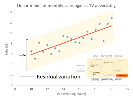
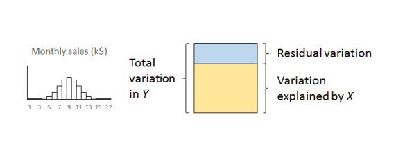
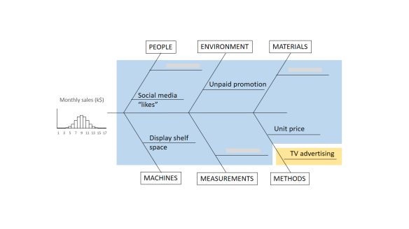
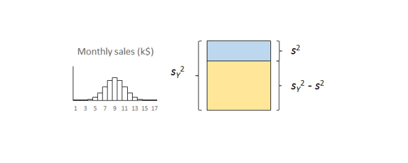
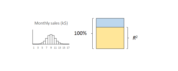
The important thing to remember is that the residual variation is not a statistical artifact of the analysis. It is part of the real world business system, the cause-system of the Ys.7 It is the part on which you still have little quantitative grasp and which continues to hurt you. Returning to the cause and effect diagram, we picked one factor X to investigate and took its influence out of the data. The residual variation is the variation arising from the aggregate of all the other causes.

As we shall see in more detail in Part 3, the residual variation imposes a fundamental bound on the precision of predictions from the model. It turns out that s is the limiting standard error of future predictions

Whether your regression was a worthwhile one or not so you will want to probe the residual variation further. A technique like DMAIC works well. Other improvement processes are available.

So how big should R2 be? Well that is a question for your business leaders not a statistician. How much does the business gain financially from being able to explain just so much variation in the outcome? Anybody with an MBA should be able to answer this so you should have somebody in your organisation who can help.

The correlation coefficient

Some people like to take the square root of R2 to obtain what they call a correlation coefficient. I have never been clear as to what this was trying to achieve. It always ends up telling me less than the scatter plot. So why bother? R2 tells me something important that I understand and need to know. Leave it alone.

What about statistical significance?

I fear that “significance” is, pace George Miller, “a word worn smooth by many tongues”. It is a word that I try to avoid. Yet it seems a natural practice for some people to calculate a p-value and ask whether the regression is significant.

I have criticised p-values elsewhere. I might calculate them sometimes but only because I know what I am doing. The terrible fact is that if you collect sufficient data then your regression will eventually be significant. Statistical significance only tells me that you collected a lot of data. That’s why so many studies published in the press are misleading. Collect enough data and you will get a “significant” result. It doesn’t mean it matters in the real world.

R2 is the real world measure of sensible trouble (relatively) impervious to statistical manipulation. I can make p as small as I like just by collecting more and more data. In fact there is an equation that, for any given R2, links p and the number of observations, n, for linear regression.8

FvR2 equation

Here, Fμ, ν(x) is the F-distribution with μ and ν degrees of freedom. A little playing about with that equation in Excel will reveal that you can make p as small as you like without R2 changing at all. Simply by making n larger. Collecting data until p is small is mere p-hacking. All p-values should be avoided by the novice. R2 is the real world measure (relatively) impervious to statistical manipulation. That is what I am interested in. And what your boss should be interested in.

Next time

Once we are confident that our regression model is stable and predictable, and that the regression is worth having, we can move on to the next stage.

Next time I shall look at prediction intervals and how to assess uncertainty in forecasts.

References

  1. Kahneman, D (2011) Thinking, Fast and Slow, Allen Lane, p240
  2. Berkeley, G (1710) A Treatise Concerning the Principles of Human Knowledge, Part 1, Dublin
  3. Stigler, S M (2016) The Seven Pillars of Statistical Wisdom, Harvard University Press, pp141-148
  4. Taguchi, G (1987) The System of Experimental Design: Engineering Methods to Optimize Quality and Minimize Costs, Quality Resources
  5. Draper, N R & Smith, H (1998) Applied Regression Analysis, 3rd ed., Wiley, p30
  6. Draper & Smith (1998) p33
  7. For an appealing discussion of cause-systems from a broader cultural standpoint see: Bostridge, I (2015) Schubert’s Winter Journey: Anatomy of an Obsession, Faber, pp358-365
  8. Draper & Smith (1998) p243

Regression done right: Part 1: Can I predict the future?

I recently saw an article in the Harvard Business Review called “Refresher on Regression Analysis”. I thought it was horrible so I wanted to set the record straight.

Linear regression from the viewpoint of machine learning

Linear regression is important, not only because it is a useful tool in itself, but because it is (almost) the simplest statistical model. The issues that arise in a relatively straightforward form are issues that beset the whole of statistical modelling and predictive analytics. Anyone who understands linear regression properly is able to ask probing questions about more complicated models. The complex internal algorithms of Kalman filters, ARIMA processes and artificial neural networks are accessible only to the specialist mathematician. However, each has several general features in common with simple linear regression. A thorough understanding of linear regression enables a due diligence of the claims made by the machine learning advocate. Linear regression is the paradigmatic exemplar of machine learning.

There are two principal questions that I want to talk about that are the big takeaways of linear regression. They are always the first two questions to ask in looking at any statistical modelling or machine learning scenario.

  1. What predictions can I make (if any)?
  2. Is it worth the trouble?

I am going to start looking at (1) in this blog and complete it in a future Part 2. I will then look at (2) in a further Part 3.

Variation, variation, variation

Variation is a major problem for business, the tendency of key measures to fluctuate irregularly. Variation leads to uncertainty. Will the next report be high or low? Or in the middle? Because of the uncertainty we have to allow safety margins or swallow some non-conformancies. We have good days and bad days, good products and not so good. We have to carry costly working capital because of variation in cash flow. And so on.

We learned in our high school statistics class to characterise variation in a key process measure, call it the Big Y, by an histogram of observations. Perhaps we are bothered by the fluctuating level of monthly sales.

RegressionHistogram

The variation arises from a whole ecology of competing and interacting effects and factors that we call the cause-system of the outcome. In general, it is very difficult to single out individual factors as having been the cause of a particular observation, so entangled are they. It is still useful to capture them for reference on a cause and effect diagram.

RegressionIshikawa

One of the strengths of the cause and effect diagram is that it may prompt the thought that one of the factors is particularly important, call it Big X, perhaps it is “hours of TV advertising” (my age is showing). Motivated by that we can generate a sample of corresponding measurements data of both the Y and X and plot them on a scatter plot.

RegressionScatter1

Well what else is there to say? The scatter plot shows us all the information in the sample. Scatter plots are an important part of what statistician John Tukey called Exploratory Data Analysis (EDA). We have some hunches and ideas, or perhaps hardly any idea at all, and we attack the problem by plotting the data in any way we can think of. So much easier now than when W Edwards Deming wrote:1

[Statistical practice] means tedious work, such as studying the data in various forms, making tables and charts and re-making them, trying to use and preserve the evidence in the results and to be clear enough to the reader: to endure disappointment and discouragement.

Or as Chicago economist Ronald Coase put it.

If you torture the data enough, nature will always confess.

The scatter plot is a fearsome instrument of data torture. It tells me everything. It might even tempt me to think that I have a basis on which to make predictions.

Prediction

In machine learning terms, we can think of the sample used for the scatter plot as a training set of data. It can be used to set up, “train”, a numerical model that we will then fix and use to predict future outcomes. The scatter plot strongly suggests that if we know a future X alone we can have a go at predicting the corresponding future Y. To see that more clearly we can draw a straight line by hand on the scatter plot, just as we did in high school before anybody suggested anything more sophisticated.

RegressionScatter2

Given any particular X we can read off the corresponding Y.

RegressionScatter3

The immediate insight that comes from drawing in the line is that not all the observations lie on the line. There is variation about the line so that there is actually a range of values of Y that seem plausible and consistent for any specified X. More on that in Parts 2 and 3.

In understanding machine learning it makes sense to start by thinking about human learning. Psychologists Gary Klein and Daniel Kahneman investigated how firefighters were able to perform so successfully in assessing a fire scene and making rapid, safety critical decisions. Lives of the public and of other firefighters were at stake. This is the sort of human learning situation that machines, or rather their expert engineers, aspire to emulate. Together, Klein and Kahneman set out to describe how the brain could build up reliable memories that would be activated in the future, even in the agony of the moment. They came to the conclusion that there are two fundamental conditions for a human to acquire a skill.2

  • An environment that is sufficiently regular to be predictable.
  • An opportunity to learn these regularities through prolonged practice

The first bullet point is pretty much the most important idea in the whole of statistics. Before we can make any prediction from the regression, we have to be confident that the data has been sampled from “an environment that is sufficiently regular to be predictable”. The regression “learns” from those regularities, where they exist. The “learning” turns out to be the rather prosaic mechanics of matrix algebra as set out in all the standard texts.3 But that, after all, is what all machine “learning” is really about.

Statisticians capture the psychologists’ “sufficiently regular” through the mathematical concept of exchangeability. If a process is exchangeable then we can assume that the distribution of events in the future will be like the past. We can project our historic histogram forward. With regression we can do better than that.

Residuals analysis

Formally, the linear regression calculations calculate the characteristics of the model:

Y = mX + c + “stuff”

The “mX+c” bit is the familiar high school mathematics equation for a straight line. The “stuff” is variation about the straight line. What the linear regression mathematics does is (objectively) to calculate the m and c and then also tell us something about the “stuff”. It splits the variation in Y into two components:

  • What can be explained by the variation in X; and
  • The, as yet unexplained, variation in the “stuff”.

The first thing to learn about regression is that it is the “stuff” that is the interesting bit. In 1849 British astronomer Sir John Herschel observed that:

Almost all the greatest discoveries in astronomy have resulted from the consideration of what we have elsewhere termed RESIDUAL PHENOMENA, of a quantitative or numerical kind, that is to say, of such portions of the numerical or quantitative results of observation as remain outstanding and unaccounted for after subducting and allowing for all that would result from the strict application of known principles.

The straight line represents what we guessed about the causes of variation in Y and which the scatter plot confirmed. The “stuff” represents the causes of variation that we failed to identify and that continue to limit our ability to predict and manage. We call the predicted Ys that correspond to the measured Xs, and lie on the fitted straight line, the fits.

fiti = mXic

The residual values, or residuals, are obtained by subtracting the fits from the respective observed Y values. The residuals represent the “stuff”. Statistical software does this for us routinely. If yours doesn’t then bin it.

residuali = Yi – fiti

RegressionScatter4

There are a number of properties that the residuals need to satisfy for the regression to work. Investigating those properties is called residuals analysis.4 As far as use for prediction in concerned, it is sufficient that the “stuff”, the variation about the straight line, be exchangeable.5 That means that the “stuff” so far must appear from the data to be exchangeable and further that we have a rational belief that such a cause system will continue unchanged into the future. Shewhart charts are the best heuristics for checking the requirement for exchangeability, certainly as far as the historical data is concerned. Our first and, be under no illusion, mandatory check on the ability of the linear regression, or any statistical model, to make predictions is to plot the residuals against time on a Shewhart chart.

RegressionPBC

If there are any signals of special causes then the model cannot be used for prediction. It just can’t. For prediction we need residuals that are all noise and no signal. However, like all signals of special causes, such will provide an opportunity to explore and understand more about the cause system. The signal that prevents us from using this regression for prediction may be the very thing that enables an investigation leading to a superior model, able to predict more exactly than we ever hoped the failed model could. And even if there is sufficient evidence of exchangeability from the training data, we still need to continue vigilance and scrutiny of all future residuals to look out for any novel signals of special causes. Special causes that arise post-training provide fresh information about the cause system while at the same time compromising the reliability of the predictions.

Thorough regression diagnostics will also be able to identify issues such as serial correlation, lack of fit, leverage and heteroscedasticity. It is essential to regression and its ommision is intolerable. Residuals analysis is one of Stephen Stigler’s Seven Pillars of Statistical Wisdom.6 As Tukey said:

The greatest value of a picture is when it forces us to notice what we never expected to see.

To come:

Part 2: Is my regression significant? … is a dumb question.
Part 3: Quantifying predictions with statistical intervals.

References

  1. Deming, W E (‎1975) “On probability as a basis for action”, The American Statistician 29(4) pp146-152
  2. Kahneman, D (2011) Thinking, Fast and Slow, Allen Lane, p240
  3. Draper, N R & Smith, H (1998) Applied Regression Analysis, 3rd ed., Wiley, p44
  4. Draper & Smith (1998) Chs 2, 8
  5. I have to admit that weaker conditions may be adequate in some cases but these are far beyond any other than a specialist mathematician.
  6. Stigler, S M (2016) The Seven Pillars of Statistical Wisdom, Harvard University Press, Chapter 7

Does noise make you fat?

“A new study has unearthed some eye-opening facts about the effects of noise pollution on obesity,” proclaimed The Huffington Post recently in another piece or poorly uncritical data journalism.

Journalistic standards notwithstanding, in Exposure to traffic noise and markers of obesity (BMJ Occupational and environmental medicine, May 2015) Andrei Pyko and eight (sic) collaborators found “evidence of a link between traffic noise and metabolic outcomes, especially central obesity.” The particular conclusion picked up by the press was that each 5 dB increase in traffic noise could add 2 mm to the waistline.

Not trusting the press I decided I wanted to have a look at this research myself. I was fortunate that the paper was available for free download for a brief period after the press release. It took some finding though. The BMJ insists that you will now have to pay. I do find that objectionable as I see that the research was funded in part by the European Union. Us European citizens have all paid once. Why should we have to pay again?

On reading …

I was though shocked reading Pyko’s paper as the Huffington Post journalists obviously hadn’t. They state “Lack of sleep causes reduced energy levels, which can then lead to a more sedentary lifestyle and make residents less willing to exercise.” Pyko’s paper says no such thing. The researchers had, in particular, conditioned on level of exercise so that effect had been taken out. It cannot stand as an explanation of the results. Pyko’s narrative concerned noise-induced stress and cortisol production, not lack of exercise.

In any event, the paper is densely written and not at all easy to analyse and understand. I have tried to pick out the points that I found most bothering but first a statistics lesson.

Prediction 101

Frame(Almost) the first thing to learn in statistics is the relationship between population, frame and sample. We are concerned about the population. The frame is the enumerable and accessible set of things that approximate the population. The sample is a subset of the frame, selected in an economic, systematic and well characterised manner.

In Some Theory of Sampling (1950), W Edwards Deming drew a distinction between two broad types of statistical studies, enumerative and analytic.

  • Enumerative: Action will be taken on the frame.
  • Analytic: Action will be on the cause-system that produced the frame.

It is explicit in Pyko’s work that the sampling frame was metropolitan Stockholm, Sweden between the years 2002 and 2006. It was a cross-sectional study. I take it from the institutional funding that the study intended to advise policy makers as to future health interventions. Concern was beyond the population of Stockholm, or even Sweden. This was an analytic study. It aspired to draw generalised lessons about the causal mechanisms whereby traffic noise aggravated obesity so as to support future society-wide health improvement.

How representative was the frame of global urban areas stretching over future decades? I have not the knowledge to make a judgment. The issue is mentioned in the paper but, I think, with insufficient weight.

There are further issues as to the sampling from the frame. Data was taken from participants in a pre-existing study into diabetes that had itself specific criteria for recruitment. These are set out in the paper but intensify the questions of whether the sample is representative of the population of interest.

The study

The researchers chose three measures of obesity, waist circumference, waist-hip ratio and BMI. Each has been put forwards, from time to time, as a measure of health risk.

There were 5,075 individual participants in the study, a sample of 5,075 observations. The researchers performed both a linear regression simpliciter and a logistic regression. For want of time and space I am only going to comment on the former. It is the origin of the headline 2 mm per 5 dB claim.

The researchers have quoted p-values but they haven’t committed the worst of sins as they have shown the size of the effects with confidence intervals. It’s not surprising that they found so many soi-disant significant effects given the sample size.

However, there was little assistance in judging how much of the observed variation in obesity was down to traffic noise. I would have liked to see a good old fashioned analysis of variance table. I could then at least have had a go at comparing variation from the measurement process, traffic noise and other effects. I could also have calculated myself an adjusted R2.

Measurement Systems Analysis

Understanding variation from the measurement process is critical to any analysis. I have looked at the World Health Organisation’s definitive 2011 report on the effects of waist circumference on health. Such Measurement Systems Analysis as there is occurs at p7. They report a “technical error” (me neither) of 1.31 cm from intrameasurer error (I’m guessing repeatability) and 1.56 cm from intermeasurer error (I’m guessing reproducibility). They remark that “Even when the same protocol is used, there may be variability within and between measurers when more than one measurement is made.” They recommend further research but I have found none. There is no way of knowing from what is published by Pyko whether the reported effects are real or flow from confounding between traffic noise and intermeasurer variation.

When it comes to waist-hip ratio I presume that there are similar issues in measuring hip circumference. When the two dimensions are divided then the individual measurement uncertainties aggregate. More problems, not addressed.

Noise data

The key predictor of obesity was supposed to be noise. The noise data used were not in situ measurements in the participants’ respective homes. The road traffic noise data were themselves predicted from a mathematical model using “terrain data, ground surface, building height, traffic data, including 24 h yearly average traffic flow, diurnal distribution and speed limits, as well as information on noise barriers”. The model output provided 5 dB contours. The authors then applied some further ad hoc treatments to the data.

The authors recognise that there is likely to be some error in the actual noise levels, not least from the granularity. However, they then seem to assume that this is simply an errors in variables situation. That would do no more than (conservatively) bias any observed effect towards zero. However, it does seem to me that there is potential for much more structured systematic effects to be introduced here and I think this should have been explored further.

Model criticism

The authors state that they carried out a residuals analysis but they give no details and there are no charts, even in the supplementary material. I would like to have had a look myself as the residuals are actually the interesting bit. Residuals analysis is essential in establishing stability.

In fact, in the current study there is so much data that I would have expected the authors to have saved some of the data for cross-validation. That would have provided some powerful material for model criticism and validation.

Given that this is an analytic study these are all very serious failings. With nine researchers on the job I would have expected some effort on these matters and some attention from whoever was the statistical referee.

Results

Separate results are presented for road, rail and air traffic noise. Again, for brevity I am looking at the headline 2 mm / 5 dB quoted for road traffic noise. Now, waist circumference is dependent on gross body size. Men are bigger than women and have larger waists. Similarly, the tall are larger-waisted than the short. Pyko’s regression does not condition on height (as a gross characterisation of body size).

BMI is a factor that attempts to allow for body size. Pyko found no significant influence on BMI from road traffic noise.

Waist-hip ration is another parameter that attempts to allow for body size. It is often now cited as a better predictor of morbidity than BMI. That of course is irrelevant to the question of whether noise makes you fat. As far as I can tell from Pyko’s published results, a 5 dB increase in road traffic noise accounted for a 0.16 increase in waist-hip ratio. Now, let us look at this broadly. Consider a woman with waist circumference 85 cm, hip 100 cm, hence waist-hip ratio, 0.85. All pretty typical for the study. Predictively the study is suggesting that a 5 dB increase in road traffic noise might unremarkably take her waist-hip ratio up over 1.0. That seems barely consistent with the results from waist circumference alone where there would not only be millimetres of growth. It is incredible physically.

I must certainly have misunderstood what the waist-hip result means but I could find no elucidation in Pyko’s paper.

Policy

Research such as this has to be aimed at advising future interventions to control traffic noise in urban environments. Broadly speaking, 5 dB is a level of noise change that is noticeable to human hearing but no more. All the same, achieving such a reduction in an urban environment is something that requires considerable economic resources. Yet, taking the research at its highest, it only delivers 2 mm on the waistline.

I had many criticisms other than those above and I do not, in any event, consider this study adequate for making any prediction about a future intervention. Nothing in it makes me feel the subject deserves further study. Or that I need to avoid noise to stay slim.