UK railway suicides – 2015 update

The latest UK rail safety statistics were published in September 2015 absent the usual press fanfare. Regular readers of this blog will know that I have followed the suicide data series, and the press response, closely in 2014, 2013 and 2012.

This year I am conscious that one of those units is not a mere statistic but a dear colleague, Nigel Clements. It was poet W B Yeats who observed, in his valedictory verse Under Ben Bulben that “Measurement began our might.” He ends the poem by inviting us to “Cast a cold eye/ On life, on death.” Sometimes, with statistics, we cast the cold eye but the personal reminds us that it must never be an academic exercise.

Nigel’s death gives me an additional reason for following this series. I originally latched onto it because I felt that exaggerated claims  as to trends were being made. It struck me as a closely bounded problem that should be susceptible to taught measurement. And it was something important.  Again I have re-plotted the data myself on a Shewhart chart.

RailwaySuicides4

Readers should note the following about the chart.

  • Some of the numbers for earlier years have been updated by the statistical authority.
  • I have recalculated natural process limits as there are still no more than 20 annual observations.
  • The signal noted last year has persisted (in red) with two consecutive observations above the upper natural process limit. There are also now eight points below the centre line at the beginning of the series.

As my colleague Terry Weight always taught me, a signal gives us license to interpret the ups and downs on the chart. This increasingly looks like a gradual upward trend.

Though there was this year little coverage in the press, I did find this article in The Guardian newspaper. I had previously wondered whether the railway data simply reflected an increasing trend in UK suicide in general. The Guardian report is eager to emphasise:

The total number [of suicides] in the UK has risen in recent years, with the latest Office for National Statistics figures showing 6,233 suicides registered in the UK in 2013, a 4% increase on the previous year.

Well, #executivetimeseries! I have low expectations of press data journalism so I do not know why I am disappointed. In any event I decided to plot the data. There were a few problems. The railway data is not collected by calendar year so the latest observation is 2014/15. I have not managed to identify which months are included though, while I was hunting I found out that the railway data does not include London Underground. I can find no railway data before 2001/02. The national suicide data is collected by calendar year and the last year published is 2013. I have done my best by (not quite) arbitrarily identifying 2013/14 in the railway data with 2013 nationally. I also tried the obvious shift by one year and it did not change the picture.

RailwaySuicides5

I have added a LOWESS line (with smoothing parameter 0.4) to the national data the better to pick out the minimum around 2007, just before the start of the financial crisis. That is where the steady decline over the previous quarter century reverses. It is in itself an arresting statistic. But I don’t see the national trend mirrored in the railway data, thereby explaining that trend.

Previously I noted proposals to repeat a strategy from Japan of bathing railway platforms with blue light. Professor Michiko Ueda of Syracuse University was kind enough to send me details of the research. The conclusions were encouraging but tentative and, unfortunately, the Japanese rail companies have not made any fresh data available for analysis since 2010. In the UK, I understand that such lights were installed at Gatwick in summer 2014 but I have not seen any data.

A huge amount of sincere endeavour has gone into this issue but further efforts have to be against the background that there is an escalating and unexplained problem.

Things and actions are what they are and the consequences of them will be what they will be: why then should we desire to be deceived?

Joseph Butler

Advertisement

Amazon II: The sales story

Jeff Bezos' iconic laugh.jpgI recently commented on an item in the New York Times about Amazon’s pursuit of “rigorous data driven management”. Dina Vaccari, one of the employees cited in the original New York Times article, has taken the opportunity to tell her own story in this piece. I found it enlightening as to what goes on at Amazon. Of course, it is only another anecdote from a former employee, a data source of notoriously limited quality. However, as Arthur Koestler once observed:

Without the hard little bits of marble which are called ‘facts’ or ‘data’ one cannot compose a mosaic; what matters, however, are not so much the individual bits, but the successive patterns into which you arrange them, then break them up and rearrange them.

Vaccari’s role was to sell Amazon gift cards. The measure of her success was how many she sold. Vaccari had read Timothy Ferriss’ transgressive little book The 4-Hour Workweek. She decided to employ a subcontractor from Chennai, India to generate for her 100 leads daily for $10. The idea worked out well. Another illustration of the law of comparative advantage.

Vaccari them emailed the leads, not with the standard email that she had been instructed to use by Amazon, but with a formula of her own. Vacarri claims a 10 to 50% response rate. She then followed up using her traditional sales skills, exceeding her sales target and besting the rest of the sales team.

That drew attention from her supervisor. Not unnaturally he wanted to capture good practice. When he saw Vaccari’s non-standard email he was critical. We now know that process discipline is important at Amazon. Nothing wrong with that though if you really want to exercise your mind on the topic you would do well to watch the Hollywood movie Crimson Tide.

What is more interesting is that, when Vaccari answered the criticism by pointing to her response and sales figures, the supervisor retorted that this was “just luck”.

So there we have it. Somebody made a change and the organisation couldn’t agree whether or not it was an improvement. Vaccari said she saw a signal. Her supervisor said that it was just noise.

The supervisor’s response was particularly odd as he was shadowing Vacarri because of his favourable perception of her performance. It is as though his assessment as to whether Vacarri’s results were signal or noise depended on his approval or disapproval of how she had achieved them. It certainly seems that this is not normative behaviour at Amazon. Vaccari criticises her supervisor for failing to display Amazon Leadership Principles. The exchange illustrates what happens if an organisation generates data but is then unable to turn it into a reliable basis for action because there is no systematic and transparent method for creating a consensus around what is signal and what, noise. Vicarri’s exchange with her supervisor is reassuring in that both recognised that there is an important distinction. Vacarri knew that a signal should be a tocsin for action, in this case to embed a successful innovation through company wide standardisation. Her supervisor knew that to mistake noise for a signal would lead to a degraded process performance. Or at least he hid behind that to project his disapproval. Vacarri’s recall of the incident makes her “cringe”. Numbers aren’t just about numbers.

Trenchant data criticism, motivated by the rigorous segregation of signal and noise, is the catalyst of continual improvement in sales, product quality, economic efficiency and market agility.

The goal is not to be driven by data but to be led by the insights it yields.

Data science sold down the Amazon? Jeff Bezos and the culture of rigour

This blog appeared on the Royal Statistical Society website Statslife on 25 August 2015

Jeff Bezos' iconic laugh.jpgThis recent item in the New York Times has catalysed discussion among managers. The article tells of Amazon’s founder, Jeff Bezos, and his pursuit of rigorous data driven management. It also tells employees’ own negative stories of how that felt emotionally.

The New York Times says that Amazon is pervaded with abundant data streams that are used to judge individual human performance and which drive reward and advancement. They inform termination decisions too.

The recollections of former employees are not the best source of evidence about how a company conducts its business. Amazon’s share of the retail market is impressive and they must be doing something right. What everybody else wants to know is, what is it? Amazon are very coy about how they operate and there is a danger that the business world at large takes the wrong messages.

Targets

Targets are essential to business. The marketing director predicts that his new advertising campaign will create demand for 12,000 units next year. The operations director looks at her historical production data. She concludes that the process lacks the capability reliably to produce those volumes. She estimates the budget required to upgrade the process and to achieve 12,000 units annually. The executive board considers the business case and signs off the investment. Both marketing and operations directors now have a target.

Targets communicate improvement priorities. They build confidence between interfacing processes. They provide constraints and parameters that prevent the system causing harm. Harm to others or harm to itself. They allow the pace and substance of multiple business processes, and diverse entities, to be matched and aligned.

But everyone who has worked in business sees it as less simple than that. The marketing and operations directors are people.

Signal and noise

Drawing conclusions from data might be an uncontroversial matter were it not for the most common feature of data, fluctuation. Call it variation if you prefer. Business measures do not stand still. Every month, week, day and hour is different. All data features noise. Sometimes is goes up, sometimes down. A whole ecology of occult causes, weakly characterised, unknown and as yet unsuspected, interact to cause irregular variation. They are what cause a coin variously to fall “heads” or “tails”. That variation may often be stable enough, or if you like “exchangeable“, so as to allow statistical predictions to be made, as in the case of the coin toss.

If all data features noise then some data features signals. A signal is a sign, an indicator that some palpable cause has made the data stand out from the background noise. It is that assignable cause which enables inferences to be drawn about what interventions in the business process have had a tangible effect and what future innovations might cement any gains or lead to bigger prospective wins. Signal and noise lead to wholly different business strategies.

The relevance for business is that people, where not exposed to rigorous decision support, are really bad at telling the difference between signal and noise. Nobel laureate economist and psychologist Daniel Kahneman has amassed a lifetime of experimental and anecdotal data capturing noise misinterpreted as signal and judgments in the face of compelling data, distorted by emotional and contextual distractions.

Signal and accountability

It is a familiar trope of business, and government, that extravagant promises are made, impressive business cases set out and targets signed off. Yet the ultimate scrutiny as to whether that envisaged performance was realised often lacks rigour. Noise, with its irregular ups and downs, allows those seeking solace from failure to pick out select data points and cast self-serving narratives on the evidence.

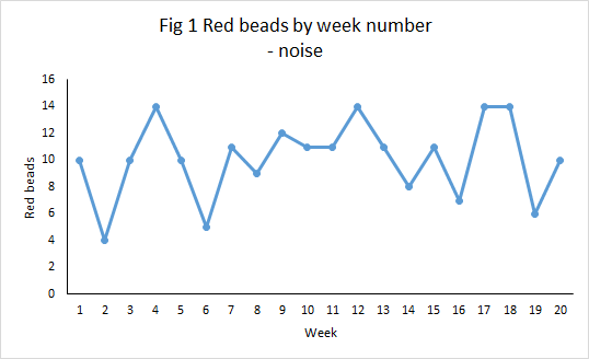
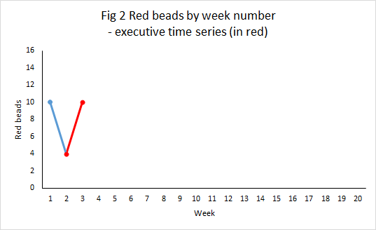
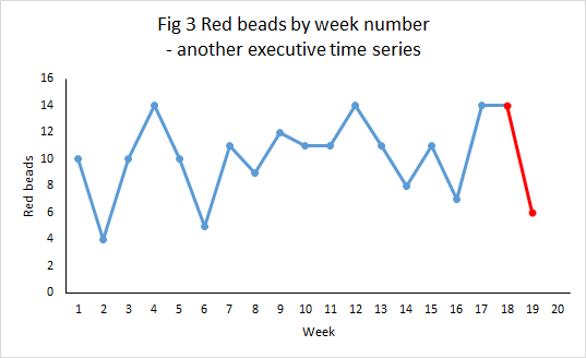
Our hypothetical marketing director may fail to achieve his target but recount how there were two individual months where sales exceeded 1,000, construct elaborate rationales as to why only they are representative of his efforts and point to purported external factors that frustrated the remaining ten reports. Pairs of individual data points can always be selected to support any story, Don Wheeler’s classic executive time series.

This is where the ability to distinguish signal and noise is critical. To establish whether targets have been achieved requires crisp definition of business measures, not only outcomes but also the leading indicators that provide context and advise judgment as to prediction reliability. Distinguishing signal and noise requires transparent reporting that allows diverse streams of data criticism. It requires a rigorous approach to characterising noise and a systematic approach not only to identifying signals but to reacting to them in an agile and sustainable manner.

Data is essential to celebrating a target successfully achieved and to responding constructively to a failure. But where noise is gifted the status of signal to confirm a fanciful business case, or to protect a heavily invested reputation, then the business is misled, costs increased, profits foregone and investors cheated.

Where employees believe that success and reward is being fudged, whether because of wishful thinking or lack of data skills, or mistakenly through lack of transparency, then cynicism and demotivation will breed virulently. Employees watch the behaviours of their seniors carefully as models of what will lead to their own advancement. Where it is deceit or innumeracy that succeed, that is what will thrive.

Noise and blame

Here is some data of the number of defects caused by production workers last month.

Worker Defects
Al 10
Simone 6
Jose 10
Gabriela 16
Stan 10

What is to be done about Gabriela? Move to an easier job? Perhaps retraining? Or should she be let go? And Simone? Promote to supervisor?

Well, the numbers were just random numbers that I generated. I didn’t add anything in to make Gabriela’s score higher and there was nothing in the way that I generated the data to suggest who would come top or bottom. The data are simply noise. They are the sort of thing that you might observe in a manufacturing plant that presented a “stable system of trouble”. Nothing in the data signals any behaviour, attitude, skill or diligence that Gabriela lacked or wrongly exercised. The next month’s data would likely show a different candidate for dismissal.

Mistaking signal for noise is, like mistaking noise for signal, the path to business under performance and employee disillusionment. It has a particularly corrosive effect where used, as it might be in Gabriela’s case, to justify termination. The remaining staff will be bemused as to what Gabriela was actually doing wrong and start to attach myriad and irrational doubts to all sorts of things in the business. There may be a resort to magical thinking. The survivors will be less open and less willing to share problems with their supervisors. The business itself has the costs of recruitment to replace Gabriela. The saddest aspect of the whole business is the likelihood that Gabriela’s replacement will perform better than did Gabriela, vindicating the dismissal in the mind of her supervisor. This is the familiar statistical artefact of regression to the mean. An extreme event is likely to be followed by one less extreme. Again, Kahneman has collected sundry examples of managers so deceived by singular human performance and disappointed by its modest follow-up.

It was W Edwards Deming who observed that every time you recruit a new employee you take a random sample from the pool of job seekers. That’s why you get the regression to the mean. It must be true at Amazon too as their human resources executive Mr Tony Galbato explains their termination statistics by admitting that “We don’t always get it right.” Of course, everybody thinks that their recruitment procedures are better than average. That’s a management claim that could well do with rigorous testing by data.

Further, mistaking noise for signal brings the additional business expense of over adjustment, spending money to add costly variation while degrading customer satisfaction. Nobody in the business feels good about that.

Target quality, data quality

I admitted above that the evidence we have about Amazon’s operations is not of the highest quality. I’m not in a position to judge what goes on at Amazon. But all should fix in their minds that setting targets demands rigorous risk assessment, analysis of perverse incentives and intense customer focus.

It is a sad reality that, if you set incentives perversely enough,some individuals will find ways of misreporting data. BNFL’s embarrassment with Kansai Electric and Steven Eaton’s criminal conviction were not isolated incidents.

One thing that especially bothered me about the Amazon report was the soi-disant Anytime Feedback Tool that allowed unsolicited anonymous peer appraisal. Apparently, this formed part of the “data” that determined individual advancement or termination. The description was unchallenged by Amazon’s spokesman (sic) Mr Craig Berman. I’m afraid, and I say this as a practising lawyer, unsourced and unchallenged “evidence” carries the spoor of the Star Chamber and the party purge. I would have thought that a pretty reliable method for generating unreliable data would be to maximise the personal incentives for distortion while protecting it from scrutiny or governance.

Kahneman observed that:

… we pay more attention to the content of messages than to information about their reliability, and as a result end up with a view of the world around us that is simpler and more coherent than the data justify.

It is the perverse confluence of fluctuations and individual psychology that makes statistical science essential, data analytics interesting and business, law and government difficult.

#executivetimeseries

ExecTS1OxfordDon Wheeler coined the term executive time series. I was just leaving court in Oxford the other day when I saw this announcement on a hoarding. I immediately thought to myself “#executivetimeseries”.

Wheeler introduced the phrase in his 2000 book Understanding Variation: The Key to Managing Chaos. He meant to criticise the habitual way that statistics are presented in business and government. A comparison is made between performance at two instants in time. Grave significance is attached as to whether performance is better or worse at the second instant. Well, it was always unlikely that it would be the same.

The executive time series has the following characteristics.

  • It as applied to some statistic, metric, Key Performance Indicator (KPI) or other measure that will be perceived as important by its audience.
  • Two time instants are chosen.
  • The statistic is quoted at each of the two instants.
  • If the latter is greater than the first then an increase is inferred. A decrease is inferred from the converse.
  • Great significance is attached to the increase or decrease.

Why is this bad?

At its best it provides incomplete information devoid of context. At its worst it is subject to gross manipulation. The following problems arise.

  • Though a signal is usually suggested there is inadequate information to infer this.
  • There is seldom explanation of how the time points were chosen. It is open to manipulation.
  • Data is presented absent its context.
  • There is no basis for predicting the future.

The Oxford billboard is even worse than the usual example because it doesn’t even attempt to tell us over what period the carbon reduction is being claimed.

Signal and noise

Let’s first think about noise. As Daniel Kahneman put it “A random event does not … lend itself to explanation, but collections of random events do behave in a highly regular fashion.” Noise is a collection of random events. Some people also call it common cause variation.

Imagine a bucket of thousands of beads. Of the beads, 80% are white and 20%, red. You are given a paddle that will hold 50 beads. Use the paddle to stir the beads then draw out 50 with the paddle. Count the red beads. Repeat this, let us say once a week, until you have 20 counts. The data might look something like this.

RedBeads1

What we observe in Figure 1 is the irregular variation in the number of red beads. However, it is not totally unpredictable. In fact, it may be one of the most predictable things you have ever seen. Though we cannot forecast exactly how many red beads we will see in the coming week, it will most likely be in the rough range of 4 to 14 with rather more counts around 10 than at the extremities. The odd one below 4 or above 14 would not surprise you I think.

But nothing changed in the characteristics of the underlying process. It didn’t get better or worse. The percentage of reds in the bucket was constant. It is a stable system of trouble. And yet measured variation extended between 4 and 14 red beads. That is why an executive time series is so dangerous. It alleges change while the underlying cause-system is constant.

Figure 2 shows how an executive time series could be constructed in week 3.

RedBeads2

The number of beads has increase from 4 to 10, a 150% increase. Surely a “significant result”. And it will always be possible to find some managerial initiative between week 2 and 3 that can be invoked as the cause. “Between weeks 2 and 3 we changed the angle of inserting the paddle and it has increased the number of red beads by 150%.”

But Figure 2 is not the only executive time series that the data will support. In Figure 3 the manager can claim a 57% reduction from 14 to 6. More than the Oxford banner. Again, it will always be possible to find some factor or incident supposed to have caused the reduction. But nothing really changed.

RedBeads3

The executive can be even more ambitious. “Between week 2 and 17 we achieved a 250% increase in red beads.” Now that cannot be dismissed as a mere statistical blip.

RedBeads4

#executivetimeseries

Data has no meaning apart from its context.

Walter Shewhart

Not everyone who cites an executive time series is seeking to deceive. But many are. So anybody who relies on an executive times series, devoid of context, invites suspicion that they are manipulating the message. This is Langian statistics. par excellence. The fallacy of What you see is all there is. It is essential to treat all such claims with the utmost caution. What properly communicates the present reality of some measure is a plot against time that exposes its variation, its stability (or otherwise) and sets it in the time context of surrounding events.

We should call out the perpetrators. #executivetimeseries

Techie note

The data here is generated from a sequence of 20 Bernoulli experiments with probability of “red” equal to 0.2 and 50 independent trials in each experiment.

Soccer management – signal, noise and contract negotiation

Some poor data journalism here from the BBC on 28 May 2015, concerning turnover in professional soccer managers in England. “Managerial sackings reach highest level for 13 years” says the headline. A classic executive time series. What is the significance of the 13 years? Other than it being the last year with more sackings than the present.

The data was purportedly from the League Managers’ Association (LMA) and their Richard Bevan thought the matter “very concerning”. The BBC provided a chart (fair use claimed).

MgrSackingsto201503

Now, I had a couple of thoughts as soon as I saw this. Firstly, why chart only back to 2005/6? More importantly, this looked to me like a stable system of trouble (for football managers) with the possible exception of this (2014/15) season’s Championship coach turnover. Personally, I detest multiple time series on a common chart unless there is a good reason for doing so. I do not think it the best way of showing variation and/ or association.

Signal and noise

The first task of any analyst looking at data is to seek to separate signal from noise. Nate Silver made this point powerfully in his book The Signal and the Noise: The Art and Science of Prediction. As Don Wheeler put it: all data has noise; some data has signal.

Noise is typically the irregular aggregate of many causes. It is predictable in the same way as a roulette wheel. A signal is a sign of some underlying factor that has had so large an effect that it stands out from the noise. Signals can herald a fundamental unpredictability of future behaviour.

If we find a signal we look for a special cause. If we start assigning special causes to observations that are simply noise then, at best, we spend money and effort to no effect and, at worst, we aggravate the situation.

The Championship data

In any event, I wanted to look at the data for myself. I was most interested in the Championship data as that was where the BBC and LMA had been quick to find a signal. I looked on the LMA’s website and this is the latest data I found. The data only records dismissals up to 31 March of the 2014/15 season. There were 16. The data in the report gives the total number of dismissals for each preceding season back to 2005/6. The report separates out “dismissals” from “resignations” but does not say exactly how the classification was made. It can be ambiguous. A manager may well resign because he feels his club have themselves repudiated his contract, a situation known in England as constructive dismissal.

The BBC’s analysis included dismissals right up to the end of each season including 2014/15. Reading from the chart they had 20. The BBC have added some data for 2014/15 that isn’t in the LMA report and not given the source. I regard that as poor data journalism.

I found one source of further data at website The Sack Race. That told me that since the end of March there had been four terminations.

Manager Club Termination Date
Malky Mackay Wigan Athletic Sacked 6 April
Lee Clark Blackpool Resigned 9 May
Neil Redfearn Leeds United Contract expired 20 May
Steve McClaren Derby County Sacked 25 May

As far as I can tell, “dismissals” include contract non-renewals and terminations by mutual consent. There are then a further three dismissals, not four. However, Clark left Blackpool amid some corporate chaos. That is certainly a termination that is classifiable either way. In any event, I have taken the BBC figure at face value though I am alerted as to some possible data quality issues here.

Signal and noise

Looking at the Championship data, this was the process behaviour chart, plotted as an individuals chart.

MgrSackingsto201503

There is a clear signal for the 2014/15 season with an observation, 20 dismissals,, above the upper natural process limit of 19.18 dismissals. Where there is a signal we should seek a special cause. There is no guarantee that we will find a special cause. Data limitations and bounded rationality are always constraints. In fact, there is no guarantee that there was a special cause. The signal could be a false positive. Such effects cannot be eliminated. However, signals efficiently direct our limited energy for, what Daniel Kahneman calls, System 2 thinking towards the most promising enquiries.

Analysis

The BBC reports one narrative woven round the data.

Bevan said the current tenure of those employed in the second tier was about eight months. And the demand to reach the top flight, where a new record £5.14bn TV deal is set to begin in 2016, had led to clubs hitting the “panic button” too quickly.

It is certainly a plausible view. I compiled a list of the dismissals and non-renewals, not the resignations, with data from Wikipedia and The Sack Race. I only identified 17 which again suggests some data quality issue around classification. I have then charted a scatter plot of date of dismissal against the club’s then league position.

MgrSackings201415

It certainly looks as though risk of relegation is the major driver for dismissal. Aside from that, Watford dismissed Billy McKinlay after only two games when they were third in the league, equal on points with the top two. McKinlay had been an emergency appointment after Oscar Garcia had been compelled to resign through ill health. Watford thought they had quickly found a better manager in Slavisa Jokanovic. Watford ended the season in second place and were promoted to the Premiership.

There were two dismissals after the final game on 2 May by disappointed mid-table teams. Beyond that, the only evidence for impulsive managerial changes in pursuit of promotion is the three mid-season, mid-table dismissals.

Club league position
Manager Club On dismissal At end of season
Nigel Adkins Reading 16 19
Bob Peeters Charlton Athletic 14 12
Stuart Pearce Nottingham Forrest 12 14

A table that speaks for itself. I am not impressed by the argument that there has been the sort of increase in panic sackings that Bevan fears. Both Blackpool and Leeds experienced chaotic executive management which will have resulted in an enhanced force of mortality on their respective coaches. That along with the data quality issues and the technical matter I have described below lead me to feel that there was no great enhanced threat to the typical Championship manager in 2014/15.

Next season I would expect some regression to the mean with a lower number of dismissals. Not much of a prediction really but that’s what the data tells me. If Bevan tries to attribute that to the LMA’s activism them I fear that he will be indulging in Langian statistical analysis. Will he be able to resist?

Techie bit

I have a preference for individuals charts but I did also try plotting the data on an np-chart where I found no signal. It is trite service-course statistics that a Poisson distribution with mean λ has standard deviation √λ so an upper 3-sigma limit for a (homogeneous) Poisson process with mean 11.1 dismissals would be 21.1 dismissals. Kahneman has cogently highlighted how people tend to see patterns in data as signals even where they are typical of mere noise. In this case I am aware that the data is not atypical of a Poisson process so I am unsurprised that I failed to identify a special cause.

A Poisson process with mean 11.1 dismissals is a pretty good model going forwards and that is the basis I would press on any managers in contract negotiations.

Of course, the clubs should remember that when they look for a replacement manager they will then take a random sample from the pool of job seekers. Really!