
The latest UK rail safety statistics were published in September 2015 absent the usual press fanfare. Regular readers of this blog will know that I have followed the suicide data series, and the press response, closely in 2014, 2013 and 2012.
This year I am conscious that one of those units is not a mere statistic but a dear colleague, Nigel Clements. It was poet W B Yeats who observed, in his valedictory verse Under Ben Bulben that “Measurement began our might.” He ends the poem by inviting us to “Cast a cold eye/ On life, on death.” Sometimes, with statistics, we cast the cold eye but the personal reminds us that it must never be an academic exercise.
Nigel’s death gives me an additional reason for following this series. I originally latched onto it because I felt that exaggerated claims as to trends were being made. It struck me as a closely bounded problem that should be susceptible to taught measurement. And it was something important. Again I have re-plotted the data myself on a Shewhart chart.
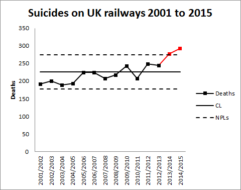
Readers should note the following about the chart.
- Some of the numbers for earlier years have been updated by the statistical authority.
- I have recalculated natural process limits as there are still no more than 20 annual observations.
- The signal noted last year has persisted (in red) with two consecutive observations above the upper natural process limit. There are also now eight points below the centre line at the beginning of the series.
As my colleague Terry Weight always taught me, a signal gives us license to interpret the ups and downs on the chart. This increasingly looks like a gradual upward trend.
Though there was this year little coverage in the press, I did find this article in The Guardian newspaper. I had previously wondered whether the railway data simply reflected an increasing trend in UK suicide in general. The Guardian report is eager to emphasise:
The total number [of suicides] in the UK has risen in recent years, with the latest Office for National Statistics figures showing 6,233 suicides registered in the UK in 2013, a 4% increase on the previous year.
Well, #executivetimeseries! I have low expectations of press data journalism so I do not know why I am disappointed. In any event I decided to plot the data. There were a few problems. The railway data is not collected by calendar year so the latest observation is 2014/15. I have not managed to identify which months are included though, while I was hunting I found out that the railway data does not include London Underground. I can find no railway data before 2001/02. The national suicide data is collected by calendar year and the last year published is 2013. I have done my best by (not quite) arbitrarily identifying 2013/14 in the railway data with 2013 nationally. I also tried the obvious shift by one year and it did not change the picture.
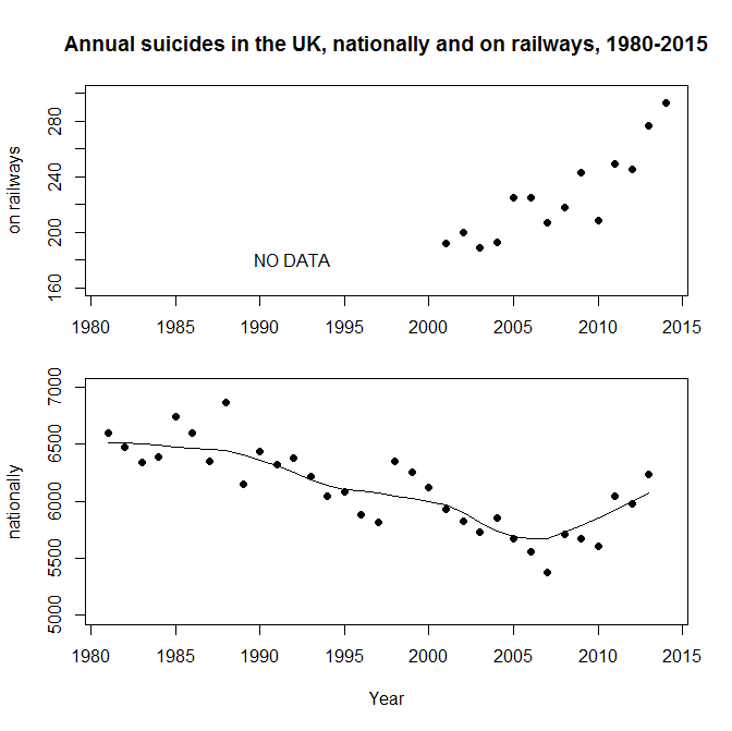
I have added a LOWESS line (with smoothing parameter 0.4) to the national data the better to pick out the minimum around 2007, just before the start of the financial crisis. That is where the steady decline over the previous quarter century reverses. It is in itself an arresting statistic. But I don’t see the national trend mirrored in the railway data, thereby explaining that trend.
Previously I noted proposals to repeat a strategy from Japan of bathing railway platforms with blue light. Professor Michiko Ueda of Syracuse University was kind enough to send me details of the research. The conclusions were encouraging but tentative and, unfortunately, the Japanese rail companies have not made any fresh data available for analysis since 2010. In the UK, I understand that such lights were installed at Gatwick in summer 2014 but I have not seen any data.
A huge amount of sincere endeavour has gone into this issue but further efforts have to be against the background that there is an escalating and unexplained problem.
Things and actions are what they are and the consequences of them will be what they will be: why then should we desire to be deceived?

Another interesting and thought provoking article.
If you compare the ‘current year’ statistics with the historic data using the Poisson Distribution, then the number of fatalities in 2013 and 2014 appear to be significantly higher than would be expected due to random variations and ‘chance’. based on previous data. Although not conclusive evidence of a developing trend – this would suggest that ‘something has changed’ and that predictions based on historic data may be miss-leading.
In this context, recognizing ‘trends’ may help identify underlying causes – or alert us to the the inaccuracies of predictions based on ‘old data’.
To clarify my previous comment, I would use the historic data (average number of deaths/per year, to date) to predict the the range of values for the next year – and compare the actual data with that prediction. If the results are consistently above the 50% Poisson Prediction – or heavily skewed, is would support the argument that a trend exists – and should be investigated.
However, we may find a variety of patterns in the data, including long term trends due to improved design of stations and tracks or more effective surveillance, and cyclic variation based on social-economic factors.