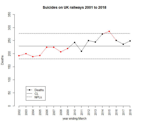
The latest UK rail safety statistics were published on 6 December 2018, again absent much of the press fanfare we had seen in the past. Regular readers of this blog will know that I have followed the suicide data series, and the press response, closely in 2017, 2016, 2015, 2014, 2013 and 2012. Again I have re-plotted the data myself on a Shewhart chart.
Readers should note the following about the chart.
- Many thanks to Tom Leveson Gower at the Office of Rail and Road who confirmed that the figures are for the year up to the end of March.
- Some of the numbers for earlier years have been updated by the statistical authority.
- I have recalculated natural process limits (NPLs) as there are still no more than 20 annual observations, and because the historical data has been updated. The NPLs have therefore changed but, this year, not by much.
- Again, the pattern of signals, with respect to the NPLs, is similar to last year.
The current chart again shows the same two signals, an observation above the upper NPL in 2015 and a run of 8 below the centre line from 2002 to 2009. As I always remark, the Terry Weight rule says that a signal gives us license to interpret the ups and downs on the chart. So I shall have a go at doing that.
After two successive annual falls there has been an increase in the number of fatalities.
I haven’t yet seen any real contemporaneous comment on the numbers from the press this year. But what conclusions can we really draw?
In 2015 I was coming to the conclusion that the data increasingly looked like a gradual upward trend. The 2016 and 2017 data offered a challenge to that but my view was still that it was too soon to say that the trend had reversed. There was nothing in the data incompatible with a continuing trend. The decline has not continued but how much can we read into that? There is nothing inherently informative about a relative increase. Remember, the data would certainly have gone up or down. Then again, was there some sort of peak in 2015?
Signal or noise?
Has there been a change to the underlying cause system that drives the suicide numbers? Since the 2016 data, I have fitted a trend line through the data and asked which narrative best fitted what I observed, a continuing increasing trend or a trend that had plateaued or even reversed. You can review my analysis from 2016 here. And from 2017 here.
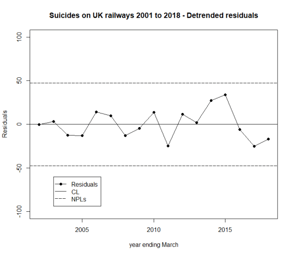
Here is the data and fitted trend updated with this year’s numbers, along with NPLs around the fitted line, the same as I did in 2016 and 2017.
We always go back to the cause and effect diagram.

As I always emphasise, the difficulty with the suicide data is that there is very little reproducible and verifiable knowledge as to its causes. There is a lot of useful thinking from common human experience and from more general theories in psychology. But the uncertainty is great. It is not possible to come up with a definitive cause and effect diagram on which all will agree, other from the point of view of identifying candidate factors. In statistical terminology, the problem lacks rigidity.
The earlier evidence of a trend, however, suggests that there might be some causes that are developing over time. It is not difficult to imagine that economic trends and the cumulative awareness of other fatalities might have an impact. We are talking about a number of things that might appear on the cause and effect diagram and some that do not, the “unknown unknowns”. When I identified “time” as a factor, I was taking sundry “lurking” factors and suspected causes from the cause and effect diagram that might have a secular impact. I aggregated them under the proxy factor “time” for want of a more refined analysis.
What I have tried to do is to split the data into two parts:
- A trend (linear simply for the sake of exploratory data analysis (EDA)); and
- The residual variation about the trend.
The question I want to ask is whether the residual variation is stable, just plain noise, or whether there is a signal there that might give me a clue that a linear trend does not hold.
There is no signal in the detrended data, no signal that the trend has reversed. The tough truth of the data is that it supports either narrative.
- The upward trend is continuing and is stable. There has been no reversal of trend yet.
- The raw data is not stable. True there is evidence of an upward trend in the past but there is now evidence that deaths are decreasing, notwithstanding the increase over the last year.
Of course, there is no particular reason, absent the data, to believe in an increasing trend and the initiative to mitigate the situation might well be expected to result in an improvement.
Sometimes, with data, we have to be honest and say that we do not have the conclusive answer. That is the case here. All that can be done is to continue the existing initiatives and look to the future. Nobody ever likes that as a conclusion but it is no good pretending things are unambiguous when that is not the case.
Next steps
Previously I noted proposals to repeat a strategy from Japan of bathing railway platforms with blue light. In the UK, I understand that such lights were installed at Gatwick in summer 2014. There is some recent commentary here from the BBC but I feel the absence of any real systematic follow up on this. I have certainly seen nothing from Gatwick. My wife and I returned through there mid-January this year and the lights are still in place.
A huge amount of sincere endeavour has gone into this issue but further efforts have to be against the background that there is still no conclusive evidence of improvement.
Suggestions for alternative analyses are always welcomed here.