UK railway suicides – 2015 update

The latest UK rail safety statistics were published in September 2015 absent the usual press fanfare. Regular readers of this blog will know that I have followed the suicide data series, and the press response, closely in 2014, 2013 and 2012.

This year I am conscious that one of those units is not a mere statistic but a dear colleague, Nigel Clements. It was poet W B Yeats who observed, in his valedictory verse Under Ben Bulben that “Measurement began our might.” He ends the poem by inviting us to “Cast a cold eye/ On life, on death.” Sometimes, with statistics, we cast the cold eye but the personal reminds us that it must never be an academic exercise.

Nigel’s death gives me an additional reason for following this series. I originally latched onto it because I felt that exaggerated claims  as to trends were being made. It struck me as a closely bounded problem that should be susceptible to taught measurement. And it was something important.  Again I have re-plotted the data myself on a Shewhart chart.

RailwaySuicides4

Readers should note the following about the chart.

  • Some of the numbers for earlier years have been updated by the statistical authority.
  • I have recalculated natural process limits as there are still no more than 20 annual observations.
  • The signal noted last year has persisted (in red) with two consecutive observations above the upper natural process limit. There are also now eight points below the centre line at the beginning of the series.

As my colleague Terry Weight always taught me, a signal gives us license to interpret the ups and downs on the chart. This increasingly looks like a gradual upward trend.

Though there was this year little coverage in the press, I did find this article in The Guardian newspaper. I had previously wondered whether the railway data simply reflected an increasing trend in UK suicide in general. The Guardian report is eager to emphasise:

The total number [of suicides] in the UK has risen in recent years, with the latest Office for National Statistics figures showing 6,233 suicides registered in the UK in 2013, a 4% increase on the previous year.

Well, #executivetimeseries! I have low expectations of press data journalism so I do not know why I am disappointed. In any event I decided to plot the data. There were a few problems. The railway data is not collected by calendar year so the latest observation is 2014/15. I have not managed to identify which months are included though, while I was hunting I found out that the railway data does not include London Underground. I can find no railway data before 2001/02. The national suicide data is collected by calendar year and the last year published is 2013. I have done my best by (not quite) arbitrarily identifying 2013/14 in the railway data with 2013 nationally. I also tried the obvious shift by one year and it did not change the picture.

RailwaySuicides5

I have added a LOWESS line (with smoothing parameter 0.4) to the national data the better to pick out the minimum around 2007, just before the start of the financial crisis. That is where the steady decline over the previous quarter century reverses. It is in itself an arresting statistic. But I don’t see the national trend mirrored in the railway data, thereby explaining that trend.

Previously I noted proposals to repeat a strategy from Japan of bathing railway platforms with blue light. Professor Michiko Ueda of Syracuse University was kind enough to send me details of the research. The conclusions were encouraging but tentative and, unfortunately, the Japanese rail companies have not made any fresh data available for analysis since 2010. In the UK, I understand that such lights were installed at Gatwick in summer 2014 but I have not seen any data.

A huge amount of sincere endeavour has gone into this issue but further efforts have to be against the background that there is an escalating and unexplained problem.

Things and actions are what they are and the consequences of them will be what they will be: why then should we desire to be deceived?

Joseph Butler

Advertisement

Imagine …

Ben Bernanke official portrait.jpgNo, not John Lennon’s dreary nursery rhyme for hippies.

In his memoir of the 2007-2008 banking crisis, The Courage to ActBen Benanke wrote about his surprise when the crisis materialised.

We saw, albeit often imperfectly, most of the pieces of the puzzle. But we failed to understand – “failed to imagine” might be a better phrase – how those pieces would fit together to produce a financial crisis that compared to, and arguably surpassed, the financial crisis that ushered in the Great Depression.

That captures the three essentials of any attempt to foresee a complex future.

  • The pieces
  • The fit
  • Imagination

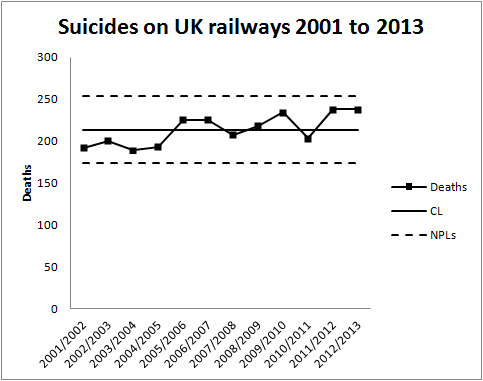
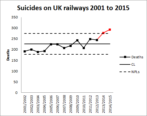
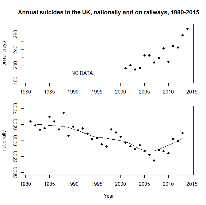
In any well managed organisation, “the pieces” consist of the established Key Performance Indicators (KPIs) and leading measures. Diligent and rigorous criticism of historical data using process behaviour charts allows departures from stability to be identified timeously. A robust and disciplined system of management and escalation enables an agile response when special causes arise.

Of course, “the fit” demands a broader view of the data, recognising interactions between factors and the possibility of non-simple global responses remote from a locally well behaved response surface. As the old adage goes, “Fit locally. Think globally.” This is where the Cardinal Newman principle kicks in.

“The pieces” and “the fit”, taken at their highest, yield a map of historical events with some limited prediction as to how key measures will behave in the future. Yet it is common experience that novel factors persistently invade. The “bow wave” of such events will not fit a recognised pattern where there will be a ready consensus as to meaning, mechanism and action. These are the situations where managers are surprised by rapidly emerging events, only to protest, “We never imagined …”.

Nassim Taleb’s analysis of the financial crisis hinged on such surprises and took him back to the work of British economist G L S Shackle. Shackle had emphasised the importance of imagination in economics. Put at its most basic, any attempt to assign probabilities to future events depends upon the starting point of listing the alternatives that might occur. Statisticians call it the sample space. If we don’t imagine some specific future we won’t bother thinking about the probability that it might come to be. Imagination is crucial to economics but it turns out to be much more pervasive as an engine of improvement that at first is obvious.

Imagination and creativity

Frank Whittle had to imagine the jet engine before he could bring it into being. Alan Turing had to imagine the computer. They were both fortunate in that they were able to test their imagination by construction. It was all realised in a comparatively short period of time. Whittle’s and Turing’s respective imaginations were empirically verified.

What is now proved was once but imagined.

William Blake

Not everyone has had the privilege of seeing their imagination condense into reality within their lifetime. In 1946, Sir George Paget Thomson and Moses Blackman imagined a plentiful source of inexpensive civilian power from nuclear fusion. As of writing, prospects of a successful demonstration seem remote. Frustratingly, as far as I can see, the evidence still refuses to tip the balance as to whether future success is likely or that failure is inevitable.

Something as illusive as imagination can have a testable factual content. As we know, not all tests are conclusive.

Imagination and analysis

Imagination turns out to be essential to something as prosaic as Root Cause Analysis. And essential in a surprising way. Establishing an operative cause of a past event is an essential task in law and engineering. It entails the search for a counterfactual, not what happened but what might have happened to avoid the  regrettable outcome. That is inevitably an exercise in imagination.

In almost any interesting situation there will be multiple imagined pasts. If there is only one then it is time to worry. Sometimes it is straightforward to put our ideas to the test. This is where the Shewhart cycle comes into its own. In other cases we are in the realms of uncomfortable science. Sometimes empirical testing is frustrated because the trail has gone cold.

The issues of counterfactuals, Root Cause Analysis and causation have been explored by psychologists Daniel Kahneman1 and Ruth Byrne2 among others. Reading their research is a corrective to the optimistic view that Root Cause analysis is some sort of inevitably objective process. It is distorted by all sorts of heuristics and biases. Empirical testing is vital, if only through finding some data with borrowing strength.

Imagine a millennium bug

In 1984, Jerome and Marilyn Murray published Computers in Crisis in which they warned of a significant future risk to global infrastructure in telecommunications, energy, transport, finance, health and other domains. It was exactly those areas where engineers had been enthusiastic to exploit software from the earliest days, often against severe constraints of memory and storage. That had led to the frequent use of just two digits to represent a year, “71” for 1971, say. From the 1970s, software became more commonly embedded in devices of all types. As the year 2000 approached, the Murrays envisioned a scenario where the dawn of 1 January 2000 was heralded by multiple system failures where software registers reset to the year 1900, frustrating functions dependent on timing and forcing devices into a fault mode or a graceless degradation. Still worse, systems may simply malfunction abruptly and without warning, the only sensible signal being when human wellbeing was compromised. And the ruinous character of such a threat would be that failure would be inherently simultaneous and global, with safeguarding systems possibly beset with the same defects as the primary devices. It was easy to imagine a calamity.

Risk matrixYou might like to assess that risk yourself (ex ante) by locating it on the Risk Assessment Matrix to the left. It would be a brave analyst who would categorise it as “Low”, I think. Governments and corporations were impressed and embarked on a massive review of legacy software and embedded systems, estimated to have cost around $300 billion at year 2000 prices. A comprehensive upgrade programme was undertaken by nearly all substantial organisations, public and private.

Then, on 1 January 2000, there was no catastrophe. And that caused consternation. The promoters of the risk were accused of having caused massive expenditure and diversion of resources against a contingency of negligible impact. Computer professionals were accused, in terms, of self-serving scare mongering. There were a number of incidents which will not have been considered minor by the people involved. For example, in a British hospital, tests for Down’s syndrome were corrupted by the bug resulting in contra-indicated abortions and births. However, there was no global catastrophe.

This is the locus classicus of a counterfactual. Forecasters imagined a catastrophe. They persuaded others of their vision and the necessity of vast expenditure in order to avoid it. The preventive measures were implemented at great costs. The Catastrophe did not occur. Ex post, the forecasters were disbelieved. The danger had never been real. Even Cassandra would have sympathised.

Critics argued that there had been a small number of relatively minor incidents that would have been addressed most economically on a “fix on failure” basis. Much of this turns out to be a debate about the much neglected column of the risk assessment headed “Detectability”. Where a failure will inflict immediate pain, it is so much more critical as to management and mitigation than a failure that will present the opportunity for detection and protection in advance of a broader loss. Here, forecasting Detectability was just as important as Probability and Consequences in arriving at an economic strategy for management.

It is the fundamental paradox of risk assessment that, where control measures eliminate a risk, it is not obvious whether the benign outcome was caused by the control or whether the risk assessment was just plain wrong and the risk never existed. Another counterfactual. Again, finding some alternative data with borrowing strength can help though it will ever be difficult to build a narrative appealing to a wide population. There are links to some sources of data on the Wikipedia article about the bug. I will leave it to the reader.

Imagine …

Of course it is possible to find this all too difficult and to adopt the Biblical outlook.

I returned, and saw under the sun, that the race is not to the swift, nor the battle to the strong, neither yet bread to the wise, nor yet riches to men of understanding, nor yet favour to men of skill; but time and chance happeneth to them all.

Ecclesiastes 9:11
King James Bible

That is to adopt the outlook of the lady on the level crossing. Risk professionals look for evidence that their approach works.

The other day, I was reading the annual report of the UK Health and Safety Executive (pdf). It shows a steady improvement in the safety of people at work though oddly the report is too coy to say this in terms. The improvement occurs over the period where risk assessment has become ubiquitous in industry. In an individual work activity it will always be difficult to understand whether interventions are being effective. But using the borrowing strength of the overall statistics there is potent evidence that risk assessment works.

References

  1. Kahneman, D & Tversky, A (1979) “The simulation heuristic”, reprinted in Kahneman et al. (1982) Judgment under Uncertainty: Heuristics and Biases, Cambridge, p201
  2. Byrne, R M J (2007) The Rational Imagination: How People Create Alternatives to Reality, MIT Press

FIFA and the Iron Law of Oligarchy

Йозеф Блаттер.jpgIn 1911, Robert Michels embarked on one of the earliest investigations into organisational culture. Michels was a pioneering sociologist, a student of Max Weber. In his book Political Parties he aggregated evidence about a range of trade unions and political groups, in particular the German Social Democratic Party.

He concluded that, as organisations become larger and more complex, a bureaucracy inevitably forms to take, co-ordinate and optimise decisions. It is the most straightforward way of creating alignment in decision making and unified direction of purpose and policy. Decision taking power ends up in the hands of a few bureaucrats and they increasingly use such power to further their own interests, isolating themselves from the rest of the organisation to protect their privilege. Michels called this the Iron Law of Oligarchy.

These are very difficult matters to capture quantitavely and Michels’ limited evidential sampling frame has more of the feel of anecdote than data. “Iron Law” surely takes the matter too far. However, when we look at the allegations concerning misconduct within FIFA it is tempting to feel that Michels’ theory is validated, or at least has gathered another anecdote to take the evidence base closer to data.

But beyond that, what Michels surely identifies is a danger that a bureaucracy, a management cadre, can successfully isolate itself from superior and inferior strata in an organisation, limiting the mobility of business data and fostering their own ease. The legitimate objectives of the organisation suffer.

Michels failed to identify a realistic solution, being seduced by the easy, but misguided, certainties of fascism. However, I think that a rigorous approach to the use of data can guard against some abuses without compromising human rights.

Oligarchs love traffic lights

I remember hearing the story of a CEO newly installed in a mature organisation. His direct reports had instituted a “traffic light” system to report status to the weekly management meeting. A green light meant all was well. An amber light meant that some intervention was needed. A red light signalled that threats to the company’s goals had emerged. At his first meeting, the CEO found that nearly all “lights” were green, with a few amber. The new CEO perceived an opportunity to assert his authority and show his analytical skills. He insisted that could not be so. There must be more problems and he demanded that the next meeting be an opportunity for honesty and confronting reality.

At the next meeting there was a kaleidoscope of red, amber and green “lights”. Of course, it turned out that the managers had flagged as red the things that were either actually fine or could be remedied quickly. They could then report green at the following meeting. Real career limiting problems were hidden behind green lights. The direct reports certainly didn’t want those exposed.

Openness and accountability

I’ve quoted Nobel laureate economist Kenneth Arrow before.

… a manager is an information channel of decidedly limited capacity.

Essays in the Theory of Risk-Bearing

Perhaps the fundamental problem of organisational design is how to enable communication of information so that:

  • Individual managers are not overloaded.
  • Confidence in the reliable satisfaction of process and organisational goals is shared.
  • Systemic shortfalls in process capability are transparent to the managers responsible, and their managers.
  • Leading indicators yield early warnings of threats to the system.
  • Agile responses to market opportunities are catalysed.
  • Governance functions can exploit the borrowing strength of diverse data sources to identify misreporting and misconduct.

All that requires using analytics to distinguish between signal and noise. Traffic lights offer a lousy system of intra-organisational analytics. Traffic light systems leave it up to the individual manager to decide what is “signal” and what “noise”. Nobel laureate psychologist Daniel Kahneman has studied how easily managers are confused and misled in subjective attempts to separate signal and noise. It is dangerous to think that What you see is all there is. Traffic lights offer a motley cloak to an oligarch wishing to shield his sphere of responsibility from scrutiny.

The answer is trenchant and candid criticism of historical data. That’s the only data you have. A rigorous system of goal deployment and mature use of process behaviour charts delivers a potent stimulus to reluctant data sharers. Process behaviour charts capture the development of process performance over time, for better or for worse. They challenge the current reality of performance through the Voice of the Customer. They capture a shared heuristic for characterising variation as signal or noise.

Individual managers may well prefer to interpret the chart with various competing narratives. The message of the data, the Voice of the Process, will not always be unambiguous. But collaborative sharing of data compels an organisation to address its structural and people issues. Shared data generation and investigation encourage an organisation to find practical ways of fostering team work, enabling problem solving and motivating participation. It is the data that can support the organic emergence of a shared organisational narrative that adds further value to the data and how it is used and developed. None of these organisational and people matters have generalised solutions but a proper focus on data drives an organisation to find practical strategies that work within their own context. And to test the effectiveness of those strategies.

Every week the press discloses allegations of hidden or fabricated assets, repudiated valuations, fraud, misfeasance, regulators blindsided, creative reporting, anti-competitive behaviour, abused human rights and freedoms.

Where a proper system of intra-organisational analytics is absent, you constantly have to ask yourself whether you have another FIFA on your hands. The FIFA allegations may be true or false but that they can be made surely betrays an absence of effective governance.

#oligarchslovetrafficlights

Soccer management – signal, noise and contract negotiation

Some poor data journalism here from the BBC on 28 May 2015, concerning turnover in professional soccer managers in England. “Managerial sackings reach highest level for 13 years” says the headline. A classic executive time series. What is the significance of the 13 years? Other than it being the last year with more sackings than the present.

The data was purportedly from the League Managers’ Association (LMA) and their Richard Bevan thought the matter “very concerning”. The BBC provided a chart (fair use claimed).

MgrSackingsto201503

Now, I had a couple of thoughts as soon as I saw this. Firstly, why chart only back to 2005/6? More importantly, this looked to me like a stable system of trouble (for football managers) with the possible exception of this (2014/15) season’s Championship coach turnover. Personally, I detest multiple time series on a common chart unless there is a good reason for doing so. I do not think it the best way of showing variation and/ or association.

Signal and noise

The first task of any analyst looking at data is to seek to separate signal from noise. Nate Silver made this point powerfully in his book The Signal and the Noise: The Art and Science of Prediction. As Don Wheeler put it: all data has noise; some data has signal.

Noise is typically the irregular aggregate of many causes. It is predictable in the same way as a roulette wheel. A signal is a sign of some underlying factor that has had so large an effect that it stands out from the noise. Signals can herald a fundamental unpredictability of future behaviour.

If we find a signal we look for a special cause. If we start assigning special causes to observations that are simply noise then, at best, we spend money and effort to no effect and, at worst, we aggravate the situation.

The Championship data

In any event, I wanted to look at the data for myself. I was most interested in the Championship data as that was where the BBC and LMA had been quick to find a signal. I looked on the LMA’s website and this is the latest data I found. The data only records dismissals up to 31 March of the 2014/15 season. There were 16. The data in the report gives the total number of dismissals for each preceding season back to 2005/6. The report separates out “dismissals” from “resignations” but does not say exactly how the classification was made. It can be ambiguous. A manager may well resign because he feels his club have themselves repudiated his contract, a situation known in England as constructive dismissal.

The BBC’s analysis included dismissals right up to the end of each season including 2014/15. Reading from the chart they had 20. The BBC have added some data for 2014/15 that isn’t in the LMA report and not given the source. I regard that as poor data journalism.

I found one source of further data at website The Sack Race. That told me that since the end of March there had been four terminations.

Manager Club Termination Date
Malky Mackay Wigan Athletic Sacked 6 April
Lee Clark Blackpool Resigned 9 May
Neil Redfearn Leeds United Contract expired 20 May
Steve McClaren Derby County Sacked 25 May

As far as I can tell, “dismissals” include contract non-renewals and terminations by mutual consent. There are then a further three dismissals, not four. However, Clark left Blackpool amid some corporate chaos. That is certainly a termination that is classifiable either way. In any event, I have taken the BBC figure at face value though I am alerted as to some possible data quality issues here.

Signal and noise

Looking at the Championship data, this was the process behaviour chart, plotted as an individuals chart.

MgrSackingsto201503

There is a clear signal for the 2014/15 season with an observation, 20 dismissals,, above the upper natural process limit of 19.18 dismissals. Where there is a signal we should seek a special cause. There is no guarantee that we will find a special cause. Data limitations and bounded rationality are always constraints. In fact, there is no guarantee that there was a special cause. The signal could be a false positive. Such effects cannot be eliminated. However, signals efficiently direct our limited energy for, what Daniel Kahneman calls, System 2 thinking towards the most promising enquiries.

Analysis

The BBC reports one narrative woven round the data.

Bevan said the current tenure of those employed in the second tier was about eight months. And the demand to reach the top flight, where a new record £5.14bn TV deal is set to begin in 2016, had led to clubs hitting the “panic button” too quickly.

It is certainly a plausible view. I compiled a list of the dismissals and non-renewals, not the resignations, with data from Wikipedia and The Sack Race. I only identified 17 which again suggests some data quality issue around classification. I have then charted a scatter plot of date of dismissal against the club’s then league position.

MgrSackings201415

It certainly looks as though risk of relegation is the major driver for dismissal. Aside from that, Watford dismissed Billy McKinlay after only two games when they were third in the league, equal on points with the top two. McKinlay had been an emergency appointment after Oscar Garcia had been compelled to resign through ill health. Watford thought they had quickly found a better manager in Slavisa Jokanovic. Watford ended the season in second place and were promoted to the Premiership.

There were two dismissals after the final game on 2 May by disappointed mid-table teams. Beyond that, the only evidence for impulsive managerial changes in pursuit of promotion is the three mid-season, mid-table dismissals.

Club league position
Manager Club On dismissal At end of season
Nigel Adkins Reading 16 19
Bob Peeters Charlton Athletic 14 12
Stuart Pearce Nottingham Forrest 12 14

A table that speaks for itself. I am not impressed by the argument that there has been the sort of increase in panic sackings that Bevan fears. Both Blackpool and Leeds experienced chaotic executive management which will have resulted in an enhanced force of mortality on their respective coaches. That along with the data quality issues and the technical matter I have described below lead me to feel that there was no great enhanced threat to the typical Championship manager in 2014/15.

Next season I would expect some regression to the mean with a lower number of dismissals. Not much of a prediction really but that’s what the data tells me. If Bevan tries to attribute that to the LMA’s activism them I fear that he will be indulging in Langian statistical analysis. Will he be able to resist?

Techie bit

I have a preference for individuals charts but I did also try plotting the data on an np-chart where I found no signal. It is trite service-course statistics that a Poisson distribution with mean λ has standard deviation √λ so an upper 3-sigma limit for a (homogeneous) Poisson process with mean 11.1 dismissals would be 21.1 dismissals. Kahneman has cogently highlighted how people tend to see patterns in data as signals even where they are typical of mere noise. In this case I am aware that the data is not atypical of a Poisson process so I am unsurprised that I failed to identify a special cause.

A Poisson process with mean 11.1 dismissals is a pretty good model going forwards and that is the basis I would press on any managers in contract negotiations.

Of course, the clubs should remember that when they look for a replacement manager they will then take a random sample from the pool of job seekers. Really!

Deconstructing Deming XI B – Eliminate numerical goals for management

11. Part B. Eliminate numerical goals for management.

W. Edwards Deming.jpgA supposed corollary to the elimination of numerical quotas for the workforce.

This topic seems to form a very large part of what passes for exploration and development of Deming’s ideas in the present day. It gets tied in to criticisms of remuneration practices and annual appraisal, and target-setting in general (management by objectives). It seems to me that interest flows principally from a community who have some passionately held emotional attitudes to these issues. Advocates are enthusiastic to advance the views of theorists like Alfie Kohn who deny, in terms, the effectiveness of traditional incentives. It is sad that those attitudes stifle analytical debate. I fear that the problem started with Deming himself.

Deming’s detailed arguments are set out in Out of the Crisis (at pp75-76). There are two principle reasoned objections.

  1. Managers will seek empty justification from the most convenient executive time series to hand.
  2. Surely, if we can improve now, we would have done so previously, so managers will fall back on (1).

The executive time series

I’ve used the time series below in some other blogs (here in 2013 and here in 2012). It represents the anual number of suicides on UK railways. This is just the data up to 2013.
RailwaySuicides2

The process behaviour chart shows a stable system of trouble. There is variation from year to year but no significant (sic) pattern. There is noise but no signal. There is an average of just over 200 fatalities, varying irregularly between around 175 and 250. Sadly, as I have discussed in earlier blogs, simply selecting a pair of observations enables a polemicist to advance any theory they choose.

In Railway Suicides in the UK: risk factors and prevention strategies, Kamaldeep Bhui and Jason Chalangary of the Wolfson Institute of Preventive Medicine, and Edgar Jones of the Institute of Psychiatry, King’s College, London quoted the Rail Safety and Standards Board (RSSB) in the following two assertions.

  • Suicides rose from 192 in 2001-02 to a peak 233 in 2009-10; and
  • The total fell from 233 to 208 in 2010-11 because of actions taken.

Each of these points is what Don Wheeler calls an executive time series. Selective attention, or inattention, on just two numbers from a sequence of irregular variation can be used to justify any theory. Deming feared such behaviour could be perverted to justify satisfaction of any goal. Of course, the process behaviour chart, nowhere more strongly advocated than by Deming himself in Out of the Crisis, is the robust defence against such deceptions. Diligent criticism of historical data by means of process behaviour charts is exactly what is needed to improve the business and exactly what guards against success-oriented interpretations.

Wishful thinking, and the more subtle cognitive biases studied by Daniel Kahneman and others, will always assist us in finding support for our position somewhere in the data. Process behaviour charts keep us objective.

If not now, when?

If I am not for myself, then who will be for me?
And when I am for myself, then what am “I”?
And if not now, when?

Hillel the Elder

Deming criticises managerial targets on the grounds that, were the means of achieving the target known, it would already have been achieved and, further, that without having the means efforts are futile at best. It’s important to remember that Deming is not here, I think, talking about efforts to stabilise a business process. Deming is talking about working to improve an already stable, but incapable, process.

There are trite reasons why a target might legitimately be mandated where it has not been historically realised. External market conditions change. A manager might unremarkably be instructed to “Make 20% more of product X and 40% less of product Y“. That plays in to the broader picture of targets’ role in co-ordinating the parts of a system, internal to the organisation of more widely. It may be a straightforward matter to change the output of a well-understood, stable system by an adjustment of the inputs.

Deming says:

If you have a stable system, then there is no use to specify a goal. You will get whatever the system will deliver.

But it is the manager’s job to work on a stable system to improve its capability (Out of the Crisis at pp321-322). That requires capital and a plan. It involves a target because the target captures the consensus of the whole system as to what is required, how much to spend, what the new system looks like to its customer. Simply settling for the existing process, being managed through systematic productivity to do its best, is exactly what Deming criticises at his Point 1 (Constancy of purpose for improvement).

Numerical goals are essential

… a manager is an information channel of decidedly limited capacity.

Kenneth Arrow
Essays in the Theory of Risk-Bearing

Deming’s followers have, to some extent, conceded those criticisms. They say that it is only arbitrary targets that are deprecated and not the legitimate Voice of the Customer/ Voice of the Business. But I think they make a distinction without a difference through the weasel words “arbitrary” and “legitimate”. Deming himself was content to allow managerial targets relating to two categories of existential risk.

However, those two examples are not of any qualitatively different type from the “Increase sales by 10%” that he condemns. Certainly back when Deming was writing Out of the Crisis most OELs were based on LD50 studies, a methodology that I am sure Deming would have been the first to criticise.

Properly defined targets are essential to business survival as they are one of the principal means by which the integrated function of the whole system is communicated. If my factory is producing more than I can sell, I will not work on increasing capacity until somebody promises me that there is a plan to improve sales. And I need to know the target of the sales plan to know where to aim with plant capacity. It is no good just to say “Make as much as you can. Sell as much as you can.” That is to guarantee discoordination and inefficiency. It is unsurprising that Deming’s thinking has found so little real world implementation when he seeks to deprive managers of one of the principle tools of managing.

Targets are dangerous

I have previously blogged about what is needed to implement effective targets. An ill judged target can induce perverse incentives. These can be catastrophic for an organisation, particularly one where the rigorous criticism of historical data is absent.