Late-night drinking laws saved lives

That was the headline in The Times (London) on 19 August 2013. The copy went on:

“Hundreds of young people have escaped death on Britain’s roads after laws were relaxed to allow pubs to open late into the night, a study has found.”

It was accompanied by a chart.

How death toll fell

This conclusion was apparently based on a report detailing work led by Dr Colin Green at Lancaster University Management School. The report is not on the web but Lancaster were very kind in sending me a copy and I extend my thanks to them for the courtesy.

This is very difficult data to analyse. Any search for a signal has to be interpreted against a sustained fall in recorded accidents involving personal injury that goes back to the 1970s and is well illustrated in the lower part of the graphic (see here for data). The base accident data is therefore manifestly not stable and predictable. To draw inferences we need to be able to model the long term trend in a persuasive manner so that we can eliminate its influence and work with a residual data sequence amendable to statistical analysis.

It is important to note, however, that the authors had good reason to believe that relaxation of licensing laws may have an effect so this was a proper exercise in Confirmatory Data Analysis.

Reading the Lancaster report I learned that The Times graphic is composed of five-month moving averages. I do not think that I am attracted by that as a graphic. Shewhart’s Second Rule of Data Presentation is:

Whenever an average, range or histogram is used to summarise observations, the summary must not mislead the user into taking any action that the user would not take if the data were presented in context.

I fear that moving-averages will always obscure the message in the data. I preferred this chart from the Lancaster report. The upper series are for England, the lower for Scotland.

Drink Drive scatter

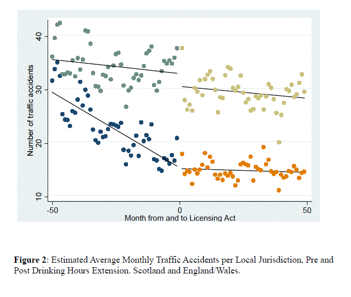
Now we can see the monthly observations. Subjectively there looks to be, at least in some years, some structure of variation throughout the year. That is unsurprising but it does ruin all hope of justifying an assumption of “independent identically distributed” residuals. Because of that alone, I feel that the use of p-values here is inappropriate, the usual criticisms of p-values in general notwithstanding (see the advocacy of Stephen Ziliak and Deirdre McCloskey).

As I said, this is very tricky data from which to separate signal and noise. Because of the patterned variation within any year I think that there is not much point in analysing other than annual aggregates. The analysis that I would have liked to have seen would have been a straight line regression through the whole of the annual data for England. There may be an initial disappointment that that gives us “less data to play with”. However, considering the correlation within the intra-year monthly figures, a little reflection confirms that there is very little sacrifice of real information. I’ve had a quick look at the annual aggregates for the period under investigation and I can’t see a signal. The analysis could be taken further by calculating an R2. That could then be compared with an R2 calculated for the Lancaster bi-linear “change point” model. Is the extra variation explained worth having for the extra parameters?

I see that the authors calculated an R2 of 42%. However, that includes accounting for the difference between English and Scottish data which is the dominant variation in the data set. I’m not sure what the Scottish data adds here other than to inflate R2.

There might also be an analysis approach by taking out the steady long term decline in injuries using a LOWESS curve then looking for a signal in the residuals.

What that really identifies are three ways of trying to cope with the long term declining trend, which is a nuisance in this analysis: straight line regression, straight line regression with “change point”, and LOWESS. If they don’t yield the same conclusions then any inference has to be treated with great caution. Inevitably, any signal is confounded with lack of stability and predictability in the long term trend.

I comment on this really to highlight the way the press use graphics without explaining what they mean. I intend no criticism of the Lancaster team as this is very difficult data to analyse. Of course, the most important conclusion is that there is no signal that the relaxation in licensing resulted in an increase in accidents. I trust that my alternative world view will be taken constructively.

Risks of Paediatric heart surgery in the NHS

I thought, before posting, I would let the controversy die down around this topic and in particular the anxieties and policy changes around Leeds General Infirmary. However, I had a look at this report and found there were some interesting things in it worth blogging about.

Readers will remember that there was anxiety in the UK about mortality rates from paediatric surgery and whether differential mortality rates from the limited number of hospitals was evidence of relative competence and, moreover, patient safety. For a time Leeds General Infirmary suspended all such surgery. The report I’ve been looking at was a re-analysis of the data after some early data quality problems had been resolved. Leeds was exonerated and recommenced surgery.

The data analysed is from 2009 to 2012. The headline graphic in the report is this. The three letter codes indicate individual hospitals.

Heart Summary

I like this chart as it makes an important point. There is nothing, in itself, significant about having the highest mortality rate. There will always be exactly two hospitals at the extremes of any league table. The task of data analysis is to tell us whether that is simply a manifestation of the noise in the system or whether it is a signal of an underlying special cause. Nate Silver makes these points very well in his book The Signal and the Noise. Leeds General Infirmary had the greatest number of deaths, relative to expectations, but then somebody had to. It may feel emotionally uncomfortable being at the top but it is no guide to executive action.

Statisticians like the word “significant” though I detest it. It is a “word worn smooth by a million tongues”. The important idea is that of a sign or signal that stands out in unambiguous contrast to the noise. As Don Wheeler observed, all data has noise, some data also has signals. Even the authors of the report seem to have lost confidence in the word as they enclose it in quotes in their introduction. However, what this report is all about is trying to separate signal from noise. Against all the variation in outcomes in paediatric heart surgery, is there a signal? If so, what does the signal tell us and what ought we to do?

The authors go about their analysis using p-values. I agree with Stephen Ziliak and Deirdre McCloskey in their criticism of p-values. They are a deeply unreliable as a guide to action. I do not think they do much harm they way they are used in this report but I would have preferred to see the argument made in a different way.

The methodology of the report starts out by recognising that the procedural risks will not be constant for all hospitals. Factors such as differential distributions of age, procedural complexity and the patient’s comorbidities will affect the risk. The report’s analysis is predicated on a model (PRAiS) that predicts the number of deaths to be expected in a given year as a function of these sorts of variables. The model is based on historical data, I presume from before 2009. I shall call this the “training” data. The PRAiS model endeavours to create a “level playing field”. If the PRAiS adjusted mortality figures are stable and predictable then we are simply observing noise. The noise is the variation that the PRAiS model cannot explain. It is caused by factors as yet unknown and possibly unknowable. What we are really interested in is whether any individual hospital in an individual year shows a signal, a mortality rate that is surprising given the PRAiS prediction.

The authors break down the PRAiS adjusted data by year and hospital. They then take a rather odd approach to the analysis. In each year, they make a further adjustment to the observed deaths based on the overall mortality rate for all hospitals in that year. I fear that there is no clear explanation as to why this was adopted.

I suppose that this enables them to make an annual comparison between hospitals. However, it does have some drawbacks. Any year-on-year variation not explained by the PRAiS model is part of the common cause variation, the noise, in the system. It ought to have been stable and predictable over the data with which the model was “trained”. It seems odd to adjust data on the basis of noise. If there were a deterioration common to all hospitals, it would not be picked up in the authors’ p-values. Further, a potential signal of deterioration in one hospital might be masked by a moderately bad, but unsurprising, year in general.

What the analysis does mask is that there is a likely signal here suggesting a general improvement in mortality rates common across the hospitals. Look at 2009-10 for example. Most hospitals reported fewer deaths than the PRAiS model predicted. The few that didn’t, barely exceeded the prediction.

Hear0910

In total, over the three years and 9930 procedures studied, the PRAiS model predicted 291 deaths. There were 243. For what it’s worth, I get a p-value of 0.002. Taking that at face value, there is a signal that mortality has dropped. Not a fact that I would want to disguise.

The plot that I would like to have seen, as an NHS user, would be a chart of PRAiS adjusted annual deaths against time for the “training” data. That chart should then have natural process limits (“NPLs”) added, calculated from the PRAiS adjusted deaths. This must show stable and predictable PRAiS adjusted deaths. Otherwise, the usefulness of the model and the whole approach is compromised. The NPLs could then be extended forwards in time and subsequent PRAiS adjusted mortalities charted on an annual basis. There would be individual hospital charts and a global chart. New points would be added annually.

I know that there is a complexity with the varying number of patients each year but if plotted in the aggregate and by hospital there is not enough variation, I think, to cause a problem.

The chart I suggest has some advantages. It would show performance over time in a manner transparent to NHS users. Every time the data comes in issue we could look and see that we have the same chart as last time we looked with new data added. We could see the new data in the context of the experience base. That helps build trust in data. There would be no need for an ad hoc analysis every time a question was raised. Further, the “training” data would give us the residual process variation empirically. We would not have to rely on simplifying assumptions such as the Poisson distribution when we are looking for a surprise.

There is a further point. The authors of the report recognise a signal against two criteria, an “Alert area” and an “Alarm area”. I’m not sure how clinicians and managers respond to a signal in these respective areas. It is suggestive of the old-fashioned “warning limits” that used to be found on some control charts. However, the authors of the report compound matters by then stating that hospitals “approaching the alert threshold may deserve additional scrutiny and monitoring of current performance”. The simple truth is that, as Terry Weight used to tell me, a signal is a signal is a signal. As soon as we see a signal we protect the customer and investigate its cause. That’s all there is to it. There is enough to do in applying that tactic diligently. Over complicating the urgency of response does not, I think, help people to act effectively on data. If we act when there is no signal then we have a strategy that will make outcomes worse.

Of course, I may have misunderstood the report and I’m happy for the authors to post here and correct me.

If we wish to make data the basis for action then we have to move from reactive ad hoc analysis to continual and transparent measurement along with a disciplined pattern of response. Medical safety strikes me as exactly the sort of system that demands such an approach.

Trust in data – I

I was listening to the BBC’s election coverage on 2 May (2013) when Nick Robinson announced that UKIP supporters were five times more likely than other voters to believe that the MMR vaccine was dangerous.

I had a search on the web. The following graphic had appeared on Mike Smithson’s PoliticalBetting blog on 21 April 2013.

MMR plot

It’s not an attractive bar chart. The bars are different colours. There is a “mean” bar that tends to make the variation look less than it is and makes the UKIP bar (next to it) look more extreme. I was, however, intrigued so I had a look for the original data which had come from a YouGov survey of 1765 respondents. You can find the data here.

Here is a summary of the salient points of the data from the YouGov website in a table which I think is less distracting than the graphic.

Voting   intention Con. Lab. Lib. Dem. UKIP
No. Of   respondents 417 518 142 212
% % % %
MMR safe 99 85 84 72
MMR unsafe 1 3 12 28
Don’t know 0 12 3 0

My first question was: Where had Nick Robinson and Mike Smithson got their numbers from? It is possible that there was another survey I have not found. It is also possible that I am being thick. In any event, the YouGov data raises some interesting questions. This is an exploratory date analysis exercise. We are looking for interesting theories. I don’t think there is any doubt that there is a signal in this data. How do we interpret it? There does look to be some relationship between voting intention and attitude to public safety data.

Should anyone be tempted to sneer at people with political views other than their own, it is worth remembering that it is unlikely that anyone surveyed had scrutinised any of the published scientific research on the topic. All will have digested it, most probably at third hand, through the press, internet, or cooler moment. They may not have any clear idea of the provenance of the assurances as to the vaccination’s safety. They may not have clearly identified issues as to whether what they had absorbed was a purportedly independent scientific study or a governmental policy statement that sought to rely on the science. I suspect that most of my readers have given it no more thought.

The mental process behind the answers probably wouldn’t withstand much analysis. This would be part of Kahneman’s System 1 thinking. However, the question of how such heuristics become established is an interesting one. I suspect there is a factor here that can be labelled “trust in data”.

Trust in data is an issue we all encounter, in business and in life. How do we know when we can trust data?

A starting point for many in this debate is the often cited observation of Brian Joiner that, when presented with a numerical target, a manager has three options: Manage the system so as to achieve the target, distort the system so the target is achieved but at the cost of performance elsewhere (possibly not on the dashboard), or simply distort the data. This, no doubt true, observation is then cited in support of the general proposition that management by numerical target is at best ineffective and at worst counter productive. John Seddon is a particular advocate of the view that, whatever benefits may flow from management by target (and they are seldom championed with any great energy), they are outweighed by the inevitable corruption of the organisation’s data generation and reporting.

It is an unhappy view. One immediate objection is that the broader system cannot operate without targets. Unless the machine part’s diameter is between 49.99 and 50.01 mm it will not fit. Unless chlorine concentrations are below the safe limit, swimmers risk being poisoned. Unless demand for working capital is cut by 10% we will face the consequences of insolvency. Advocates of the target free world respond that those matters can be characterised as the legitimate voice of the customer/ business. It is only arbitrary targets that are corrosive.

I am not persuaded that the legitimate/ arbitrary distinction is a real one, nor how the distinction motivates two different kinds of behaviour. I will blog more about this later. Leadership’s urgent task is to ensure that all managers have the tools to measure present reality and work to improve it. Without knowing how much improvement is essential a manager cannot make rational decisions about the allocation of resources. In that context, when the correct management control is exercised, improving the system is easier than cheating. I shall blog about goal deployment and Hoshin Kanri on another occasion.

Trust in data is just a factor of trust in general. In his popular book on evolutionary psychology and economics, The Origins of Virtue, Matt Ridley observes the following.

Trust is as vital a form of social capital as money is a form of actual capital. … Trust, like money, can be lent (‘I trust you because I trust the person who told me he trusts you’), and can be risked, hoarded or squandered. It pays dividends in the currency of more trust.

Within an organisation, trust in data is something for everybody to work on building collaboratively under diligent leadership. As to the public sphere, trust in data is related to trust in politicians and that may be a bigger problem to solve. It is also a salutary warning as to what happens when there is a failure of trust in leadership.