Imagination, data and leadership

I had an intriguing insight into the nature of imagination the other evening when I was watching David Eagleman’s BBC documentary The Brain which you can catch on iPlayer until 27 February 2016 if you have a UK IP address.

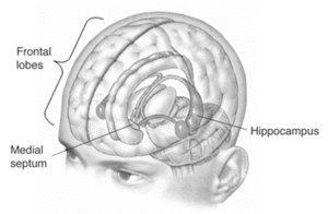
Eagleman told the strange story of Henry Molaison. Molaison suffered from debilitating epilepsy following a bicycle accident when he was nine years old. At age 27, Molaison underwent radical brain surgery that removed, all but completely, his hippocampi. The intervention stabilised the epilepsy but left Molaison’s memory severely impaired. Though he could recall his childhood, Molaison had no recall of events in the years leading up to his surgery and was unable to create new long-term memories. The case was important evidence for the theory that the hippocampus is critical to memory function. Molaison, having lost his, was profoundly compromised as to recall.

But Eagleman’s analysis went further and drew attention to a passage in a interview with Molaison later in his life.1 Though his presenting symptoms post-intervention were those of memory loss, Molaison also encountered difficulty in talking about what he would do the following day. Eagleman advances the theory that the hippocampus is critical, not only to memory, but to imagining the future. The systems that create memories are common to those that generate a model by which we can forecast, predict and envision novel outcomes.

I blogged about imagination back in November and how it was pivotal to core business activities from invention and creativity to risk management and root cause analysis. If Eagleman’s theory about the entanglement of memory and imagination is true then it might have profound implications for management. Perhaps our imagination will only function as well as our memory. That was, apparently, the case with Molaison. It could just be that an organisation’s ability to manage the future depends upon the same systems as those by which it critically captures the past.

That chimes with a theory of innovation put forward by W Brian Arthur of the Santa Fe Institute.2 Arthur argues that purportedly novel inventions are no more than combinations of known facts. There are no great leaps of creativity, just the incremental variation of a menagerie of artifacts and established technologies. Ideas similar to Arthur’s have been advanced by Matt Ridley,3,4 and Steven Berlin Johnson.5 Only mastery of the present exposes the opportunities to innovate. They say.

Data

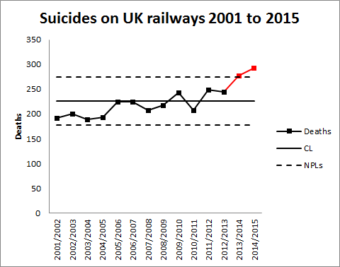
This all should be no surprise to anybody experienced in business improvement. Diligent and rigorous criticism of historical data is the catalyst of change and the foundation of realising a vivid future. This is a good moment to remind ourselves of the power of the process behaviour chart in capturing learning and creating an organisational memory.

GenericPBC

The process behaviour chart provides a cogent record of the history of operation of a business process, its surprises and disappointments, existential risks and epochs of systematic productivity. It records attempted business solutions, successful, failed, temporary and partial work-rounds. It segregates signal from noise. It suggests realistic bounds on prediction. It is the focus of inclusive discussion about what the data means. It is the live report of experimentation and investigation, root cause analysis and problem solving. It matches data with its historical context. It is the organisation’s memory of development of a business process, and the people who developed it. It is the basis for creating the future.

If you are not familiar with how process behaviour charts work in this context then have a look at Don Wheeler’s example of A Japanese Control Chart.6

Leadership

Tim Harford tries to take the matter further.7 On Harford’s account of invention, “trial and error” consistently outperform “expert leadership” through a Darwinian struggle of competing ideas. The successful innovations, Harford says, propagate by adoption and form an ecology of further random variation, out of which the best ideas emergently repeat the cycle or birth and death. Of course, Leo Tolstoy wrote War and Peace, his “airport novel” avant la lettre, (also currently being dramatised by the BBC) to support exactly this theory of history. In Tolsoy’s intimate descriptions of the Battles of Austerlitz and Borodino, combatants lose contact with their superiors, battlefields are obscured by smoke from the commanding generals, individuals act on impulse and in despite of field discipline. How, Tolstoy asked in terms, could anyone claim to be the organising intelligence of victory or the culpable author of defeat?

However, I think that a view of war at odds with Tolstoy’s is found in the career of General George Marshall.8 Marshall rose to the rank of General of the Army of the USA as an expert in military logistics rather than as a commander in the field. Reading a biography of Marshall presents an account of war as a contest of supply chains. The events of the theatre of operations may well be arbitrary and capricious. It was the delivery of superior personnel and materiel to the battlefield that would prove decisive. That does not occur without organisation and systematic leadership. I think.

Harford and the others argue that, even were the individual missing from history, the innovation would still have occurred. But even though it could have been anyone, it still had to be someone. And what that someone had to provide was leadership to bring the idea to market or into operation. We would still have motor cars without Henry Ford and tablet devices without Steve Jobs but there would have been two other names who had put themselves on the line to create something out of nothing.

In my view, the evolutionary model of innovation is interesting but stretches a metaphor too far. Innovation demands leadership. The history of barbed wire is instructive.9 In May 1873, at a county fair in Illinois, Henry B Rose displayed a comical device to prevent cattle beating down primitive fencing, a “wooden strip with metallic points”. The device hung round the cattle’s horns and any attempts to butt the fence drove the spikes into the beast’s head. It didn’t catch on but at the fair that day were Joseph Glidden, Isaac L Ellwood and Jacob Haish. The three went on, within a few months, each to invent barbed wire. The winning memes often come from failed innovation.

Leadership is critical, not only in scrutinising innovation but in organising the logistics that will bring it to market.10 More fundamentally, leadership is pivotal in creating the organisation in which diligent criticism of historical data is routine and where it acts as a catalyst for innovation.11

References

  1. http://www.sciencemuseum.org.uk/visitmuseum_OLD/galleries/who_am_i/~/media/8A897264B5064BC7BE1D5476CFCE50C5.ashx, retrieved 29 January 2016, at p5
  2. Arthur, W B (2009) The Nature of Technology: What it is and How it Evolves, The Free Press/ Penguin Books.
  3. Ridley, M (2010) The Rational Optimist, Fourth Estate
  4. — (2015) The Evolution of Everything, Fourth Estate
  5. Johnson, S B (2010) Where Good Ideas Come From: The Seven Patterns of Innovation, Penguin
  6. Wheeler, D J (1992) Understanding Statistical Process Control, SPC Press
  7. Harford, T (2011) Adapt: Why Success Always Starts with Failure, Abacus
  8. Cray, E (2000) General of the Army: George C. Marshall, Soldier and Statesman, Cooper Square Press
  9. Krell, A (2002) The Devil’s Rope: A Cultural History of Barbed Wire, Reaktion Books
  10. Armytage, W H G (1976) A Social History of Engineering, 4th ed., Faber
  11. Nonaka, I & Takeuchi, H (1995) The Knowledge-Creating Company: How Japanese Companies Create the Dynamics of Innovation, Oxford University Press

Why did the polls get it wrong?

This week has seen much soul-searching by the UK polling industry over their performance leading up to the 2015 UK general election on 7 May. The polls had seemed to predict that Conservative and Labour Parties were neck and neck on the popular vote. In the actual election, the Conservatives polled 37.8% to Labour’s 31.2% leading to a working majority in the House of Commons, once the votes were divided among the seats contested. I can assure my readers that it was a shock result. Over breakfast on 7 May I told my wife that the probability of a Conservative majority in the House was nil. I hold my hands up.

An enquiry was set up by the industry led by the National Centre for Research Methods (NCRM). They presented their preliminary findings on 19 January 2016. The principal conclusion was that the failure to predict the voting share was because of biases in the way that the data were sampled and inadequate methods for correcting for those biases. I’m not so sure.

Population -> Frame -> Sample

The first thing students learn when studying statistics is the critical importance, and practical means, of specifying a sampling frame. If the sampling frame is not representative of the population of concern then simply collecting more and more data will not yield a prediction of greater accuracy. The errors associated with the specification of the frame are inherent to the sampling method. Creating a representative frame is very hard in opinion polling because of the difficulty in contacting particular individuals efficiently. It turns out that Conservative voters are harder than Labour voters to get hold of, so that they can be questioned. The NCRM study concluded that, within the commercial constraints of an opinion poll, there was a lower probability that a Conservative voter would be contacted. They therefore tended to be under-represented in the data causing a substantial bias towards Labour.

This is a well known problem in polling practice and there are demographic factors that can be used to make a statistical adjustment. Samples can be stratified. NCRM concluded that, in the run up to the 2015 election, there were important biases tending to under state the Conservative vote and the existing correction factors were inadequate. Fresh sampling strategies were needed to eradicate the bias and improve prediction. There are understandable fears that this will make polling more costly. More calls will be needed to catch Conservatives at home.

Of course, that all sounds an eminently believable narrative. These sorts of sampling frame biases are familiar but enormously troublesome for pollsters. However, I wanted to look at the data myself.

Plot data in time order

That is the starting point of all statistical analysis. Polls continued after the election, though with lesser frequency. I wanted to look at that data after the election in addition to the pre-election data. Here is a plot of poll results against time for Conservative and Labour. I have used data from 25 January to the end of 2015.1, 2 I have not managed to jitter the points so there is some overprinting of Conservative by Labour pre-election.

Polling201501

Now that is an arresting plot. Yet again plotting against time elucidates the cause system. Something happened on the date of the election. Before the election the polls had the two parties neck and neck. The instant (sic) the election was done there was clear red/ blue water between the parties. Applying my (very moderate) level of domain knowledge to the data before, the poll results look stable and predictable. There is a shift after the election to a new datum that remains stable and predictable. The respective arithmetic means are given below.

Party Mean Poll Before Election Mean Poll After
Conservative 33.3% 37.8% 38.8%
Labour 33.5% 31.2% 30.9%

The mean of the post-election polls is doing fairly well but is markedly different from the pre-election results. Now, it is trite statistics that the variation we observe on a chart is the aggregate of variation from two sources.

  • Variation from the thing of interest; and
  • Variation from the measurement process.

As far as I can gather, the sampling methods used by the polling companies have not so far been modified. They were awaiting the NCRM report. They certainly weren’t modified in the few days following the election. The abrupt change on 7 May cannot be because of corrected sampling methods. The misleading pre-election data and the “impressive” post-election polls were derived from common sampling practices. It seems to me difficult to reconcile NCRM’s narrative to the historical data. The shift in the data certainly needs explanation within that account.

What did change on the election date was that a distant intention turned into the recall of a past action. What everyone wants to know in advance is the result of the election. Unsurprisingly, and as we generally find, it is not possible to sample the future. Pollsters, and their clients, have to be content with individuals’ perceptions of how they will vote. The vast majority of people pay very little attention to politics at all and the general level of interest outside election time is de minimis. Standing in a polling booth with a ballot paper is a very different matter from being asked about intentions some days, weeks or months hence. Most people take voting very seriously. It is not obvious that the same diligence is directed towards answering pollster’s questions.

Perhaps the problems aren’t statistical at all and are more concerned with what psychologists call affective forecasting, predicting how we will feel and behave under future circumstances. Individuals are notoriously susceptible to all sorts of biases and inconsistencies in such forecasts. It must at least be a plausible source of error that intentions are only imperfectly formed in advance and mapping into votes is not straightforward. Is it possible that after the election respondents, once again disengaged from politics, simply recalled how they had voted in May? That would explain the good alignment with actual election results.

Imperfect foresight of voting intention before the election and 20/25 hindsight after is, I think, a narrative that sits well with the data. There is no reason whatever why internal reflections in the Cartesian theatre of future voting should be an unbiased predictor of actual votes. In fact, I think it would be a surprise, and one demanding explanation, if they were so.

The NCRM report does make some limited reference to post-election re-interviews of contacts. However, this is presented in the context of a possible “late swing” rather than affective forecasting. There are no conclusions I can use.

Meta-analysis

The UK polls took a horrible beating when they signally failed to predict the result of the 1992 election in under-estimating the Conservative lead by around 8%.3 Things then felt better. The 1997 election was happier, where Labour led by 13% at the election with final polls in the range of 10 to 18%.4 In 2001 each poll managed to get the Conservative vote within 3% but all over-estimated the Labour vote, some pollsters by as much as 5%.5 In 2005, the final poll had Labour on 38% and Conservative,  33%. The popular vote was Labour 36.2% and Conservative 33.2%.6 In 2010 the final poll had Labour on 29% and Conservative, 36%, with a popular vote of 29.7%/36.9%.7 The debacle of 1992 was all but forgotten when 2015 returned to pundits’ dismay.

Given the history and given the inherent difficulties of sampling and affective forecasting, I’m not sure why we are so surprised when the polls get it wrong. Unfortunately for the election strategist they are all we have. That is a common theme with real world data. Because of its imperfections it has to be interpreted within the context of other sources of evidence rather than followed slavishly. The objective is not to be driven by data but to be led by the insights it yields.

References

  1. Opinion polling for the 2015 United Kingdom general election. (2016, January 19). In Wikipedia, The Free Encyclopedia. Retrieved 22:57, January 20, 2016, from https://en.wikipedia.org/w/index.php?title=Opinion_polling_for_the_2015_United_Kingdom_general_election&oldid=700601063
  2. Opinion polling for the next United Kingdom general election. (2016, January 18). In Wikipedia, The Free Encyclopedia. Retrieved 22:55, January 20, 2016, from https://en.wikipedia.org/w/index.php?title=Opinion_polling_for_the_next_United_Kingdom_general_election&oldid=700453899
  3. Butler, D & Kavanagh, D (1992) The British General Election of 1992, Macmillan, Chapter 7
  4. — (1997) The British General Election of 1997, Macmillan, Chapter 7
  5. — (2002) The British General Election of 2001, Palgrave-Macmillan, Chapter 7
  6. Kavanagh, D & Butler, D (2005) The British General Election of 2005, Palgrave-Macmillan, Chapter 7
  7. Cowley, P & Kavanagh, D (2010) The British General Election of 2010, Palgrave-Macmillan, Chapter 7

UK railway suicides – 2015 update

The latest UK rail safety statistics were published in September 2015 absent the usual press fanfare. Regular readers of this blog will know that I have followed the suicide data series, and the press response, closely in 2014, 2013 and 2012.

This year I am conscious that one of those units is not a mere statistic but a dear colleague, Nigel Clements. It was poet W B Yeats who observed, in his valedictory verse Under Ben Bulben that “Measurement began our might.” He ends the poem by inviting us to “Cast a cold eye/ On life, on death.” Sometimes, with statistics, we cast the cold eye but the personal reminds us that it must never be an academic exercise.

Nigel’s death gives me an additional reason for following this series. I originally latched onto it because I felt that exaggerated claims  as to trends were being made. It struck me as a closely bounded problem that should be susceptible to taught measurement. And it was something important.  Again I have re-plotted the data myself on a Shewhart chart.

RailwaySuicides4

Readers should note the following about the chart.

  • Some of the numbers for earlier years have been updated by the statistical authority.
  • I have recalculated natural process limits as there are still no more than 20 annual observations.
  • The signal noted last year has persisted (in red) with two consecutive observations above the upper natural process limit. There are also now eight points below the centre line at the beginning of the series.

As my colleague Terry Weight always taught me, a signal gives us license to interpret the ups and downs on the chart. This increasingly looks like a gradual upward trend.

Though there was this year little coverage in the press, I did find this article in The Guardian newspaper. I had previously wondered whether the railway data simply reflected an increasing trend in UK suicide in general. The Guardian report is eager to emphasise:

The total number [of suicides] in the UK has risen in recent years, with the latest Office for National Statistics figures showing 6,233 suicides registered in the UK in 2013, a 4% increase on the previous year.

Well, #executivetimeseries! I have low expectations of press data journalism so I do not know why I am disappointed. In any event I decided to plot the data. There were a few problems. The railway data is not collected by calendar year so the latest observation is 2014/15. I have not managed to identify which months are included though, while I was hunting I found out that the railway data does not include London Underground. I can find no railway data before 2001/02. The national suicide data is collected by calendar year and the last year published is 2013. I have done my best by (not quite) arbitrarily identifying 2013/14 in the railway data with 2013 nationally. I also tried the obvious shift by one year and it did not change the picture.

RailwaySuicides5

I have added a LOWESS line (with smoothing parameter 0.4) to the national data the better to pick out the minimum around 2007, just before the start of the financial crisis. That is where the steady decline over the previous quarter century reverses. It is in itself an arresting statistic. But I don’t see the national trend mirrored in the railway data, thereby explaining that trend.

Previously I noted proposals to repeat a strategy from Japan of bathing railway platforms with blue light. Professor Michiko Ueda of Syracuse University was kind enough to send me details of the research. The conclusions were encouraging but tentative and, unfortunately, the Japanese rail companies have not made any fresh data available for analysis since 2010. In the UK, I understand that such lights were installed at Gatwick in summer 2014 but I have not seen any data.

A huge amount of sincere endeavour has gone into this issue but further efforts have to be against the background that there is an escalating and unexplained problem.

Things and actions are what they are and the consequences of them will be what they will be: why then should we desire to be deceived?

Joseph Butler

How to predict floods

File:Llanrwst Floods 2015 1.ogv
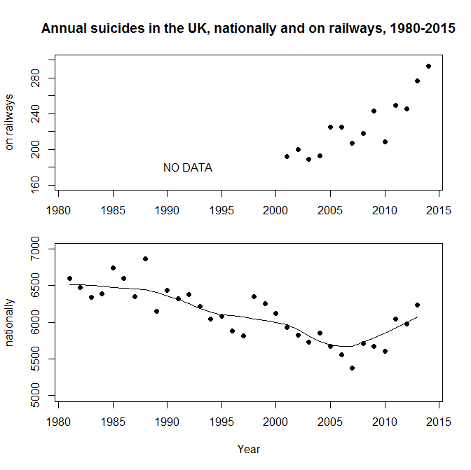
I started my grown-up working life on a project seeking to predict extreme ocean currents off the north west coast of the UK. As a result I follow environmental disasters very closely. I fear that it’s natural that incidents in my own country have particular salience. I don’t want to minimise disasters elsewhere in the world when I talk about recent flooding in the north of England. It’s just that they are close enough to home for me to get a better understanding of the essential features.

The causes of the flooding are multi-factorial and many of the factors are well beyond my expertise. However, The Times (London) reported on 28 December 2015 that “Some scientists say that [the UK Environment Agency] has been repeatedly caught out by the recent heavy rainfall because it sets too much store by predictions based on historical records” (p7). Setting store by predictions based on historical records is very much where my hands-on experience of statistics began.

The starting point of prediction is extreme value theory, developed by Sir Ronald Fisher and L H C Tippett in the 1920s. Extreme value analysis (EVA) aims to put probabilistic bounds on events outside the existing experience base by predicating that such events follow a special form of probability distribution. Historical data can be used to fit such a distribution using the usual statistical estimation methods. Prediction is then based on a double extrapolation: firstly in the exact form of the tail of the extreme value distribution and secondly from the past data to future safety. As the old saying goes, “Interpolation is (almost) always safe. Extrapolation is always dangerous.”

EVA rests on some non-trivial assumptions about the process under scrutiny. No statistical method yields more than was input in the first place. If we are being allowed to extrapolate beyond the experience base then there are inevitably some assumptions. Where the real world process doesn’t follow those assumptions the extrapolation is compromised. To some extent there is no cure for this other than to come to a rational decision about the sensitivity of the analysis to the assumptions and to apply a substantial safety factor to the physical engineering solutions.

One of those assumptions also plays to the dimension of extrapolation from past to future. Statisticians often demand that the data be independent and identically distributed. However, that is a weird thing to demand of data. Real world data is hardly ever independent as every successive observation provides more information about the distribution and alters the probability of future observations. We need a better idea to capture process stability.

Historical data can only be projected into the future if it comes from a process that is “sufficiently regular to be predictable”. That regularity is effectively characterised by the property of exchangeability. Deciding whether data is exchangeable demands, not only statistical evidence of its past regularity, but also domain knowledge of the physical process that it measures. The exchangeability must continue into the predicable future if historical data is to provide any guide. In the matter of flooding, knowledge of hydrology, climatology, planning and engineering, law, in addition to local knowledge about economics and infrastructure changes already in development, is essential. Exchangeability is always a judgment. And a critical one.

Predicting extreme floods is a complex business and I send my good wishes to all involved. It is an example of something that is essentially a team enterprise as it demands the co-operative inputs of diverse sets of experience and skills.

In many ways this is an exemplary model of how to act on data. There is no mechanistic process of inference that stands outside a substantial knowledge of what is being measured. The secret of data analysis, which often hinges on judgments about exchangeability, is to visualize the data in a compelling and transparent way so that it can be subjected to collaborative criticism by a diverse team.

Imagine …

Ben Bernanke official portrait.jpgNo, not John Lennon’s dreary nursery rhyme for hippies.

In his memoir of the 2007-2008 banking crisis, The Courage to ActBen Benanke wrote about his surprise when the crisis materialised.

We saw, albeit often imperfectly, most of the pieces of the puzzle. But we failed to understand – “failed to imagine” might be a better phrase – how those pieces would fit together to produce a financial crisis that compared to, and arguably surpassed, the financial crisis that ushered in the Great Depression.

That captures the three essentials of any attempt to foresee a complex future.

  • The pieces
  • The fit
  • Imagination

In any well managed organisation, “the pieces” consist of the established Key Performance Indicators (KPIs) and leading measures. Diligent and rigorous criticism of historical data using process behaviour charts allows departures from stability to be identified timeously. A robust and disciplined system of management and escalation enables an agile response when special causes arise.

Of course, “the fit” demands a broader view of the data, recognising interactions between factors and the possibility of non-simple global responses remote from a locally well behaved response surface. As the old adage goes, “Fit locally. Think globally.” This is where the Cardinal Newman principle kicks in.

“The pieces” and “the fit”, taken at their highest, yield a map of historical events with some limited prediction as to how key measures will behave in the future. Yet it is common experience that novel factors persistently invade. The “bow wave” of such events will not fit a recognised pattern where there will be a ready consensus as to meaning, mechanism and action. These are the situations where managers are surprised by rapidly emerging events, only to protest, “We never imagined …”.

Nassim Taleb’s analysis of the financial crisis hinged on such surprises and took him back to the work of British economist G L S Shackle. Shackle had emphasised the importance of imagination in economics. Put at its most basic, any attempt to assign probabilities to future events depends upon the starting point of listing the alternatives that might occur. Statisticians call it the sample space. If we don’t imagine some specific future we won’t bother thinking about the probability that it might come to be. Imagination is crucial to economics but it turns out to be much more pervasive as an engine of improvement that at first is obvious.

Imagination and creativity

Frank Whittle had to imagine the jet engine before he could bring it into being. Alan Turing had to imagine the computer. They were both fortunate in that they were able to test their imagination by construction. It was all realised in a comparatively short period of time. Whittle’s and Turing’s respective imaginations were empirically verified.

What is now proved was once but imagined.

William Blake

Not everyone has had the privilege of seeing their imagination condense into reality within their lifetime. In 1946, Sir George Paget Thomson and Moses Blackman imagined a plentiful source of inexpensive civilian power from nuclear fusion. As of writing, prospects of a successful demonstration seem remote. Frustratingly, as far as I can see, the evidence still refuses to tip the balance as to whether future success is likely or that failure is inevitable.

Something as illusive as imagination can have a testable factual content. As we know, not all tests are conclusive.

Imagination and analysis

Imagination turns out to be essential to something as prosaic as Root Cause Analysis. And essential in a surprising way. Establishing an operative cause of a past event is an essential task in law and engineering. It entails the search for a counterfactual, not what happened but what might have happened to avoid the  regrettable outcome. That is inevitably an exercise in imagination.

In almost any interesting situation there will be multiple imagined pasts. If there is only one then it is time to worry. Sometimes it is straightforward to put our ideas to the test. This is where the Shewhart cycle comes into its own. In other cases we are in the realms of uncomfortable science. Sometimes empirical testing is frustrated because the trail has gone cold.

The issues of counterfactuals, Root Cause Analysis and causation have been explored by psychologists Daniel Kahneman1 and Ruth Byrne2 among others. Reading their research is a corrective to the optimistic view that Root Cause analysis is some sort of inevitably objective process. It is distorted by all sorts of heuristics and biases. Empirical testing is vital, if only through finding some data with borrowing strength.

Imagine a millennium bug

In 1984, Jerome and Marilyn Murray published Computers in Crisis in which they warned of a significant future risk to global infrastructure in telecommunications, energy, transport, finance, health and other domains. It was exactly those areas where engineers had been enthusiastic to exploit software from the earliest days, often against severe constraints of memory and storage. That had led to the frequent use of just two digits to represent a year, “71” for 1971, say. From the 1970s, software became more commonly embedded in devices of all types. As the year 2000 approached, the Murrays envisioned a scenario where the dawn of 1 January 2000 was heralded by multiple system failures where software registers reset to the year 1900, frustrating functions dependent on timing and forcing devices into a fault mode or a graceless degradation. Still worse, systems may simply malfunction abruptly and without warning, the only sensible signal being when human wellbeing was compromised. And the ruinous character of such a threat would be that failure would be inherently simultaneous and global, with safeguarding systems possibly beset with the same defects as the primary devices. It was easy to imagine a calamity.

Risk matrixYou might like to assess that risk yourself (ex ante) by locating it on the Risk Assessment Matrix to the left. It would be a brave analyst who would categorise it as “Low”, I think. Governments and corporations were impressed and embarked on a massive review of legacy software and embedded systems, estimated to have cost around $300 billion at year 2000 prices. A comprehensive upgrade programme was undertaken by nearly all substantial organisations, public and private.

Then, on 1 January 2000, there was no catastrophe. And that caused consternation. The promoters of the risk were accused of having caused massive expenditure and diversion of resources against a contingency of negligible impact. Computer professionals were accused, in terms, of self-serving scare mongering. There were a number of incidents which will not have been considered minor by the people involved. For example, in a British hospital, tests for Down’s syndrome were corrupted by the bug resulting in contra-indicated abortions and births. However, there was no global catastrophe.

This is the locus classicus of a counterfactual. Forecasters imagined a catastrophe. They persuaded others of their vision and the necessity of vast expenditure in order to avoid it. The preventive measures were implemented at great costs. The Catastrophe did not occur. Ex post, the forecasters were disbelieved. The danger had never been real. Even Cassandra would have sympathised.

Critics argued that there had been a small number of relatively minor incidents that would have been addressed most economically on a “fix on failure” basis. Much of this turns out to be a debate about the much neglected column of the risk assessment headed “Detectability”. Where a failure will inflict immediate pain, it is so much more critical as to management and mitigation than a failure that will present the opportunity for detection and protection in advance of a broader loss. Here, forecasting Detectability was just as important as Probability and Consequences in arriving at an economic strategy for management.

It is the fundamental paradox of risk assessment that, where control measures eliminate a risk, it is not obvious whether the benign outcome was caused by the control or whether the risk assessment was just plain wrong and the risk never existed. Another counterfactual. Again, finding some alternative data with borrowing strength can help though it will ever be difficult to build a narrative appealing to a wide population. There are links to some sources of data on the Wikipedia article about the bug. I will leave it to the reader.

Imagine …

Of course it is possible to find this all too difficult and to adopt the Biblical outlook.

I returned, and saw under the sun, that the race is not to the swift, nor the battle to the strong, neither yet bread to the wise, nor yet riches to men of understanding, nor yet favour to men of skill; but time and chance happeneth to them all.

Ecclesiastes 9:11
King James Bible

That is to adopt the outlook of the lady on the level crossing. Risk professionals look for evidence that their approach works.

The other day, I was reading the annual report of the UK Health and Safety Executive (pdf). It shows a steady improvement in the safety of people at work though oddly the report is too coy to say this in terms. The improvement occurs over the period where risk assessment has become ubiquitous in industry. In an individual work activity it will always be difficult to understand whether interventions are being effective. But using the borrowing strength of the overall statistics there is potent evidence that risk assessment works.

References

  1. Kahneman, D & Tversky, A (1979) “The simulation heuristic”, reprinted in Kahneman et al. (1982) Judgment under Uncertainty: Heuristics and Biases, Cambridge, p201
  2. Byrne, R M J (2007) The Rational Imagination: How People Create Alternatives to Reality, MIT Press