Managing a railway on historical data is like …

I was recently looking on the web for any news on the Galicia rail crash. I didn’t find anything current but came across this old item from The Guardian (London). It mentioned in passing that consortia tendering for a new high speed railway in Brazil were excluded if they had been involved in the operation of a high speed line that had had an accident in the previous five years.

Well, I don’t think that there is necessarily anything wrong with that in itself. But it is important to remember that a rail accident is not necessarily a Signal (sic). Rail accidents worldwide are often a manifestation of what W Edwards Deming called A stable system of trouble. In other words, a system that features only Noise but which cannot deliver the desired performance. An accident free record of five years is a fine thing but there is nothing about a stable system of trouble that says it can’t have long incident free periods.

In order to turn that incident free five years into evidence about future likely safety performance we also need hard evidence, statistical and qualitative, about the stability and predictability of the rail operator’s processes. Procurement managers are often much worse at looking for, and at, this sort of data. In highly sophisticated industries such as automotive it is routine to demand capability data and evidence of process surveillance from a potential supplier. Without that, past performance is of no value whatever in predicting future results.

Rearview

The cyclist on the railway crossing – a total failure of risk perception

This is a shocking video. It shows a cyclist wholly disregarding warnings and safety barriers at a railway crossing in the UK. She evaded death, and the possible derailment of the train, by the thinnest of margins imaginable.

In my mind this raises fundamental questions, not only about risk perception, but also about how we can expect individuals to behave in systems not of their own designing. Such systems, of course, include organisations.

I was always intrigued by John Adams’ anthropological taxonomy of attitudes to risk (taken from his 1995 book Risk).

AdamsTaxonomy1

Adams identifies four attitudes to risk found at large. Each is entirely self-consistent within its own terms. The egalitarian believes that human and natural systems inhabit a precarious equilibrium. Any departure from the sensitive balance will propel the system towards catastrophe. However, the individualist believes the converse, that systems are in general self-correcting. Any disturbance away from repose will be self-limiting and the system will adjust itself back to equilibrium. The hierarchist agrees with the individualist up to a point but only so long as any disturbance remains within scientifically drawn limits. Outside that lies catastrophe. The fatalist believes that outcomes are inherently uncontrollable and indifferent to individual ambition. Worrying about outcomes is not the right criterion for deciding behaviour.

Without an opportunity to interview the cyclist it is difficult to analyse what she was up to. Even then, I think that it would be difficult for her recollection to escape distortion by some post hoc and post-traumatic rationalisation. I think Adams provides some key insights but there is a whole ecology of thoughts that might be interacting here.

Was the cyclist a fatalist resigned to the belief that no matter how she behaved on the road injury, should it come, would be capricious and arbitrary? Time and chance happeneth to them all.

Was she an individualist confident that the crossing had been designed with her safety assured and that no mindfulness on her part was essential to its effectiveness? That would be consistent with Adams’ theory of risk homeostasis. Whenever a process is made safer on our behalf, we have a tendency to increase our own risk-taking so that the overall risk is the same as before. Adams cites the example of seatbelts in motor cars leading to more aggressive driving.

Did the cyclist perceive any risk at all? Wagenaar and Groeneweg (International Journal of Man-Machine Studies 1987 27 587) reviewed something like 100 shipping accidents and came to the conclusion that:

Accidents do not occur because people gamble and lose, they occur because people do not believe that the accident that is about to occur is at all possible.

Why did the cyclist not trust that the bells, flashing lights and barriers had been provided for her own safety by people who had thought about this a lot? The key word here is “trust” and I have blogged about that elsewhere. I feel that there is an emerging theme of trust in bureaucracy. Engineers are not used to mistrust, other than from accountants. I fear that we sometimes assume too easily that anti-establishment instincts are constrained by the instinct for self preservation.

However we analyse it, the cyclist suffered from a near fatal failure of imagination. Imagination is central to risk management, the richer the spectrum of futures anticipated, the more effectively risk management can be designed into a business system. To the extent that our imagination is limited, we are hostage to our agility in responding to signals in the data. That is what the cyclist discovered when she belatedly spotted the train.

Economist G L S Shackle made this point repeatedly, especially in his last book Imagination and the Nature of Choice (1979). Risk management is about getting better at imagining future scenarios but still being able to spot when an unanticipated scenario has emerged, and being excellent at responding efficiently and timeously. That is the big picture of risk identification and risk awareness.

That then leads to the question of how we manage the risks we can see. A fundamental question for any organisation is what sort of risk takers inhabit their ranks? Risk taking is integral to pursuing an enterprise. Each organisation has its own risk profile. It is critical that individual decision makers are aligned to that. Some will have an instinctive affinity for the corporate philosophy. Others can be aligned through regulation, training and leadership. Some others will not respond to guidance. It is the latter category who must only be placed in positions where the organisation knows that it can benefit from their personal risk appetite.

If you think this an isolated incident and that the cyclist doesn’t work for you, you can see more railway crossing incidents here.

Adoption statistics for England – signals of improvement?

I am adopted so I follow the politics of adoption fairly carefully. I was therefore interested to see this report on the BBC, claiming a “record” increase in adoptions. The quotation marks are the BBC’s. The usual meaning of such quotes is that the word “record” is not being used with its usual meaning. I note that the story was repeated in several newspapers this morning.

The UK government were claiming a 15% increase in children adopted from local authority care over the last year and the highest total since data had been collected on this basis starting in 1992.

Most people will, I think, recognise what Don Wheeler calls an executive time series. A comparison of two numbers ignoring any broader historical trends or context. Of course, any two consecutive numbers will be different. One will be greater than the other. Without the context that gives rise to the data, a comparison of two numbers is uninformative.

I decided to look at the data myself by following the BBC link to the GOV.UK website. I found a spreadsheet there but only with data from 2009 to 2013. I dug around a little more and managed to find 2006 to 2008. However, the website told me that to find any earlier data I would have to consult the National Archives. At the same time it told me that the search function at the National Archives did not work. I ended up browsing 30 web pages of Department of Education documents and managed to get figures back to 2004. However, when I tried to browse back beyond documents dated January 2008, I got “Sorry, the page you were looking for can’t be found” and an invitation to use the search facility. Needless to say, I failed to find the missing data back to 1992, there or on the Office for National Statistics website. It could just be my internet search skills that are wanting but I spent an hour or so on this.

Gladly, Justin Ushie and Julie Glenndenning from the Department for Education were able to help me and provided much of the missing data. Many thanks to them both. Unfortunately, even they could not find the data for 1992 and 1993.

Here is the run chart.

Adoption1

Some caution is needed in interpreting this chart because there is clearly some substantial serial correlation in the annual data. That said, I am not able to quite persuade myself that the 2013 figure represents a signal. Things look much better than the mid-1990s but 2013 still looks consistent with a system that has been stable since the early years of the century.

The mid 1990s is a long time ago so I also wanted to look at adoptions as a percentage of children in care. I don’t think that that is automatically a better measure but I wanted to check that it didn’t yield a different picture.

Adoption2

That confirms the improvement since the mid-1990s but the 2013 figures now look even less remarkable against the experience base of the rest of the 21st century.

I would like to see these charts with all the interventions and policy changes of respective governments marked. That would then properly set the data in context and assist interpretation. There would be an opportunity to build a narrative, add natural process limits and come to a firmer view about whether there was a signal. Sadly, I have not found an easy way of building a chronology of intervention from government publications.

Anyone holding themselves out as having made an improvement must bring forward the whole of the relevant context for the data. That means plotting data over time and flagging background events. It is only then that the decision maker, or citizen, can make a proper assessment of whether there has been an improvement. The simple chart of data against time, even without natural process limits, is immensely richer than a comparison of two selected numbers.

Properly capturing context is the essence of data visualization and the beginnings of graphical excellence.

One my favourite slogans:

In God we trust. All else bring data.

W Edwards Deming

I plan to come back to this data in 2014.

The graph of doom – one year on

I recently came across the chart (sic) below on this web site.

GraphofDoom

It’s apparently called the “graph of doom”. It first came to public attention in May 2012 in the UK newspaper The Guardian. It purports to show how the London Borough of Barnet’s spending on social services will overtake the Borough’s total budget some time around 2022.

At first sight the chart doesn’t offend too much against the principles of graphical excellence as set down by Edward Tufte in his book The Visual Display of Quantitative Information. The bars could probably have been better replaced by lines and that would have saved some expensive, coloured non-data ink. That is a small quibble.

The most puzzling thing about the chart is that it shows very little data. I presume that the figures for 2010/11 are actuals. The 2011/12 may be provisional. But the rest of the area of the chart shows predictions. There is a lot of ink on this chart showing predictions and very little showing actual data. Further, the chart does not distinguish, graphically, between actual data and predictions. I worry that that might lend the dramatic picture more authority that it is really entitled to. The visible trend lies wholly in the predictions.

Some past history would have exposed variation in both funding and spending and enabled the viewer to set the predictions in that historical context. A chart showing a converging trend of historical data projected into the future is more impressive than a chart showing historical stability with all the convergence found in the future prediction. This chart does not tell us which is the actual picture.

Further, I suspect that this is not the first time the author had made a prediction of future funds or demand. What would interest me, were I in the position of decision maker, is some history of how those predictions have performed in the past.

We are now more than one year on from the original chart and I trust that the 2012/13 data is now available. Perhaps the authors have produced an updated chart but it has not made its way onto the internet.

The chart shows hardly any historical data. Such data would have been useful to a decision maker. The ink devoted to predictions could have been saved. All that was really needed was to say that spending was projected to exceed total income around 2022. Some attempt at quantifying the uncertainty in that prediction would also have been useful.

Graphical representations of data carry a potent authority. Unfortunately, when on the receiving end of most Powerpoint presentations we don’t have long to deconstruct them. We invest a lot of trust in the author of a chart that it can be taken at face value. That ought to be the chart’s function, to communicate the information in the data efficiently and as dramatically as the data and its context justifies.

I think that the following principles can usefully apply to the charting of predictions and forecasts.

  • Use ink on data rather than speculation.
  • Ditto for chart space.
  • Chart predictions using a distinctive colour or symbol so as to be less prominent than measured data.
  • Use historical data to set predictions in context.
  • Update chart as soon as predictions become data.
  • Ensure everybody who got the original chart gets the updated chart.
  • Leave the prediction on the updated chart.

The last point is what really sets predictions in context.

Note: I have tagged this post “Data visualization”, adopting the US spelling which I feel has become standard English.

The Monty Hall Problem redux

This old chestnut refuses to die and I see that it has turned up again on the BBC website. I have been intending for a while to blog about this so this has given me the excuse. I think that there has been a terrible history of misunderstanding this problem and I want to set down how the confusion comes about. People have mistaken a problem in psychology for a problem in probability.

Here is the classic statement of the problem that appeared in Parade magazine in 1990.

Suppose you’re on a game show, and you’re given the choice of three doors: Behind one door is a car; behind the others, goats. You pick a door, say No. 1, and the host, who knows what’s behind the doors, opens another door, say No. 3, which has a goat. He then says to you, “Do you want to pick door No. 2?” Is it to your advantage to switch your choice?

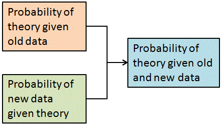
The rational way of approaching this problem is through Bayes’ theorem. Bayes’ theorem tells us how to update our views as to the probability of events when we have some new information. In this problem I have never seen anyone start from a position other than that, before any doors are opened, no door is more probably hiding the car than the others. I think it is uncontroversial to say that for each door the probability of its hiding the car is 1/3.

Once the host opens door No. 3, we have some more information. We certainly know that the car is not behind door No. 3 but does the host tell us anything else? Bayes’ theorem tells us how to ask the right question. The theorem can be illustrated like this.
Bayes

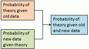
The probability of observing the new data, if the theory is correct (the green box), is called the likelihood and plays a very important role in statistics.

Without giving the details of the mathematics, Bayes’ theorem leads us to analyse the problem in this way.

MH1

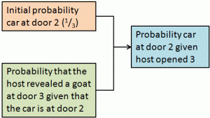
We can work this out arithmetically but, because all three doors were initially equally probable, the matter comes down to deciding which of the two likelihoods is greater.

MH2

So what are the respective probabilities of the host behaving in the way he did? Unfortunately, this is where we run into problems because the answer depends on the tactic that the host was adopting.

And we are not given that in the question.

Consider some of the following possible tactics the host may have adopted.

  1. Open an unopened door hiding a goat, if both unopened doors have goats, choose at random.
  2. If the contestant chooses door 1 (or 2, or 3), always open 3 (or 1, or 2) whether or not it contains a goat.
  3. Open either unopened door at random but only if contestant has chosen box with prize otherwise don’t open a box (the devious strategy, suggested to me by a former girlfriend as the obviously correct answer).
  4. Choose an unopened door at random. If it hides a goat open it. Otherwise do not open a door (not the same as tactic 1).
  5. Open either unopened door at random whether or not it contains a goat

There are many more. All these various tactics lead to different likelihoods.

Tactic Probability that the host revealed a goat at door 3: Rational choice
given that the car is at 1 given that the car is at 2
1

½

1

Switch
2

1

1

No difference
3

½

0

Don’t switch
4

½

½

No difference
5

½

½

No difference

So if we were given this situation in real life we would have to work out which tactic the host was adopting. The problem is presented as though it is a straightforward maths problem but it critically hinges on a problem in psychology. What can we infer from the host’s choice? What is he up to? I think that this leads to people’s discomfort and difficulty. I am aware that even people who start out assuming Tactic 1 struggle but I suspect that somewhere in the back of their minds they cannot rid themselves of the other possibilities. The seeds of doubt have been sown in the way the problem is set.

A participant in the game show would probably have to make a snap judgment about the meaning of the new data. This is the sort of thinking that Daniel Kahneman calls System 1 thinking. It is intuitive, heuristic and terribly bad at coping with novel situations. Fear of the devious strategy may well prevail.

A more ambitious contestant may try to embark on more reflective analytical System 2 thinking about the likely tactic. That would be quite an achievement under pressure. However, anyone with the inclination may have been able to prepare himself with some pre-show analysis. There may be a record of past shows from which the host’s common tactics can be inferred. The production company’s reputation in similar shows may be known. The host may be displaying signs of discomfort or emotional stress, the “tells” relied on by poker players.

There is a lot of data potentially out there. However, that only leads us to another level of statistical, and psychological, inference about the host’s strategy, an inference that itself relies on its own uncertain likelihoods and prior probabilities. And that then leads to the level of behaviour and cognitive psychology and the uncertainties in the fundamental science of human nature. It seems as though, as philosopher Richard Jeffrey put it, “It’s probabilities all the way down”.

Behind all this, it is always useful advice that, having once taken a decision, it should only be revised if there is some genuinely new data that was surprising given our initial thinking.

Economist G L S Shackle long ago lamented that:

… we habitually and, it seems, unthinkingly assume that the problem facing … a business man, is of the same kind as those set in examinations in mathematics, where the candidate unhesitatingly (and justly) takes it for granted that he has been given enough information to construe a satisfactory solution. Where, in real life, are we justified in assuming that we possess ‘enough’ information?