Deconstructing Deming III – Cease reliance on inspection

3. Cease dependence on inspection to achieve quality. Eliminate the need for massive inspection by building quality into the product in the first place.

W Edwards Deming Point 3 of Deming’s 14 Points. This at least cannot be controversial. For me it goes to the heart of Deming’s thinking.

The point is that every defective item produced (or defective service delivered) has taken cash from the pockets of customers or shareholders. They should be more angry. One day they will be. Inputs have been purchased with their cash, their resources have been deployed to transform the inputs and they will get nothing back in return. They will even face the costs of disposing of the scrap, especially if it is environmentally noxious.

That you have an efficient system for segregating non-conforming from conforming is unimpressive. That you spend even more of other people’s money reworking the product ought to be a matter of shame. Lean Six Sigma practitioners often talk of the hidden factory where the rework takes place. A factory hidden out of embarrassment. The costs remain whether you recognise them or not. Segregation is still more problematic in service industries.

The insight is not unique to Deming. This is a common theme in Lean, Six Sigma, Theory of Constraints and other approaches to operational excellence. However, Deming elucidated the profound statistical truths that belie the superficial effectiveness of inspection.

Inspection is inefficient

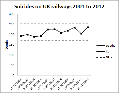
When I used to work in the railway industry I was once asked to look at what percentage of signalling scheme designs needed to be rechecked to defend against the danger of a logical error creeping through. The problem requires a simple application of Bayes’ theorem. I was rather taken aback at the result. There were only two strategies that made sense: recheck everything or recheck nothing. I didn’t at that point realise that this is a standard statistical result in inspection theory. For a wide class of real world situations, where the objective is to segregate non-conforming from conforming, the only sensible sampling schemes are 100% or 0%.

Where the inspection technique is destructive, such as a weld strength test, there really is only one option.

Inspection is ineffective

All inspection methods are imperfect. There will be false-positives and false-negatives. You will spend some money scrapping product you could have sold for cash. Some defective product will escape onto the market. Can you think of any examples in your own experience? Further, some of the conforming product will be only marginally conforming. It won’t delight the customer.

So build quality into the product

… and the process for producing the product (or delivering the service). Deming was a champion of the engineering philosophy of Genechi Taguchi who put forward a three-stage approach for achieving, what he called, off-line quality control.

  1. System design – in developing a product (or process) concept think about how variation in inputs and environment will affect performance. Choose concepts that are robust against sources of variation that are difficult or costly to control.
  2. Parameter design – choose product dimensions and process settings that minimise the sensitivity of performance to variation.
  3. Tolerance design – work out the residual sources of variation to which performance remains sensitive. Develop control plans for measuring, managing and continually reducing such variation.

Is there now no need to measure?

Conventional inspection aimed at approving or condemning a completed batch of output. The only thing of interest was the product and whether it conformed. Action would be taken on the batch. Deming called the application of statistics to such problems an enumerative study.

But the thing managers really need to know about is future outcomes and how they will be influenced by present decisions. There is no way of sampling the future. So sampling of the past has to go beyond mere characterisation and quantification of the outcomes. You are stuck with those and will have to take the consequences one way or another. Sampling (of the past) has to aim principally at understanding the causes of those historic outcomes. Only that enables managers to take a view on whether those causes will persist in the future, in what way they might change and how they might be adjusted. This is what Deming called an analytic study.

Essential to the ability to project data into the future is the recognition of common and special causes of variation. Only when managers are confident in thinking and speaking in those terms will their organisations have a sound basis for action. Then it becomes apparent that the results of inspection represent the occult interaction of inherent variation with threshold effects. Inspection obscures the distinction between common and special causes. It seduces the unwary into misguided action that exacerbates quality problems and reputational damage. It obscures the sad truth that, as Terry Weight put it, a disappointment is not necessarily a surprise.

The programme

  1. Drive out sensitivity to variation at the design stage.
  2. Routinely measure the inputs whose variation threatens product performance.
  3. Measure product performance too. Your bounded rationality may have led you to get (2) wrong.
  4. No need to measure every unit. We are trying to understand the cause system not segregate items.
  5. Plot data on a process behaviour chart.
  6. Stabilise the system.
  7. Establish capability.
  8. Keep on measuring to maintain stability and improve capability.

Some people think they have absorbed Deming’s thinking, mastered it even. Yet the test is the extent to which they are able to analyse problems in terms of common and special causes of variation. Is that the language that their organisation uses to communicate exceptions and business performance, and to share analytics, plans, successes and failures?

There has always been some distaste for Deming’s thinking among those who consider it cold, statistically driven and paralysed by data. But the data are only a means to getting beyond the emotional reaction to those two impostors: triumph and disaster. The language of common and special causes is a profound tool for building engagement, fostering communication and sharing understanding. Above that, it is the only sound approach to business measurement.

Rationing in UK health care – signal or noise?

The NHS in England appears to be rationing access to vital non-emergency hospital care, a review suggests.

This was the rather weaselly BBC headline last Friday. It referred to a report from Dr Foster Intelligence which appears to be a trading arm of Imperial College London.

The analysis alleged that the number of operations in three categories (cataract, knee and hip) had risen steadily between 2002 and 2008 but then “plateaued”. As evidence for this the BBC reproduced the following chart.

NHS_DrFoster_Dec13

Dr Foster Intelligence apparently argued that, as the UK population had continued to age since 2008, a “plateau” in the number of such operations must be evidence of “rationing”. Otherwise the rising trend would have continued. I find myself using a lot of quotes when I try to follow the BBC’s “data journalism”.

Unfortunately, I was unable to find the report or the raw data on the Dr Foster Intelligence website. It could be that my search skills are limited but I think I am fairly typical of the sort of people who might be interested in this. I would be very happy if somebody pointed me to the report and data. If I try to interpret the BBC’s journalism, the argument goes something like this.

  1. The rise in cataract, knee and hip operations has “plateaued”.
  2. Need for such operations has not plateaued.
  3. That is evidence of a decreased tendency to perform such operations when needed.
  4. Such a decreased tendency is because of “rationing”.

Now there are a lot of unanswered questions and unsupported assertions behind 2, 3 and 4 but I want to focus on 1. What the researchers say is that the experience base showed a steady rise in operations but that ceased some time around 2008. In other words, since 2008 there has been a signal that something has changed over the historical data.

Signals are seldom straightforward to spot. As Nate Silver emphasises, signals need to be contrasted with, and understood in the context of, noise, the irregular variation that is common to the whole of the historical data. The problem with common cause variation is that it can lead us to be, as Nassim Taleb puts it, fooled by randomness.

Unfortunately, without the data, I cannot test this out on a process behaviour chart. Can I be persuaded that this data represents an increasing trend then a signal of a “plateau”?

The first question is whether there is a signal of a trend at all. I suspect that in this case there is if the data is plotted on a process behaviour chart. The next question is whether there is any variation in the slope of that trend. One simple approach to this is to fit a linear regression line through the data and put the residuals on a process behaviour chart. Only if there is a signal on the residuals chart is an inference of a “plateau” left open. Looking at the data my suspicion is that there would be no such signal.

More complex analyses are possible. One possibility would be to adjust the number of operations by a measure of population age then look at the stability and predictability of those numbers. However, I see no evidence of that analysis either.

I think that where anybody claims to have detected a signal, the legal maxim should prevail: He who asserts must prove. I see no evidence in the chart alone to support the assertion of a rising trend followed by a “plateau”.

Suicide statistics for British railways

I chose a prosaic title because it’s not a subject about which levity is appropriate. I remain haunted by this cyclist on the level crossing. As a result I thought I would delve a little into railway accident statistics. The data is here. Unfortunately, the data only goes back to 2001/2002. This is a common feature of government data. There is no long term continuity in measurement to allow proper understanding of variation, trends and changes. All this encourages the “executive time series” that are familiar in press releases. I think that I shall call this political amnesia. When I have more time I shall look for a longer time series. The relevant department is usually helpful if contacted directly.

However, while I was searching I found this recent report on Railway Suicides in the UK: risk factors and prevention strategies. The report is by Kamaldeep Bhui and Jason Chalangary of the Wolfson Institute of Preventive Medicine, and Edgar Jones of the Institute of Psychiatry, King’s College, London. Originally, I didn’t intend to narrow my investigation to suicides but there were some things in the paper that bothered me and I felt were worth blogging about.

Obviously this is really important work. No civilised society is indifferent to tragedies such as suicide whose consequences are absorbed deeply into the community. The report analyses a wide base of theories and interventions concerning railway suicide risk. There is a lot of information and the authors have done an important job in bringing together and seeking conclusions. However, I was bothered by this passage (at p5).

The Rail Safety and Standards Board (RSSB) reported a progressive rise in suicides and suspected suicides from 192 in 2001-02 to a peak 233 in 2009-10, the total falling to 208 in 2010-11.

Oh dear! An “executive time series”. Let’s look at the data on a process behaviour chart.

RailwaySuicides1

There is no signal, even ignoring the last observation in 2011/2012 which the authors had not had to hand. There has been no increasing propensity for suicide since 2001. The writers have been, as Nassim Taleb would put it, “fooled by randomness”. In the words of Nate Silver, they have confused signal and noise. The common cause variation in the data has been over interpreted by zealous and well meaning policy makers as an upward trend. However, all diligent risk managers know that interpretation of a chart is forbidden if there is no signal. Over interpretation will lead to (well meaning) over adjustment and admixture of even more variation into a stable system of trouble.

Looking at the development of the data over time I can understand that there will have been a temptation to perform a regression analysis and calculate a p-value for the perceived slope. This is an approach to avoid in general. It is beset with the dangers of testing effects suggested by the data and the general criticisms of p-values made by McCloskey and Ziliak. It is not a method that will be a reliable guide to future action. For what it’s worth I got a p-value of 0.015 for the slope but I am not impressed. I looked to see if I could find a pattern in the data then tested for the pattern my mind had created. It is unsurprising that it was “significant”.

The authors of the report go on to interpret the two figures for 2009/2010 (233 suicides) and 2010/2011 (208 suicides) as a “fall in suicides”. It is clear from the process behaviour chart that this is not a signal of a fall in suicides. It is simply noise, common cause variation from year to year.

Having misidentified this as a signal they go on to seek a cause. Of course they “find” a potential cause. A partnership between Network Rail and the Samaritans, Men on the Ropes, had started in January 2010. The programme’s aim was to reduce suicides by 20% over five years. I genuinely hope that the programme shows success. However, the programme will not be assisted by thinking that it has yet shown signs of improvement.

With the current mean annual total at 211, a 20% reduction entails a new mean of 169 annual suicides.That is an ambitious target I think, and I want to emphasise that the programme is entirely laudable and plausible. However, whether it succeeds is to be judged by the figures on the process behaviour chart, not by any post hoc rationalisation. This is the tough discipline of the charts. It is no longer possible to claim an improvement where that is not supported by the data.

I will come back to this data next year and look to see if there are any signs of encouragement.

Managing a railway on historical data is like …

I was recently looking on the web for any news on the Galicia rail crash. I didn’t find anything current but came across this old item from The Guardian (London). It mentioned in passing that consortia tendering for a new high speed railway in Brazil were excluded if they had been involved in the operation of a high speed line that had had an accident in the previous five years.

Well, I don’t think that there is necessarily anything wrong with that in itself. But it is important to remember that a rail accident is not necessarily a Signal (sic). Rail accidents worldwide are often a manifestation of what W Edwards Deming called A stable system of trouble. In other words, a system that features only Noise but which cannot deliver the desired performance. An accident free record of five years is a fine thing but there is nothing about a stable system of trouble that says it can’t have long incident free periods.

In order to turn that incident free five years into evidence about future likely safety performance we also need hard evidence, statistical and qualitative, about the stability and predictability of the rail operator’s processes. Procurement managers are often much worse at looking for, and at, this sort of data. In highly sophisticated industries such as automotive it is routine to demand capability data and evidence of process surveillance from a potential supplier. Without that, past performance is of no value whatever in predicting future results.

Rearview

Adoption statistics for England – signals of improvement?

I am adopted so I follow the politics of adoption fairly carefully. I was therefore interested to see this report on the BBC, claiming a “record” increase in adoptions. The quotation marks are the BBC’s. The usual meaning of such quotes is that the word “record” is not being used with its usual meaning. I note that the story was repeated in several newspapers this morning.

The UK government were claiming a 15% increase in children adopted from local authority care over the last year and the highest total since data had been collected on this basis starting in 1992.

Most people will, I think, recognise what Don Wheeler calls an executive time series. A comparison of two numbers ignoring any broader historical trends or context. Of course, any two consecutive numbers will be different. One will be greater than the other. Without the context that gives rise to the data, a comparison of two numbers is uninformative.

I decided to look at the data myself by following the BBC link to the GOV.UK website. I found a spreadsheet there but only with data from 2009 to 2013. I dug around a little more and managed to find 2006 to 2008. However, the website told me that to find any earlier data I would have to consult the National Archives. At the same time it told me that the search function at the National Archives did not work. I ended up browsing 30 web pages of Department of Education documents and managed to get figures back to 2004. However, when I tried to browse back beyond documents dated January 2008, I got “Sorry, the page you were looking for can’t be found” and an invitation to use the search facility. Needless to say, I failed to find the missing data back to 1992, there or on the Office for National Statistics website. It could just be my internet search skills that are wanting but I spent an hour or so on this.

Gladly, Justin Ushie and Julie Glenndenning from the Department for Education were able to help me and provided much of the missing data. Many thanks to them both. Unfortunately, even they could not find the data for 1992 and 1993.

Here is the run chart.

Adoption1

Some caution is needed in interpreting this chart because there is clearly some substantial serial correlation in the annual data. That said, I am not able to quite persuade myself that the 2013 figure represents a signal. Things look much better than the mid-1990s but 2013 still looks consistent with a system that has been stable since the early years of the century.

The mid 1990s is a long time ago so I also wanted to look at adoptions as a percentage of children in care. I don’t think that that is automatically a better measure but I wanted to check that it didn’t yield a different picture.

Adoption2

That confirms the improvement since the mid-1990s but the 2013 figures now look even less remarkable against the experience base of the rest of the 21st century.

I would like to see these charts with all the interventions and policy changes of respective governments marked. That would then properly set the data in context and assist interpretation. There would be an opportunity to build a narrative, add natural process limits and come to a firmer view about whether there was a signal. Sadly, I have not found an easy way of building a chronology of intervention from government publications.

Anyone holding themselves out as having made an improvement must bring forward the whole of the relevant context for the data. That means plotting data over time and flagging background events. It is only then that the decision maker, or citizen, can make a proper assessment of whether there has been an improvement. The simple chart of data against time, even without natural process limits, is immensely richer than a comparison of two selected numbers.

Properly capturing context is the essence of data visualization and the beginnings of graphical excellence.

One my favourite slogans:

In God we trust. All else bring data.

W Edwards Deming

I plan to come back to this data in 2014.