UK railway suicides – 2014 update

It’s taken me a while to sit down and blog about this news item from October 2014: Sharp Rise in Railway Suicides Say Network Rail . Regular readers of this blog will know that I have followed this data series closely in 2013 and 2012.

The headline was based on the latest UK government data. However, I baulk at the way these things are reported by the press. The news item states as follows.

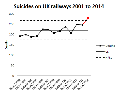
The number of people who have committed suicide on Britain’s railways in the last year has almost reached 300, Network Rail and the Samaritans have warned. Official figures for 2013-14 show there have already been 279 suicides on the UK’s rail network – the highest number on record and up from 246 in the previous year.

I don’t think it’s helpful to characterise 279 deaths as “almost … 300”, where there is, in any event, no particular significance in the number 300. It arbitrarily conveys the impression that some pivotal threshold is threatened. Further, there is no especial significance in an increase from 246 to 279 deaths. Another executive time series. Every one of the 279 is a tragedy as is every one of the 246. The experience base has varied from year to year and there is no surprise that it has varied again. To assess the tone of the news report I have replotted the data myself.

RailwaySuicides3

Readers should note the following about the chart.

  • Some of the numbers for earlier years have been updated by the statistical authority.
  • I have recalculated natural process limits as there are still no more than 20 annual observations.
  • There is now a signal (in red) of an observation above the upper natural process limit.

The news report is justified, unlike the earlier ones. There is a signal in the chart and an objective basis for concluding that there is more than just a stable system of trouble. There is a signal and not just noise.

As my colleague Terry Weight always taught me, a signal gives us license to interpret the ups and downs on the chart. There are two possible narratives that immediately suggest themselves from the chart.

  • A sudden increase in deaths in 2013/14; or
  • A gradual increasing trend from around 200 in 2001/02.

The chart supports either story. To distinguish would require other sources of information, possibly historical data that can provide some borrowing strength, or a plan for future data collection. Once there is a signal, it makes sense to ask what was its cause. Building  a narrative around the data is a critical part of that enquiry. A manager needs to seek the cause of the signal so that he or she can take action to improve system outcomes. Reliably identifying a cause requires trenchant criticism of historical data.

My first thought here was to wonder whether the railway data simply reflected an increasing trend in suicide in general. Certainly a very quick look at the data here suggests that the broader trend of suicides has been downwards and certainly not increasing. It appears that there is some factor localised to railways at work.

I have seen proposals to repeat a strategy from Japan of bathing railway platforms with blue light. I have not scrutinised the Japanese data but the claims made in this paper and this are impressive in terms of purported incident reduction. If these modifications are implemented at British stations we can look at the chart to see whether there is a signal of fewer suicides. That is the only real evidence that counts.

Those who were advocating a narrative of increasing railway suicides in earlier years may feel vindicated. However, until this latest evidence there was no signal on the chart. There is always competition for resources and directing effort on a false assumptions leads to misallocation. Intervening in a stable system of trouble, a system featuring only noise, on the false belief that there is a signal will usually make the situation worse. Failing to listen to the voice of the process on the chart risks diverting vital resources and using them to make outcomes worse.

Of course, data in terms of time between incidents is much more powerful in spotting an early signal. I have not had the opportunity to look at such data but it would have provided more, better and earlier evidence.

Where there is a perception of a trend there will always be an instinctive temptation to fit a straight line through the data. I always ask myself why this should help in identifying the causes of the signal. In terms of analysis at this stage I cannot see how it would help. However, when we come to look for a signal of improvement in future years it may well be a helpful step.

Deconstructing Deming X – Eliminate slogans!

10. Eliminate slogans, exhortations and targets for the workforce.

W Edwards Deming

Neither snow nor rain nor heat nor gloom of night stays these couriers from the swift completion of their appointed rounds.

Inscription on the James Farley Post Office, New York City, New York, USA
William Mitchell Kendall pace Herodotus

Now, that’s what I call a slogan. Is this what Point 10 of Deming’s 14 Points was condemning? There are three heads here, all making quite distinct criticisms of modern management. The important dimension of this criticism is the way in which managers use data in communicating with the wider organisation, in setting imperatives and priorities and in determining what individual workers will consider important when they are free from immediate supervision.

Eliminate slogans!

The US postal inscription at the head of this blog certainly falls within the category of slogans. Apparently the root of the word “slogan” is the Scottish Gaelic sluagh-ghairm meaning a battle cry. It seeks to articulate a solidarity and commitment to purpose that transcends individual doubts or rationalisation. That is what the US postal inscription seeks to do. Beyond the data on customer satisfaction, the demands of the business to protect and promote its reputation, the service levels in place for individual value streams, the tension between current performance and aspiration, the disappointment of missed objectives, it seeks to draw together the whole of the organisation around an ideal.

Slogans are part of the broader oral culture of an organisation. In the words of Lawrence Freedman (Strategy: A History, Oxford, 2013, p564) stories, and I think by extension slogans:

[make] it possible to avoid abstractions, reduce complexity, and make vital points indirectly, stressing the importance of being alert to serendipitous opportunities, discontented staff, or the one small point that might ruin an otherwise brilliant campaign.

But Freedman was quick to point out the use of stories by consultants and in organisations frequently confused anecdote with data. They were commonly used selectively and often contrived. Freedman sought to extract some residual value from the culture of business stories, in particular drawing on the work of psychologist Jerome Bruner along with Daniel Kahneman’s System 1 and System 2 thinking. The purpose of the narrative of an organisation, including its slogans and shared stories, is not to predict events but to define a context for action when reality is inevitably overtaken by a special cause.

In building such a rich narrative, slogans alone are an inert and lifeless tactic unless woven with the continual, rigorous criticism of historical data. In fact, it is the process behaviour chart that acts as the armature around which the narrative can be wound. Building the narrative will be critical to how individuals respond to the messages of the chart.

Deming himself coined plenty of slogans: “Drive out fear”, “Create joy in work”, … . They are not forbidden. But to be effective they must form a verisimilar commentary on, and motivation for, the hard numbers and ineluctable signals of the process behaviour chart.

Eliminate exhortations!

I had thought I would dismiss this in a single clause. It is, though, a little more complicated. The sports team captain who urges her teammates onwards to take the last gasp scoring opportunity doesn’t necessarily urge in vain. There is no analysis of this scenario. It is only muscle, nerve, sweat and emotion.

The English team just suffered a humiliating exit from the Cricket World Cup. The head coach’s response was “We’ll have to look at the data.” Andrew Miller in The Times (London) (10 March 2015) reflected most cricket fans’ view when he observed that “a team of meticulously prepared cricketers suffered a collective loss of nerve and confidence.” Exhortations might not have gone amiss.

It is not, though, a management strategy. If your principal means of managing risk, achieving compelling objectives, creating value and consistently delivering customer excellence, day in, day out is to yell “one more heave!” then you had better not lose your voice. In the long run, I am on the side of the analysts.

Slogans and exhortations will prove a brittle veneer on a stable system of trouble (RearView). It is there that they will inevitably corrode engagement, breed cynicism, foster distrust, and mask decline. Only the process behaviour chart can guard against the risk.

Eliminate targets for the workforce!

This one is more complicated. How do I communicate to the rest of the organisation what I need from them? What are the consequences when they don’t deliver? How do the rest of the organisation communicate with me? This really breaks down into two separate topics and they happen to be the two halves of Deming’s Point 11.

I shall return to those in my next two posts in the Deconstructing Deming series.


Science journal bans p-values

p-valueInteresting news here that psychology journal Basic and Applied Social Psychology (BASP) has banned the use of p-values in the academic research papers that it will publish in the future.

The dangers of p-values are widely known though their use seems to persist in any number of disciplines, from the Higgs boson to climate change.

There has been some wonderful recent advocacy deprecating p-values, from Deirdre McCloskey and Regina Nuzzo among others. BASP editor David Trafimow has indicated that the journal will not now publish formal hypothesis tests (of the Neyman-Pearson type) or confidence intervals purporting to support experimental results. I presume that appeals to “statistical significance” are proscribed too. Trafimow has no dogma as to what people should do instead but is keen to encourage descriptive statistics. That is good news.

However, Trafimow does say something that worries me.

… as the sample size increases, descriptive statistics become increasingly stable and sampling error is less of a problem.

It is trite statistics that merely increasing sample size, as in the raw number of observations, is no guarantee of improving sampling error. If the sample is not rich enough to capture all the relevant sources of variation then data is amassed in vain. A common example is that of inter-laboratory studies of analytical techniques. A researcher who takes 10 observations from Laboratory A and 10 from Laboratory B really only has two observations. At least as far as the really important and dominant sources of variation are concerned. Increasing the number of observations to 100 from each laboratory would simply be a waste of resources.

But that is not all there is to it. Sampling error only addresses how well we have represented the sampling frame. In any reasonably interesting statistics, and certainly in any attempt to manage risk, we are only interested in the future. The critical question before we can engage in any, even tentative, statistical inference is “Is the data representative of the future?”. That requires that the data has the statistical property of exchangeability. Some people prefer the more management-oriented term “stable and predictable”. That’s why I wished Trafimow hadn’t used the word “stable”.

Assessment of stability and predictability is fundamental to any prediction or data based management. It demands confident use of process-behaviour charts and trenchant scrutiny of the sources of variation that drive the data. It is the necessary starting point of all reliable inference. A taste for p-values is a major impediment to clear thinking on the matter. They do not help. It would be encouraging to believe that scepticism was on the march but I don’t think prohibition is the best means of education.


Bad Statistics I – the phantom line

I came across this chart on the web recently.

BadScatter01

This really is one of my pet hates: a perfectly informative scatter chart with a meaningless straight line drawn on it.

The scatter chart is interesting. Each individual blot represents a nation state. Its vertical position represents national average life expectancy. I take that to be mean life expectancy at birth, though it is not explained in terms. The horizontal axis represents annual per capita health spending, though there is no indication as to whether that is adjusted for purchasing power. The whole thing is a snapshot from 2011. The message I take from the chart is that Hungary and Mexico, and I think two smaller blots, represent special causes, they are outside the experience base represented by the balance of the nations. As to the other nations the chart suggests that average life expectancy doesn’t depend very strongly on health spending.

Of course, there is much more to a thorough investigation of the impact of health spending on outcomes. The chart doesn’t reveal differential performance as to morbidity, or lost hours, or a host of important economic indicators. But it does put forward that one, slightly surprising, message that longevity is not enhanced by health spending. Or at least it wasn’t in 2011 and there is no explanation as to why that year was isolated.

The question is then as to why the author decided to put the straight line through it. As the chart “helpfully” tells me it is a “Linear Trend line”. I guess (sic) that this is a linear regression through the blots, possibly with some weighting as to national population. I originally thought that the size of the blot was related to population but there doesn’t seem to be enough variation in the blot sizes. It looks like there are only two sizes of blot and the USA (population 318.5 million) is the same size as Norway (5.1 million).

The difficulty here is that I can see that the two special cause nations, Hungary and Mexico, have very high leverage. That means that they have a large impact on where the straight lines goes, because they are so unusual as observations. The impact of those two atypical countries drags the straight line down to the left and exaggerates the impact that spending appears to have on longevity. It really is an unhelpful straight line.

These lines seem to appear a lot. I think that is because of the ease with which they can be generated in Excel. They are an example of what statistician Edward Tufte called chartjunk. They simply clutter the message of the data.

Of course, the chart here is a snapshot, not a video. If you do want to know how to use scatter charts to explain life expectancy then you need to learn here from the master, Hans Rosling.

There are no lines in nature, only areas of colour, one against another.

Edouard Manet

How to use data to scare people …

… and how to use data for analytics.

Crisis hit GP surgeries forced to turn away millions of patients

That was the headline on the Royal College of General Practitioners (“RCGP” – UK family physicians) website today. The catastrophic tone was elaborated in The (London) Times: Millions shut out of doctors’ surgeries (paywall).
Blutdruck.jpg
The GPs’ alarm was based on data from the GP Patient Survey which is a survey conducted on behalf or the National Health Service (“NHS”) by pollsters Ipsos MORI. The study is conducted by way of a survey questionnaire sent out to selected NHS patients. You can find the survey form here. Ipsos MORI’s careful analysis is here.

Participants were asked to recall their experience of making an appointment last time they wanted to. From this, the GPs have extracted the material for their blog’s lead paragraph.

GP surgeries are so overstretched due to the lack of investment in general practice that in 2015 on more than 51.3m occasions patients in England will be unable to get an appointment to see a GP or nurse when they contact their local practice, according to new research.

Now, this is not analysis. For the avoidance of doubt, the Ipsos MORI report cited above does not suffer from such tendentious framing. The RCGP blog features the following tropes of Langian statistical method.

  • Using emotive language such as “crisis”, “forced” and “turn away”.
  • Stating the cause of the avowed problem, “lack of investment”, without presenting any supporting argument.
  • Quoting an absolute number of affected patients rather than a percentage which would properly capture individual risk.
  • Casually extrapolating to a future round number, over 50 million.
  • Seeking to bolster their position by citing “new research”.
  • Failing to recognise the inevitable biases that beset human descriptions of past events.

Humans are notoriously susceptible to bias in how they recall and report past events. Psychologist Daniel Kahneman has spent a lifetime mapping out the various cognitive biases that afflict our thinking. The Ipsos MORI survey appears to me rigorously designed but no degree of rigour can eliminate the frailties of human memory, especially about an uneventful visit to the GP. An individual is much more likely to recall a frustrating attempt to make an appointment than a straightforward encounter.

Sometimes, such survey data will be the best we can do and will be the least bad guide to action though in itself flawed. As Charles Babbage observed:

Errors using inadequate data are much less than those using no data at all.

Yet the GPs’ use of this external survey data to support their funding campaign looks particularly out of place in this situation. This is a case where there is a better source of evidence. The point is that the problem under investigation lies entirely within the GPs’ own domain. The GPs themselves are in a vastly superior position to collect data on frustrated appointments, within their own practices. Data can be generated at the moment an appointment is sought. Memory biases and patient non-responses can be eliminated. The reasons for any diary difficulties can be recorded as they are encountered. And investigated before the trail has gone cold. Data can be explored within the practice, improvements proposed, gains measured, solutions shared on social media. The RCGP could play the leadership role of aggregating the data and fostering sharing of ideas.

It is only with local data generation that the capability of an appointments system can be assessed. Constraints can be identified, managed and stabilised. It is only when the system is shown to be incapable that a case can be made for investment. And the local data collected is exactly the data needed to make that case. Not only does such data provide a compelling visual narrative of the appointment system’s inability to heal itself but, when supported by rigorous analysis, it liquidates the level of investment and creates its own business case. Rigorous criticism of data inhibits groundless extrapolation. At the very least, local data would have provided some borrowing strength to validate the patient survey.

Looking to external data to support a case when there is better data to be had internally, both to improve now what is in place and to support the business case for new investment, is neither pretty nor effective. And it is not analysis.