Sad news on railway suicide statistics

I recently blogged about statistics of suicides on British railways here and here. Some very worthwhile programmes had been put in place with the objective of reducing these tragic deaths. However, my view at the point of my earlier posts was that this was a stable system of trouble, that there was neither a deteriorating trend nor any sign of improvement.

I now have the statistics for 2012/2013 to hand, released without any framing press notice. Here is the updated process behaviour chart.
RailwaySuicides2

Readers should note the following about the chart.

  • Some of the numbers for earlier years have been updated by the statistical authority.
  • I have recalculated natural process limits as there are still no more than 20 annual observations.
  • There is still no signal of improvement or deterioration.

I fear that this is the tough discipline of the chart. It confronts us with current reality and deprives us of the opportunity to find comforting messages. Only a signal on the chart would be evidence of improvement. Statistics are not there to be selectively reported only when they fit our wishes and hopes. Statistics are to be charted, and reported, and discussed, and used as a basis for managing any operation; year in, year out.

Remember that in leading any operation the manager is confined to the retreating picture in the rearview mirror. Without the process behaviour chart, the manager is deprived even of that rear view.

It is a sad picture but improvement only comes from confronting current failure and finding new ways to intervene and redesign. Nobody will benefit from an ultimately vain quest for comforting messages.

Rationing in UK health care – signal or noise?

The NHS in England appears to be rationing access to vital non-emergency hospital care, a review suggests.

This was the rather weaselly BBC headline last Friday. It referred to a report from Dr Foster Intelligence which appears to be a trading arm of Imperial College London.

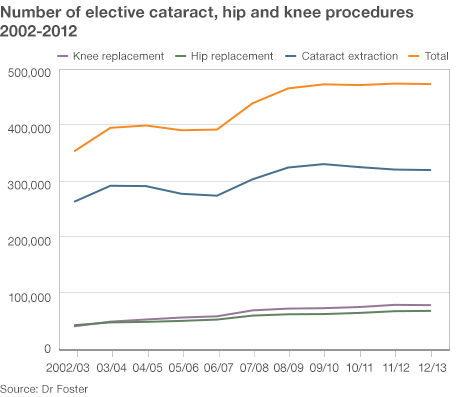
The analysis alleged that the number of operations in three categories (cataract, knee and hip) had risen steadily between 2002 and 2008 but then “plateaued”. As evidence for this the BBC reproduced the following chart.

NHS_DrFoster_Dec13

Dr Foster Intelligence apparently argued that, as the UK population had continued to age since 2008, a “plateau” in the number of such operations must be evidence of “rationing”. Otherwise the rising trend would have continued. I find myself using a lot of quotes when I try to follow the BBC’s “data journalism”.

Unfortunately, I was unable to find the report or the raw data on the Dr Foster Intelligence website. It could be that my search skills are limited but I think I am fairly typical of the sort of people who might be interested in this. I would be very happy if somebody pointed me to the report and data. If I try to interpret the BBC’s journalism, the argument goes something like this.

  1. The rise in cataract, knee and hip operations has “plateaued”.
  2. Need for such operations has not plateaued.
  3. That is evidence of a decreased tendency to perform such operations when needed.
  4. Such a decreased tendency is because of “rationing”.

Now there are a lot of unanswered questions and unsupported assertions behind 2, 3 and 4 but I want to focus on 1. What the researchers say is that the experience base showed a steady rise in operations but that ceased some time around 2008. In other words, since 2008 there has been a signal that something has changed over the historical data.

Signals are seldom straightforward to spot. As Nate Silver emphasises, signals need to be contrasted with, and understood in the context of, noise, the irregular variation that is common to the whole of the historical data. The problem with common cause variation is that it can lead us to be, as Nassim Taleb puts it, fooled by randomness.

Unfortunately, without the data, I cannot test this out on a process behaviour chart. Can I be persuaded that this data represents an increasing trend then a signal of a “plateau”?

The first question is whether there is a signal of a trend at all. I suspect that in this case there is if the data is plotted on a process behaviour chart. The next question is whether there is any variation in the slope of that trend. One simple approach to this is to fit a linear regression line through the data and put the residuals on a process behaviour chart. Only if there is a signal on the residuals chart is an inference of a “plateau” left open. Looking at the data my suspicion is that there would be no such signal.

More complex analyses are possible. One possibility would be to adjust the number of operations by a measure of population age then look at the stability and predictability of those numbers. However, I see no evidence of that analysis either.

I think that where anybody claims to have detected a signal, the legal maxim should prevail: He who asserts must prove. I see no evidence in the chart alone to support the assertion of a rising trend followed by a “plateau”.

Suicide statistics for British railways

I chose a prosaic title because it’s not a subject about which levity is appropriate. I remain haunted by this cyclist on the level crossing. As a result I thought I would delve a little into railway accident statistics. The data is here. Unfortunately, the data only goes back to 2001/2002. This is a common feature of government data. There is no long term continuity in measurement to allow proper understanding of variation, trends and changes. All this encourages the “executive time series” that are familiar in press releases. I think that I shall call this political amnesia. When I have more time I shall look for a longer time series. The relevant department is usually helpful if contacted directly.

However, while I was searching I found this recent report on Railway Suicides in the UK: risk factors and prevention strategies. The report is by Kamaldeep Bhui and Jason Chalangary of the Wolfson Institute of Preventive Medicine, and Edgar Jones of the Institute of Psychiatry, King’s College, London. Originally, I didn’t intend to narrow my investigation to suicides but there were some things in the paper that bothered me and I felt were worth blogging about.

Obviously this is really important work. No civilised society is indifferent to tragedies such as suicide whose consequences are absorbed deeply into the community. The report analyses a wide base of theories and interventions concerning railway suicide risk. There is a lot of information and the authors have done an important job in bringing together and seeking conclusions. However, I was bothered by this passage (at p5).

The Rail Safety and Standards Board (RSSB) reported a progressive rise in suicides and suspected suicides from 192 in 2001-02 to a peak 233 in 2009-10, the total falling to 208 in 2010-11.

Oh dear! An “executive time series”. Let’s look at the data on a process behaviour chart.

RailwaySuicides1

There is no signal, even ignoring the last observation in 2011/2012 which the authors had not had to hand. There has been no increasing propensity for suicide since 2001. The writers have been, as Nassim Taleb would put it, “fooled by randomness”. In the words of Nate Silver, they have confused signal and noise. The common cause variation in the data has been over interpreted by zealous and well meaning policy makers as an upward trend. However, all diligent risk managers know that interpretation of a chart is forbidden if there is no signal. Over interpretation will lead to (well meaning) over adjustment and admixture of even more variation into a stable system of trouble.

Looking at the development of the data over time I can understand that there will have been a temptation to perform a regression analysis and calculate a p-value for the perceived slope. This is an approach to avoid in general. It is beset with the dangers of testing effects suggested by the data and the general criticisms of p-values made by McCloskey and Ziliak. It is not a method that will be a reliable guide to future action. For what it’s worth I got a p-value of 0.015 for the slope but I am not impressed. I looked to see if I could find a pattern in the data then tested for the pattern my mind had created. It is unsurprising that it was “significant”.

The authors of the report go on to interpret the two figures for 2009/2010 (233 suicides) and 2010/2011 (208 suicides) as a “fall in suicides”. It is clear from the process behaviour chart that this is not a signal of a fall in suicides. It is simply noise, common cause variation from year to year.

Having misidentified this as a signal they go on to seek a cause. Of course they “find” a potential cause. A partnership between Network Rail and the Samaritans, Men on the Ropes, had started in January 2010. The programme’s aim was to reduce suicides by 20% over five years. I genuinely hope that the programme shows success. However, the programme will not be assisted by thinking that it has yet shown signs of improvement.

With the current mean annual total at 211, a 20% reduction entails a new mean of 169 annual suicides.That is an ambitious target I think, and I want to emphasise that the programme is entirely laudable and plausible. However, whether it succeeds is to be judged by the figures on the process behaviour chart, not by any post hoc rationalisation. This is the tough discipline of the charts. It is no longer possible to claim an improvement where that is not supported by the data.

I will come back to this data next year and look to see if there are any signs of encouragement.

On forecasting as the slave of our passions

Last weekend I was reading Dominic Lawson’s Sunday Times (London) review (10 November 2013) of Normal Greenspan’s recent book The Map and the Territory: Risk, Human Nature, and the Future of Forecasting. Lawson expresses his astonishment at what Greenspan says.

I and other economic forecasters didn’t understand that markets are prone to wild and even deranging mood swings that are uncoupled from any underlying rational basis.

I have to share Lawson’s astonishment. After all, Greenspan was the man who criticised the markets’ irrational exuberance back in the 1990s.

Lawson usefully reminded me of an important observation by eighteenth century philosopher David Hume.

Reason is … only the slave of the passions and can never pretend to any other office.

Perhaps computer pioneer Marvin Minksy put it in a more colloquial way.

Logic doesn’t apply in the real world.

That is something that we have to be very wary of in the management of an enterprise. Whatever the consensual mission, it is ultimately under threat from narrow decisions by individuals, or self-reinforcing groups, that might be influenced more by emotional reactions to local events than by an appreciation of the organisational system. I think that there are some things leaders can do to minimise the risks.

Firstly, put key measures on a process behaviour chart and run it continuously. This provides a focus for discussion, for testing opinions and for placing decision making in context.

Secondly, formalise periodic reviews of process capability accompanied by a reappraisal of, and immersion in, the voice of the customer. Communicate this review widely. Do not allow it to be ignored or minimised in any discussions or decision processes.

Thirdly, just be aware of the risks that decisions might be emotionally founded with only post hoc rationalisation. Keep an eye on people who chronically avoid engagement in the process behaviour chart and capability study. Be mindful of your own internal thought processes. They are certainly less rational than you think.

I think that with those precautions organisations can harness the positive emotions that generate enthusiasm for a product or process and passion for its continual improvement.