I thought, before posting, I would let the controversy die down around this topic and in particular the anxieties and policy changes around Leeds General Infirmary. However, I had a look at this report and found there were some interesting things in it worth blogging about.
Readers will remember that there was anxiety in the UK about mortality rates from paediatric surgery and whether differential mortality rates from the limited number of hospitals was evidence of relative competence and, moreover, patient safety. For a time Leeds General Infirmary suspended all such surgery. The report I’ve been looking at was a re-analysis of the data after some early data quality problems had been resolved. Leeds was exonerated and recommenced surgery.
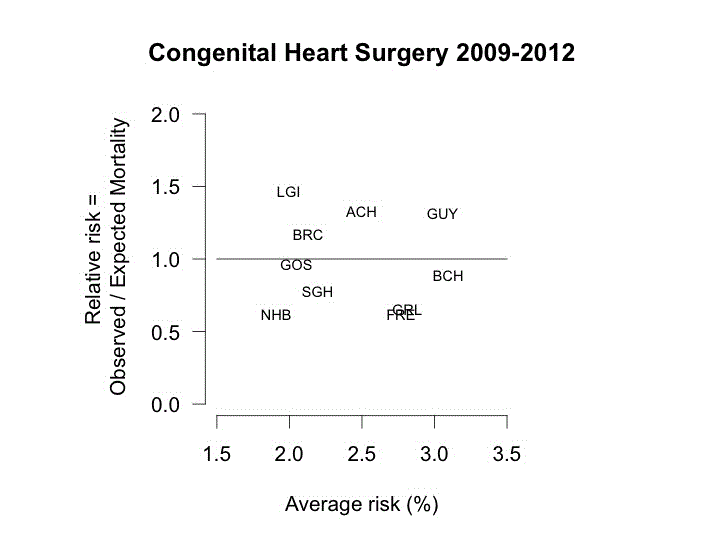
The data analysed is from 2009 to 2012. The headline graphic in the report is this. The three letter codes indicate individual hospitals.

I like this chart as it makes an important point. There is nothing, in itself, significant about having the highest mortality rate. There will always be exactly two hospitals at the extremes of any league table. The task of data analysis is to tell us whether that is simply a manifestation of the noise in the system or whether it is a signal of an underlying special cause. Nate Silver makes these points very well in his book The Signal and the Noise. Leeds General Infirmary had the greatest number of deaths, relative to expectations, but then somebody had to. It may feel emotionally uncomfortable being at the top but it is no guide to executive action.
Statisticians like the word “significant” though I detest it. It is a “word worn smooth by a million tongues”. The important idea is that of a sign or signal that stands out in unambiguous contrast to the noise. As Don Wheeler observed, all data has noise, some data also has signals. Even the authors of the report seem to have lost confidence in the word as they enclose it in quotes in their introduction. However, what this report is all about is trying to separate signal from noise. Against all the variation in outcomes in paediatric heart surgery, is there a signal? If so, what does the signal tell us and what ought we to do?
The authors go about their analysis using p-values. I agree with Stephen Ziliak and Deirdre McCloskey in their criticism of p-values. They are a deeply unreliable as a guide to action. I do not think they do much harm they way they are used in this report but I would have preferred to see the argument made in a different way.
The methodology of the report starts out by recognising that the procedural risks will not be constant for all hospitals. Factors such as differential distributions of age, procedural complexity and the patient’s comorbidities will affect the risk. The report’s analysis is predicated on a model (PRAiS) that predicts the number of deaths to be expected in a given year as a function of these sorts of variables. The model is based on historical data, I presume from before 2009. I shall call this the “training” data. The PRAiS model endeavours to create a “level playing field”. If the PRAiS adjusted mortality figures are stable and predictable then we are simply observing noise. The noise is the variation that the PRAiS model cannot explain. It is caused by factors as yet unknown and possibly unknowable. What we are really interested in is whether any individual hospital in an individual year shows a signal, a mortality rate that is surprising given the PRAiS prediction.
The authors break down the PRAiS adjusted data by year and hospital. They then take a rather odd approach to the analysis. In each year, they make a further adjustment to the observed deaths based on the overall mortality rate for all hospitals in that year. I fear that there is no clear explanation as to why this was adopted.
I suppose that this enables them to make an annual comparison between hospitals. However, it does have some drawbacks. Any year-on-year variation not explained by the PRAiS model is part of the common cause variation, the noise, in the system. It ought to have been stable and predictable over the data with which the model was “trained”. It seems odd to adjust data on the basis of noise. If there were a deterioration common to all hospitals, it would not be picked up in the authors’ p-values. Further, a potential signal of deterioration in one hospital might be masked by a moderately bad, but unsurprising, year in general.
What the analysis does mask is that there is a likely signal here suggesting a general improvement in mortality rates common across the hospitals. Look at 2009-10 for example. Most hospitals reported fewer deaths than the PRAiS model predicted. The few that didn’t, barely exceeded the prediction.

In total, over the three years and 9930 procedures studied, the PRAiS model predicted 291 deaths. There were 243. For what it’s worth, I get a p-value of 0.002. Taking that at face value, there is a signal that mortality has dropped. Not a fact that I would want to disguise.
The plot that I would like to have seen, as an NHS user, would be a chart of PRAiS adjusted annual deaths against time for the “training” data. That chart should then have natural process limits (“NPLs”) added, calculated from the PRAiS adjusted deaths. This must show stable and predictable PRAiS adjusted deaths. Otherwise, the usefulness of the model and the whole approach is compromised. The NPLs could then be extended forwards in time and subsequent PRAiS adjusted mortalities charted on an annual basis. There would be individual hospital charts and a global chart. New points would be added annually.
I know that there is a complexity with the varying number of patients each year but if plotted in the aggregate and by hospital there is not enough variation, I think, to cause a problem.
The chart I suggest has some advantages. It would show performance over time in a manner transparent to NHS users. Every time the data comes in issue we could look and see that we have the same chart as last time we looked with new data added. We could see the new data in the context of the experience base. That helps build trust in data. There would be no need for an ad hoc analysis every time a question was raised. Further, the “training” data would give us the residual process variation empirically. We would not have to rely on simplifying assumptions such as the Poisson distribution when we are looking for a surprise.
There is a further point. The authors of the report recognise a signal against two criteria, an “Alert area” and an “Alarm area”. I’m not sure how clinicians and managers respond to a signal in these respective areas. It is suggestive of the old-fashioned “warning limits” that used to be found on some control charts. However, the authors of the report compound matters by then stating that hospitals “approaching the alert threshold may deserve additional scrutiny and monitoring of current performance”. The simple truth is that, as Terry Weight used to tell me, a signal is a signal is a signal. As soon as we see a signal we protect the customer and investigate its cause. That’s all there is to it. There is enough to do in applying that tactic diligently. Over complicating the urgency of response does not, I think, help people to act effectively on data. If we act when there is no signal then we have a strategy that will make outcomes worse.
Of course, I may have misunderstood the report and I’m happy for the authors to post here and correct me.
If we wish to make data the basis for action then we have to move from reactive ad hoc analysis to continual and transparent measurement along with a disciplined pattern of response. Medical safety strikes me as exactly the sort of system that demands such an approach.